Welcome to another installment of our Tutorial Tuesday series! Today, I want to share a few ways I use blend modes in Photoshop in order to blend my own custom background papers for my layouts!
Layer blend modes can be quite confusing, and honestly I think that simply playing around with them & trying out different opacities is the best way to learn what fits your style. In general, though, layer blend modes change the way layers (or their colors) react with each other.
The modes that I use the most are:
- Linear Burn & Multiply (the 2nd group of blend modes make things darker; eliminates whites)
- Screen (3rd group of blend modes make things lighter; eliminates blacks)
- Overlay & Soft Light (4th group of blend modes generally make things lighter; they work with the gray tones, and results depend on the colors of your base layer)
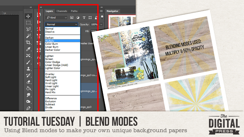
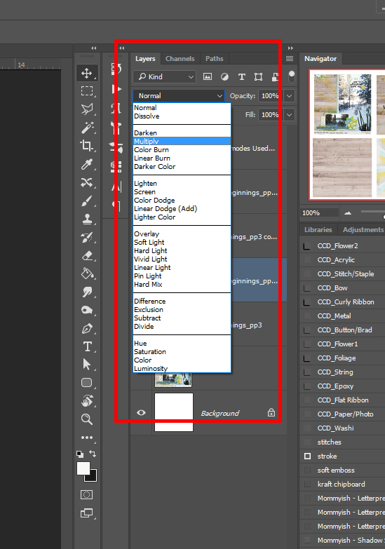
The Blend mode panel is found just above the layers in the Layer panel. The default is always ‘normal’ and clicking on the small ‘v’ will bring down the rest of the blending options, as shown here…
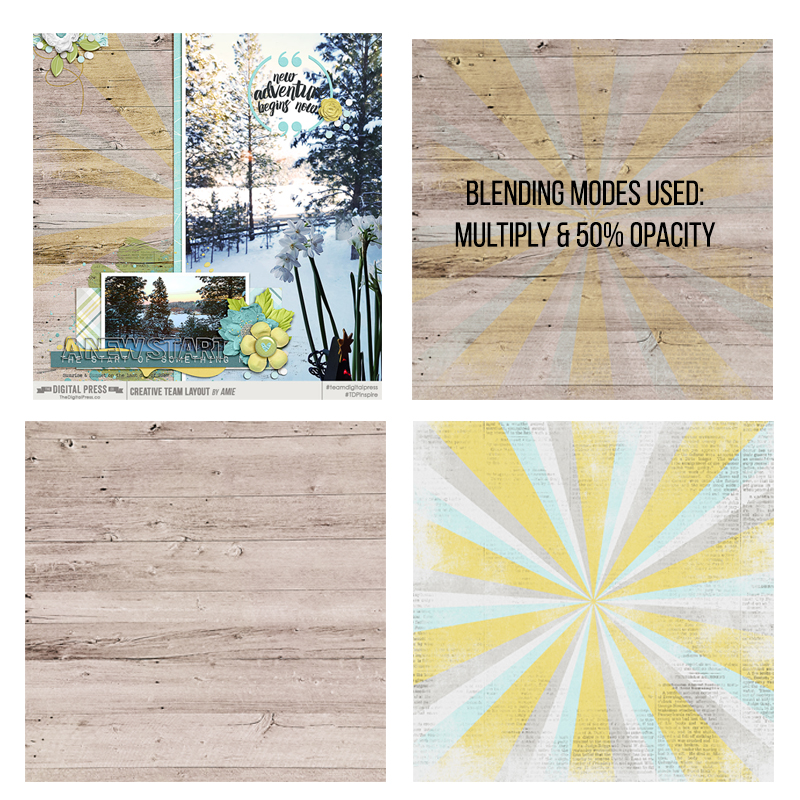
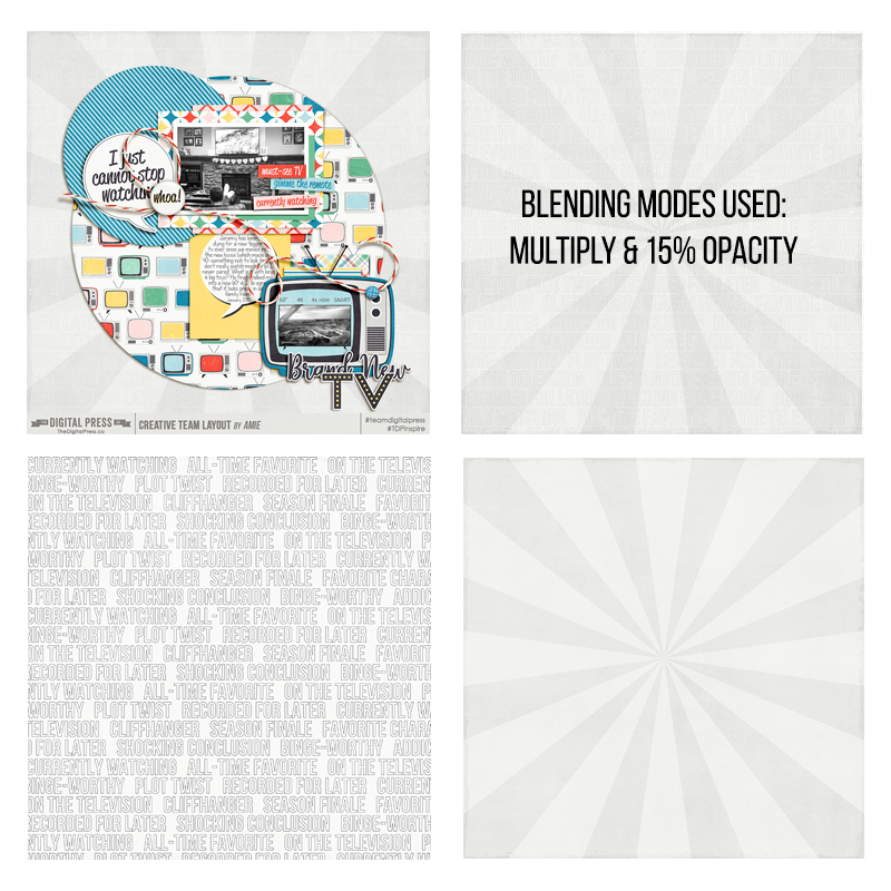
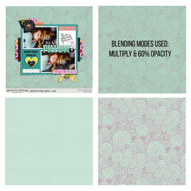
Here are a few examples of how I used the blend modes mentioned above to combine two papers together in order to make my own unique background papers. I’ve shown my final layout (top left), the original paper files from the kit I used (bottom left and right), and also the blended version (top right) along with information about the modes/opacities I used…
In the next example, the text paper (lower left) was super fun & I really wanted to use it… but as a background on its own, it was a tiny bit too distracting. Blending it into the starburst paper (lower right) & then lowering the opacity almost all the way down solved that problem. You can still see & read the words on the new version (top right)… but it doesn’t overpower the layout (top left) any longer…
In the next example, I loved the swirly paper (lower right) and wanted to use it for my background, but it was a bit too bright. When I lowered the opacity, however, it seemed to wash out the pretty greens in the paper. My solution was to use a solid green background paper (lower left) because it helped to keep that color nice & sharp, while still decreasing how bold the pattern looks on my layout (top left)…
The next example highlights a useful tip I want to share — which is that if you can’t get it just right with one blend mode, you can always combine it with another mode and/or duplicate the layer that you’re blending. In the following example, I wanted that hexagon paper (lower right) to pop, even despite the darker paper I combined it with. Duplicating the paper and lowering its opacity gave me the defined hexagons I was going for…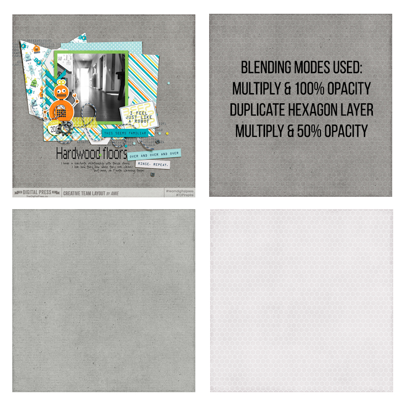

Moral to the story: if you love a certain pattern, but you need a darker/different color for your layout… or if you want to tone down the brightness… or if you simply need a certain color to tie your photos together with a kit… blend modes can be your new B.F.F.! Through the use of blend modes, the possibilities are endless!
It’s also a great technique that can help you stretch your scrapping stash! The sky is the limit when it comes to making something unique and creating your own style with just a few clicks of the mouse! 🙂
 About the Author Amie is a craft-loving dental hygienist who lives in Washington state. She loves her husband, her two kids (ages 9 & 5), and her English Bulldog… as well as coffee, baking cupcakes, daffodils, glitter & sprinkles, reading a good book, and lip gloss — not necessarily in that order.
Great tutorial Amie! I love using blend modes.
Quite often I duplicate a photo, change the blend mode to Screen and reduce the opacity to50% or less. An immediate brightening! On occasion I will mask out a lot of that Screen layer and that emphasizes the part of the photo I want to stand out.