When I look out my window right now all I see is White. I have to say I love winter, but there are some days I would love to see some more bright blue skies. I should take a walk through a stand of pine trees and pursue the color green from the needles.
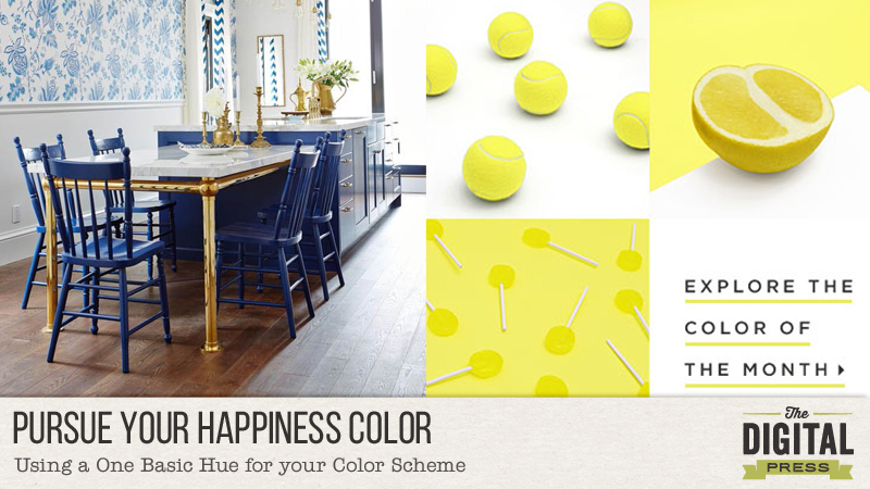
Do you have a favorite color? Does it change depending on what time of year it is? I know mine sure does. My Happiness color right now is Blue. In the spring I love all those pretty pastel colors. Summer, hot pink calls to me. And in the Fall all those beautiful earthy oranges. Christmas season is all on its own and I’m the traditional girl of the bright red.
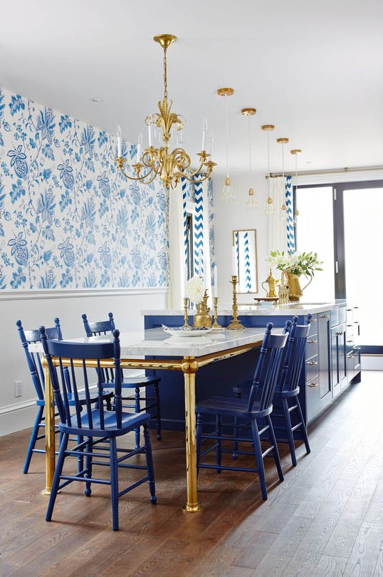
This room is a great example of using a monotone color scheme to any layout or card you create. See how dark blue the chairs and cabinets are, and how they pop against the white of the lower part of the wall! Then they placed a wallpaper on top that uses a pattern of many different shades of blue. Use this concept for the project.
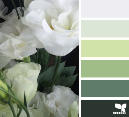
The hues used in this photograph are a great example for you to go by. See how the top color is white. Then they have added different colors of green going from the softest to the very darkest of the hunter green on the bottom of the scale.
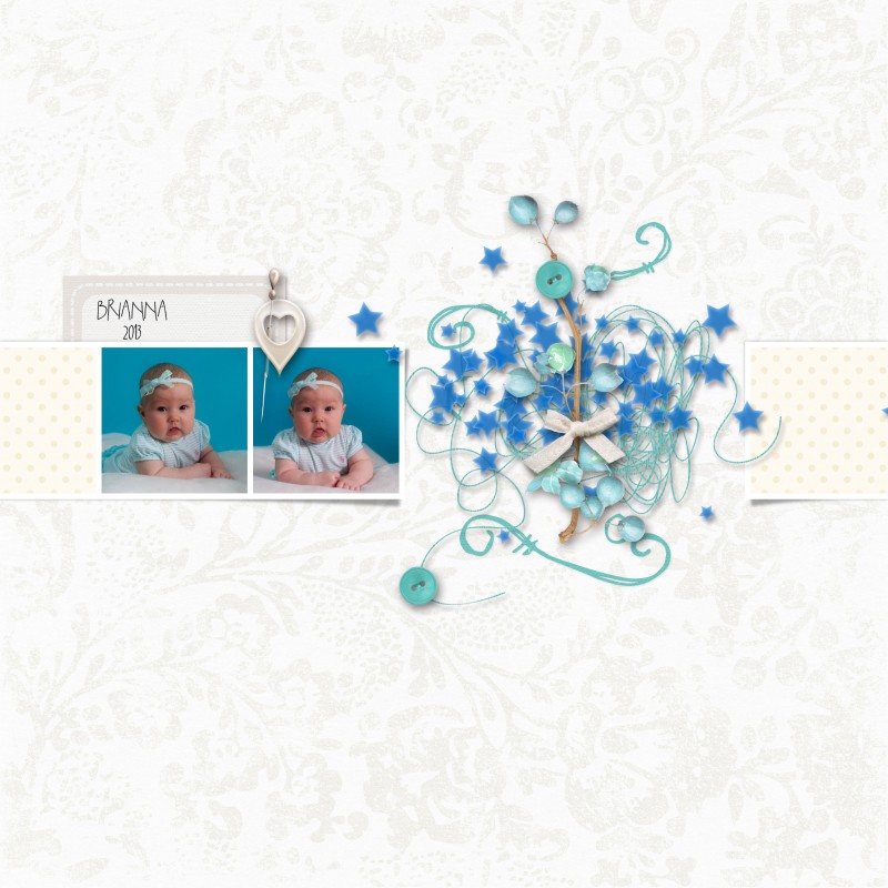
Maybe you are using your photograph as your jumping off point for your color. In my layout I have these photos of my grand niece (isn’t she adorable!) she is wearing blue and the background is also blue.
So for my layout I picked a white background but also used white pattern for my squares of paper too, then used elements ranging from white to a royal blue, baby blue and decided to add a blue/green tint to make it have more depth.
But sometimes the easiest way to add the color you want to a layout is to just convert your photograph to black and white. Or maybe you want to add color to your layout by using your color with papers, and all white elements. It is all up to you. Just remember for this challenge you need to use a white background and then a monotone color scheme. As long as your colors used on your layout are all within one color family your are good to go, and have fun playing with this design feature. This is a great way to compliment your photographs. And most of the time that is what we should remember. Showcasing our photographs!
a couple of quotes to ponder:
Expand your vision. Often we have blinders on. We’re concerned with just getting uptown or downtown. If I expand my vision by even 10 degrees, I notice new details, new color harmonies. by Cindy Coleman
So come and play! You can find the Pursue Your Happiness Color challenge HERE
 About the Author: I started paper scrapbooking in 2001, then in 2009ish I had an online friend who dared me to give digital a try. Wow! life changing in my busy day of being a stay at home mom to six children. In my free time I also love to visit antique malls for treasures, reading, meeting friends for tea and then my woman’s bible study group is a highlight of my week.