I love to use brushes/stamps on my photos, just to give them that little bit of extra. I love it when these are included in kits, but even when they’re not, it’s super easy to create your own using fun fonts and the custom shapes tool.
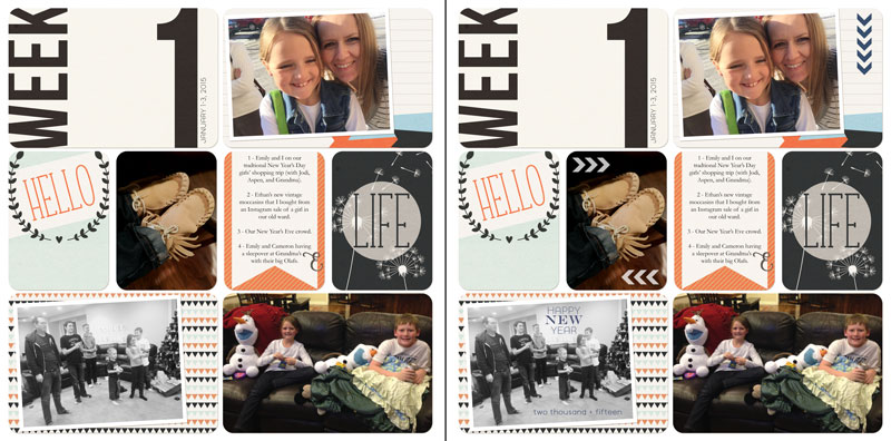
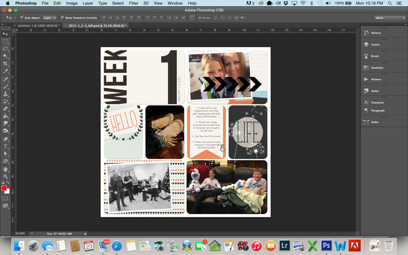
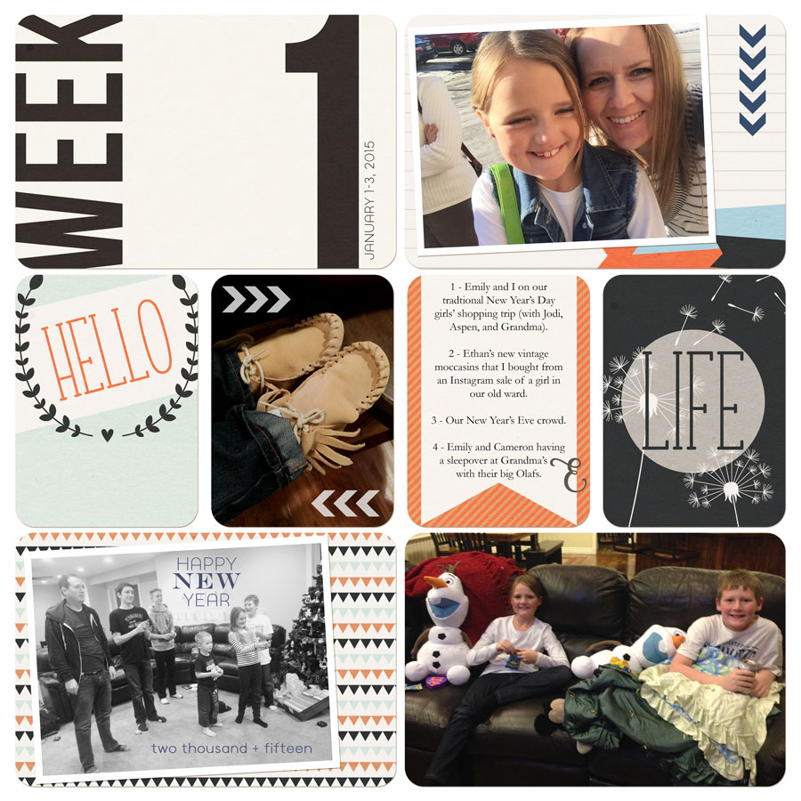
Take a look at the two pages below. They are the same page, but the first one doesn’t have the little extras I created using shapes and fonts. On the second page, I added a little, chevron arrow pattern (repeated a few times) and some custom text.
Here’s a quick tutorial on how to use custom shapes to make your own stamps to use on your own photos.
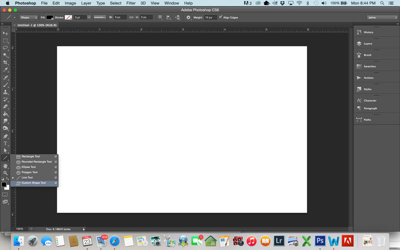
- Create a blank document. I usually use a 4×6 or 3×4 document, since those are typically the size of the “pockets” I use for my scrapbooking.
- Over on the tool bar, click on the corner of the shapes tool to bring out the flyout menu, and click on the one that says “custom shapes tool.”
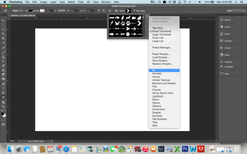
- The shape options will show up on your top toolbar. If all the shapes aren’t showing up, you can click on the little tool icon to bring up this menu. I like all of my shapes to be showing, so I select “ALL”.
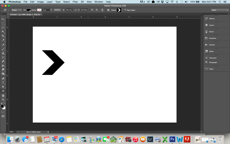
- For the page above, I chose to use this cute, little chevron-shaped arrow. Click and drag on your page to draw the shape. If you hold down shift at the same time, it will keep the same proportions (which matters for some shapes and doesn’t for others).
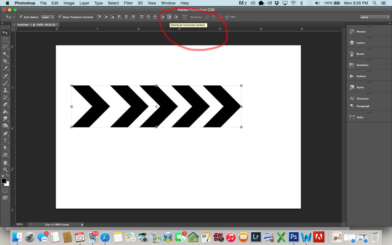
- For this one, I duplicated the arrow so I had five copies of it. Here’s one of my favorite tricks. Select all 5 arrows, and make sure your move tool is selected. Then, push the icon at the top that says “distribute horizontal centers” when you hover over it. It makes your arrows evenly spaced!
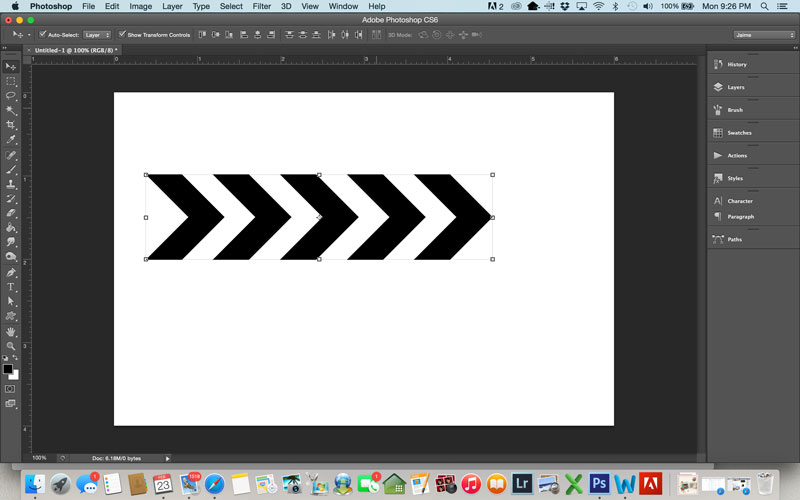
- At this point, I like to merge the shapes together. To do this, select all the arrows, right-click, and select “Merge Layers”. I also like to rasterize the shape (right-click and select “Rasterize Layer”). Now, you can drag the arrows over to your layout and use them however you want.
- For the top right pocket on this page, I rotated the arrows, made them smaller, and changed them to a blue color that matched my layout. I felt like I needed something next to the picture on the card, so I put the arrows there. I duplicated the arrows for the moccasin pic, but I decided that five arrows was too many, so I used the lasso tool to select two of the arrows, and deleted them. I also changed them to white for that pic and lowered the opacity to about 75%.
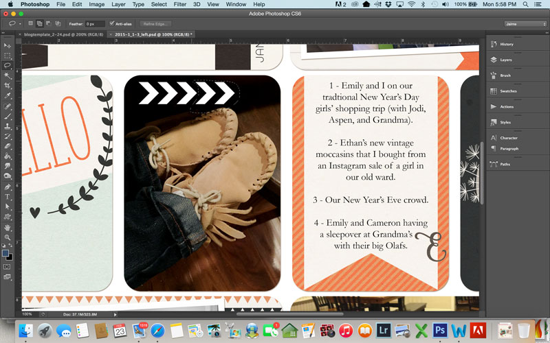
- The final step I took for this page was to add text to the bottom left pic. I had converted that photo to black and white, and I felt like it needed a little more. I just added some text boxes directly on top of the picture. Sometimes I will lower the opacity, or change the blending mode, but for this one I just changed the text to the same color as the top arrows. I liked it, so I left it that way.
Here is the final layout:
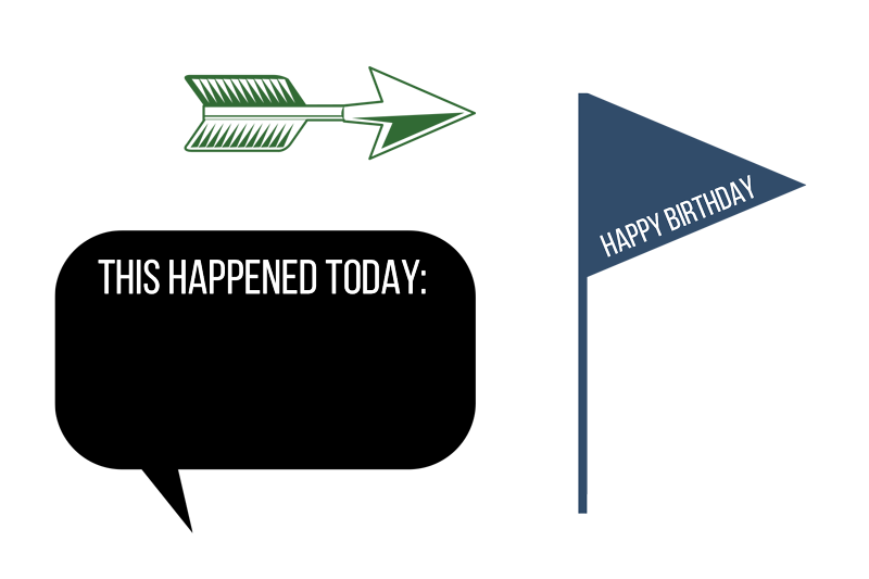
There are so many fun shapes to play around with, so the next time you think your photo or page needs a little something extra, check them out! Here are a few more of my favorites:
 About the Author: Jaime is a member of the creative team here at The Digital Press. She is a stay-at-home mom to 4 boys and 1 girl. When she’s not chauffeuring, volunteering at school, or helping with play costumes, she likes to digitally record her family’s memories, improve her photography skills, and read (there’s always a stack of books on her nightstand).