Author: The Digital Press

Tutorial Tuesday | Photographing an event

Hey there! With Holiday season upon us, we thought it might be a fun idea to give you some tips on how to photograph an event, whether it is Christmas (as in my examples below), a birthday party, a baby shower, a family reunion, a professional event or anything you could think of!

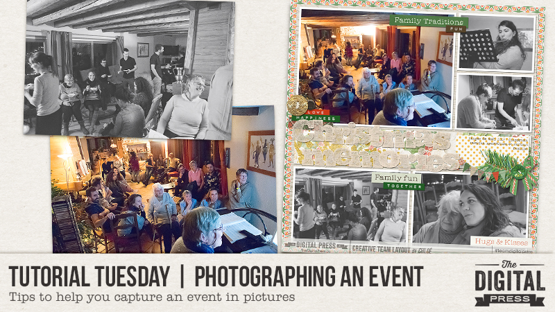
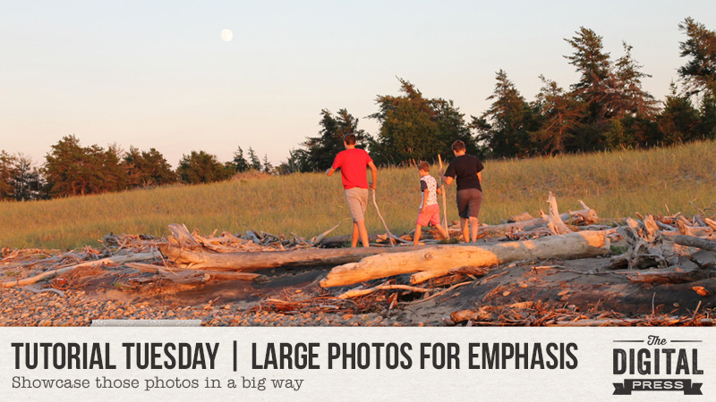
Capture the “big picture”

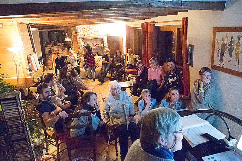
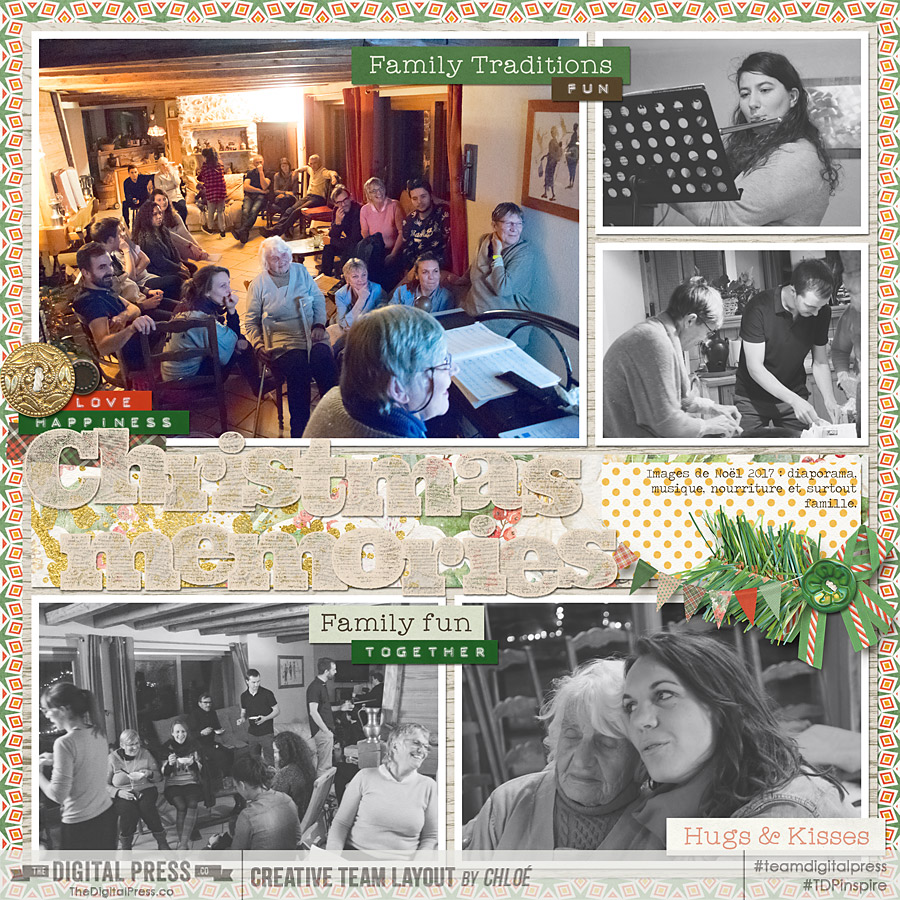
This is the most “obvious” thing, that we usually all do, so it’s an easy one to remember. Take a couple images of the whole event, the whole room (or rooms if it’s a big event). This will help record the location, but also the weather, the time of day. Of course, you will have most of the guests on those photos, even the shy ones that won’t agree to be photographed alone or in smaller groups! Remember to change your points of view so that all those pictures don’t look the same. If you can find a higher position (from a scene, for example, or even by stepping on a chair), it’ll be easier to have the whole room in your image. Use the widest lens you have (18mm in the image below).

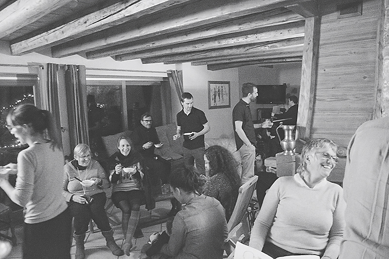
Focus on the relationships

Those events’s main interest is usually to be together, so remember to capture that in your images. The moment people arrive at the location and greet each other is a perfect opportunity to capture those happy reunions. Don’t hesitate to photograph people hugging, talking, laughing with each other. That’s the whole point of being together, right?

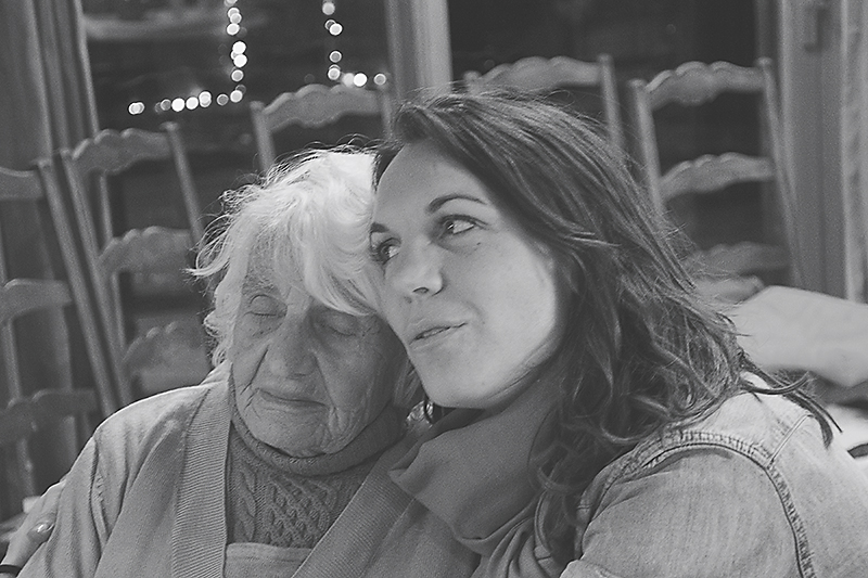
Take some “documentary” images

This is another great tip to help take photos of the shy guests: take their photo without them noticing, without directing the scene you’re photographing, as if you were a fly on the wall. Capturing them that way will help you getting relaxed, natural photos of them. Of course, if they ask you to delete the photos, you have to respect that… but try showing them how awesome they look first, they might change their mind! LOL

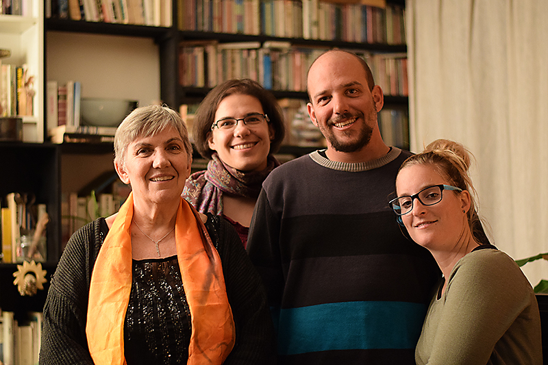
Take some posed photos

If it works with the kind of event, have a little “photo session” with traditional, posed photos of the guests. I have a tradition like that with my mom, brother, sister-in-law and now my niece when we celebrate my mom’s birthday on December 26th. It’s almost the only photo I have every year of my brother who hates to have his picture taken and is awfully good to avoid my camera… but at least I have one good yearly photo of him! LOL

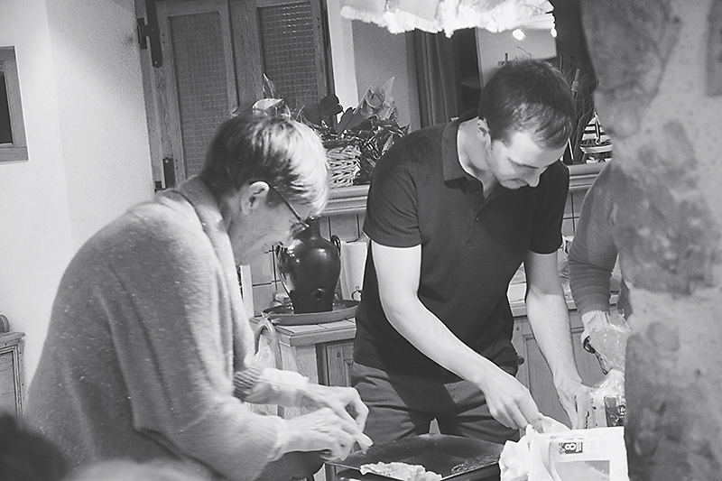
Photograph the details

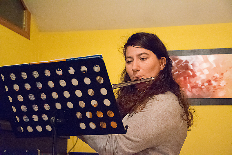
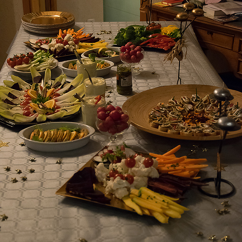
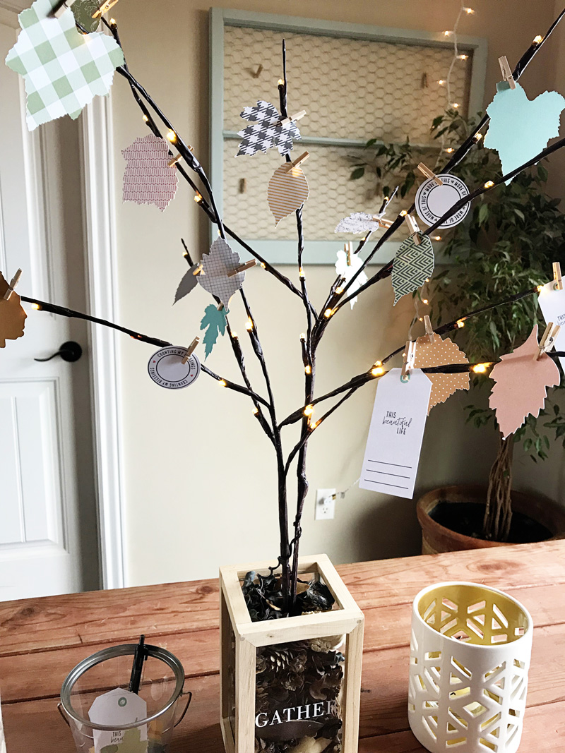
Remember to photograph all the details of the event. Decor, food, piles of gifts, the games that are played during the event, the flowers, the activities (below my family watching old photos my mom had scanned and my cousin playing some music), the invite and more! Those details make the “personality” of an event, what’s special about THAT event, they deserve to be remembered!

Don’t stress too much about technique and be present

As you can see from my pictures above, technical perfection wasn’t my main concern there. I made sure I recorded those memories, even though my white balance was a mess and some pictures were blurry, but the most important thing for me was to be present, enjoy my family (that I don’t get to see very often) and have a good night making memories with them. Don’t get too caught up in getting the “perfect” settings or trying to figure out a new photographic technique but remember to make and record memories, even if the pictures are far from being perfect!

EXTRA TIP: take videos!

Last but not least, remember that pretty much all cameras can take videos so use that awesome feature. It’s especially great for speeches, music, dancing, candles blowing, gifts opening and anything with movement! And if you want to add these videos to your scrapbooking pages of the event, here’s another tutorial on how to use QR codes on your layouts.

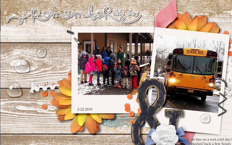
Here is a page I created using last year’s Christmas pictures and the beautiful kit “Traditionally Festive” by KimB Designs.

I hope you’ll find these tips helpful to capture all those fun memories on the next event you attend!


ChloéAbout the author  Chloé is in charge of PR and communication for her small town by day, is a digiscrapper “by night,” and a photographer whenever the light is beautiful. She lives with her man and dog Kira in a small town of Alsace (in the northeast of France), where she loves to read, watch good TV shows (TWD being her absolute favorite), and just hang out with her friends — no matter if they are close by, online, or away in her Swiss hometown. She recently became quite obsessed with Bullet Journaling, FlyLady and Zero Waste.

Hybrid How-To | Thankful Tree

Hello, everyone! Kate here to show you how to use your digital paper to make a lovely center piece that also doubles as a gratitude reminder. It’s the perfect project for November!

Supplies

  • Digital kit of your choice. I used Felicity by Little Lamm Co.
  • Photo editing program such as Photoshop or Photoshop Elements
  • Cardstock
  • Cutting machine or scissors
  • branches – real or fake. I used some fake light-up branches that I can use year after year.
  • Container like a vase or a jar
  • mini clothespins or string

Instructions

I found some leaf shapes in my digi stash that served as templates. I clipped the digital paper to the leaf templates, then printed and cut everything. Felicity had some cute tags that I printed as well. And I think I used every single paper in that kit – they were all so pretty!

Next, I arranged the branches in my container and added some pinecones and other filler. I put all the leaves, tags, clothespins and a pen into a bucket next to the tree. We’ve asked the whole family to write down what they’re grateful for on the different leaves and tags and then pin them on the tree branches as the month goes on.

I want to make this a yearly tradition for our family! And my hope is that it will be a reminder for all of us about the things that truly matter as we go into this holiday season.


Kate About the Author  Kate is on the hybrid team here at The Digital Press. She lives on the Utah/Colorado border with her husband, 5 kids, 10 chickens, a dog named Gracie, and a cat named Kit. She’s a city-born girl who found she’s really a country girl at heart. She can be found outside, barefoot, and probably in her garden.

Tutorial Tuesday | How to Make Rain Drops

Hello and welcome to another edition of our Tutorial Tuesday series here on The Digital Press blog… this time, from the rainy Pacific Northwest! I’m here today to show you a fun trip for creating digital rain drops to add to your projects.

Rain is nothing new to me; having lived in the tropics most of my adult life, I am well accustomed to monsoons! I only recently realized, however, how fun it would be to add “rain” to some of my scrapbooking layouts! In today’s tutorial, I am going to show you an easy way to add a realistic raindrop (or 5) to your projects.

Here is an example, on a layout that I created (see the clear raindrops at the top right, middle left, and lower center-right of the main cluster?)…

[ this layout uses “November” Papers and Elements, by Dunia Designs]

To show you how to do this technique, I am using Photoshop CC (PSCC)… but it should be similar on other versions of Photoshop, as well.

Also, there are a LOT of different ways to do this — but this is one of the easiest methods for beginners (read: it has fewer steps). There are certainly more things you can do to make it look even more realistic, but once you make one, you can easily save it as a PSD file to experiment on.

The beauty of this method is that we are going to leave our little rain drop as a smart object so we can easily move it, rotate it, adjust it, and even duplicate it to create more drops or various shapes and sizes!

So, here we go…

STEP 1:

You can either start this on your finished flattened page, or in your layered working document.

Either way, find the layer you want to add your droplet to and ‘create a new layer.’

For this example, I am adding water drops to the wood background, so I have selected that layer.

STEP 2:

Select the Elliptical SHAPE tool (not the marquee at the top) and set the settings to NO stroke – with a black to white gradient fill. You can choose the direction depending on your light source, but here are mine…

If you want your drop to have a more organic shape, select the layer your Ellipse is on, go to Edit > Transform > Warp. You can then manipulate the circle to create a more flattened or oblong shape like I did below.

STEP 3:

Once you have your shape the way you want it to be,  we are ready to give it a 3D effect.

Open the BLENDING MODES/LAYER STYLE control panel by right clicking on your droplet layer in the layers panel, and selecting Blending Options. We will do the next few steps in this panel…

First, change your layer Style to OVERLAY (you can see below I forgot to do this in some of my images – it is much easier to see the effects you are creating if you have your layer blending mode set correctly!)…

Now, add a small Drop Shadow to your shape. The direction of your shadow for your drop should match the light source and shadows from the rest of your page.

You can play with the settings to get the shadow just right for your shape, or simply use these…

Drop Shadow: blending mode = linear burn, opacity = 32, angle = 90, distance = 8, spread = 0, size = 6.

You can also always go back and change it later if you need to.

STEP 4:

Now we are going to give it an Inner Glow – to start shaping a more rounded 3D look. Keep playing with those settings.

Inner Glow: blending mode = linear burn, opacity = 33, noise = 0, choke = 0, size = 2.

STEP 5:

Still in your LAYER STYLE panel… we will add an Inner Shadow.

Again, you can play with the settings to see what makes it look the most realistic or go with these

Inner Shadow: blending mode = linear burn, opacity = 16, angle = -53, distance = 3, size = 3 and press OK

STEP 6:

Finally, to finish off our droplet we will add some highlights.

To do this add another new layer above your droplet and using a small soft edged paint brush add a few white highlights to the edge of your droplet where the light source should be coming from.  The size will vary depending on the size of your droplet, but you definitely want the hardness set to 0.

If you find that your painted highlights look too harsh, you can soften them with a blur filter in your filter gallery.

STEP 10:

Play around with it!

I will be honest with you… every time I make a new one of these droplets, something looks weird at first. For example — as I walked through this one the first time, I realized I didn’t like it (which is why you might see a few different shapes in the images, above!).

I want to encourage you to play around with the settings from above. Resize your shape — warp it into a different shape — change the size of the shadows or the blending modes to see what works best with your background image — etc.

You might notice in my finished page, above, the droplets look a little different on the lighter background paper than they do on top of the the darker one; that is one of the things that will affect your creation settings.

I gave you the basic steps, but you can definitely make little changes that really will make big differences in your droplet.

I really think that has to do with the fact that different sized and shaped droplets need different settings, so if something is looking off – play around with your different layer style settings until you get a droplet that you really like.  Change the inner glow color to white, or the blending mode to screen.  Move your droplets to different layers in your layout. Duplicate the layer and change the shape.  The options are almost endless!

Just keep duplicating that image and changing settings to see what works best for you!

Here are some changes I made pretty quickly by copying and altering my first droplet. All of these droplets came from that first shape.

Also, keep in mind that what is behind the droplet will also change the look. If your droplet is over text, or an image, you might want to create a birds-eye effect to create that magnified look water gives… etc. (but that is another tutorial for another day!). 🙂

I hope you’ll give this fun technique a try! Have fun experimenting… and see just how fun it can be to “play in the water”!


Erin
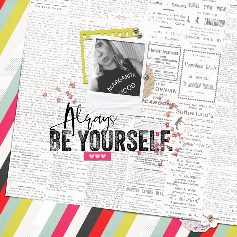
Erin is an artsy crafty kind of girl who is currently dabbling in far too many things, but is working hard to enjoy every moment of it, while avoiding the rain, which is difficult due to living in the land of many rains. She is slowly learning to use her smart phone to capture all the fun little bits of life that would otherwise go unremembered in the busy craziness that is raising a family!

Hybrid How-To | DIY Hybrid Kids’ Games

Hello, and welcome to another edition of our always-popular Hybrid How-To series here on The Digital Press blog!

I’m here today to show you how to use your favorite digital supplies to create kids’ games…such as the fun BINGO game you see pictured below.

This project is soooo simple, and really just requires a BINGO template and your favorite digital kits to create.

Let’s get started!

The first thing you’ll want to do is decide on a theme for your game cards, if desired, and choose a digital kit (or a selection of kits) that contain images that you’d like to use. For my Halloween-themed BINGO cards, I chose an awesome new collection called Spellbound that was designed by Little Lamm Paper Co., shown here…

I used the images contained within this collection to get started on filling up my BINGO card. I chose to make 6 different cards, and in doing so I placed the different images/stickers (like the tickets, candy, bat, ghost, potion and jack-o-lantern) into different spots on each card, filling all of the squares of a simple BINGO template I’d created (one of which I’ve shown here)…

When I found that I needed more images than the stickers I found in the kit, I decided to look at using the word strips and stamps, as well. I liked the tickets, the two flairs, and a circle with “Happy Halloween” printed on it… so I used those, as well. I also decided to use two ‘swatches’ of paper to represent a spider web and the color orange.

I also used a dingbat font (you can find some really great dingbat fonts for FREE on the internet) for shapes such as the cute black cat you see in the 3rd row of the card shown above. It started out as a plain black font, however… and I wanted to jazz it up a bit. In this next screenshot, you can see I found dingbat font shape I wanted — a cat — and then I simplified the layer and clipped a paper to it (the black/grey chevron pattern) from the Spellbound kit I was using…

I also added in an orange paper behind the cat shape for the eyes and just erased the parts I didn’t need… so the orange would show through the “holes” where the eyes were in the dingbat font. Cute, right? Such a simple way to add a cat into my BINGO card even though the actual digital collection I was using didn’t have one. 🙂 (I repeated this same process to create a witch’s hat and a flying witch).

As I worked, I found that this project was a wonderful way to re-think my digital products, and was a great way to re-purpose a bunch of things! For instance, I used two chipboard numbers (“31”) from a girl-themed kit to stand for the day of the month/Halloween. I also was able to use shapes like the circle moon and star from other kits, re-purposing them for this project.

Here’s a look at a bunch of my cards after I was finished creating them in Photoshop, and printing them out…

Aren’t these cards fun?

I hope today’s tutorial inspires you to re-think your own digital supply stash, and have fun playing with your digital products to make something completely new, fun, and festive — something as simple as an everyday BINGO-themed game!

Don’t forget to visit the CROSSWORD SECTION in The Digital Press forum, and jump into this month’s Hybrid Challenge if you are thinking of trying out this project. You can earn points toward discounts & FREEBIES! I hope that you will join in!


00 Headshot

About the Author  Sabrina is an avid documenter of life — herself, her children, her hubby, and her everyday life. There is beauty in the ordinary moments, and they are what she loves to scrap. She is also always on the hunt for a quiet, peaceful moment… and she usually spends it reading or playing at her crafty desk.

Tutorial Tuesday | The Lasso Tool

Happy Tutorial Tuesday!  Heidi Nicole here for a quick tip on a simple way we can make the most of our digital products.  If you’re anything like me, you’re always looking for ways to use your products in multiple projects.  I’m going to introduce you to my little friend, the lasso tool.  How will that help me ‘stretch my digital stash’, you ask?  Well, have you ever wanted to use an awesome set of sequins, but they don’t quite fit where you want them to?  Or, have you ever found amazing word art, yet you want to separate the words to fit the space where your title should be?  Well, using the lasso tool can help you use those elements, yet change them to meet your needs.

I use this tool regularly on scatters, sequins, word art, and alphas (see tutorial on Alpha Sheets here).  Basically, you can use it on anything that is packaged together, that you want to separate.  I’m going to show you a quick way to do this.

First of all, there’s a couple different options when it comes to this particular tool.

  • Lasso Tool:  This is useful for drawing free form around the object that you would like selected and/or moved.
  • Polygonal Lasso:  This one is useful for drawing straight lines around the object or selection.
  • Magnetic Lasso:  This tool is useful for objects with a defined border.  The border ‘snaps to’ the edges of the defined object.

(My personal favorite is the polygonal lasso, but I urge you to experiment with all of them.  They are each very useful in their own right.)

I’m going to use the lasso tool to separate this scatter from Audacity by Anita Designs and Karla Noel.

Step 1:  Choose which lasso tool you would like to work with.  To see what is available, click the little arrow in the lower right corner with the right mouse, which will open up the lasso options.

Step 2:  Draw around the section you would like to move.  You will see the marching ants as you draw.

Step 3:  Choose the move tool, grab the selection, and simply move it to where you want it.  Deselect (Ctrl-D), add shadows, and move on!  Simple, right?


This is a useful tool to make the most of your digital stash.  There are limitless possibilities, and once you start using it, I know you will find it to be useful in many ways… from stretching your digital stash to saving you time.  Just another tool in your digital toolkit!  Happy scrapping!

______________________________________________________________________________________________________

Heidi Nicole

About the Author  Heidi Nicole is happily married to an amazing man, a step mama to 2 wonderful kiddos, and mama to 3 sweet and sassy furbabies.  She’s a radiation therapist by day and creator of pretty things by night (she’s pretty confident that she’s hit super hero status, but refuses to wear a cape.)  She loves cats and huskies, coffee, audio books, FRIENDS reruns, St. Louis Blues hockey, cooking, baking, and traveling.  Oh, and wine… she really likes wine.  She lives a normal and happy life, and enjoys all the absolutely extraordinary people she gets to share it with on a daily basis!

Tutorial Tuesday | Large Photos for Emphasis

Hello everyone, and welcome to another edition of our Tutorial Tuesday series here on The Digital Press blog! Today, I’ll be sharing ideas for using large photos creatively to emphasize them on your scrapbook layouts!

Have you ever heard the phrase “go big, or go home”? I love it, and I say it to myself quite frequently when creating scrapbook pages that feature my favorite photos. The photos that tug at your heart strings, tell a story or just deserve a large spot in your scrapbooks, those are the photos I am talking about!

A big photo makes a statement, and is the perfect way to showcase a photo that tells a story. Use one large photo to fill the entire background of your layout!  Photos that work perfect for this are ones that show the entire landscape or are a wide angle shot with lots of white space. You can add more photos in the white space of your photo as I did on the layout below. Frames help to ground the photos you place over top of the background photo and help tie multiple photos together cohesively on a layout.

Tip: Use the opacity slider to make your background photo look more transparent. This can give the photo a look of a faded memory! If you layer your photo on top of a textured cardstock, it will take on the textured look of the paper below it!

Trick: Frame your large photo to give it more definition on the page. Use stitching or other attachments to anchor your photos and elements to the large photo. That way they don’t look like they are just floating on top of your background photo!

Trick: use a template as the guiding point for your design. Fill the background layer of that template with a large photo and work from there. On the layout below I started with this photo of the skyline and added other favorite photos from our vacation on top of it.

A large horizontal or vertical photo can be used in its natural shape on a scrapbook page by layering patterned papers and embellishments below it. You still get the emphasis of a large photo layout, without filling the entire page with the photo.

Large photo layouts are the perfect way to document a conversation or quote you want to remember from the moment the photo was taken. Keep your design simple and let the photo shine! Not only does the large photo speak volumes, the words you document right on top of it will help to recreate the story from that single moment!

Tip: Use the white space on your photo to write your journaling.

So there you have it… a few simple tips and tricks to use large photos for emphasis on your scrapbook pages.  I hope this has inspired you to use a large photo on your next layout!


JenniferHignite
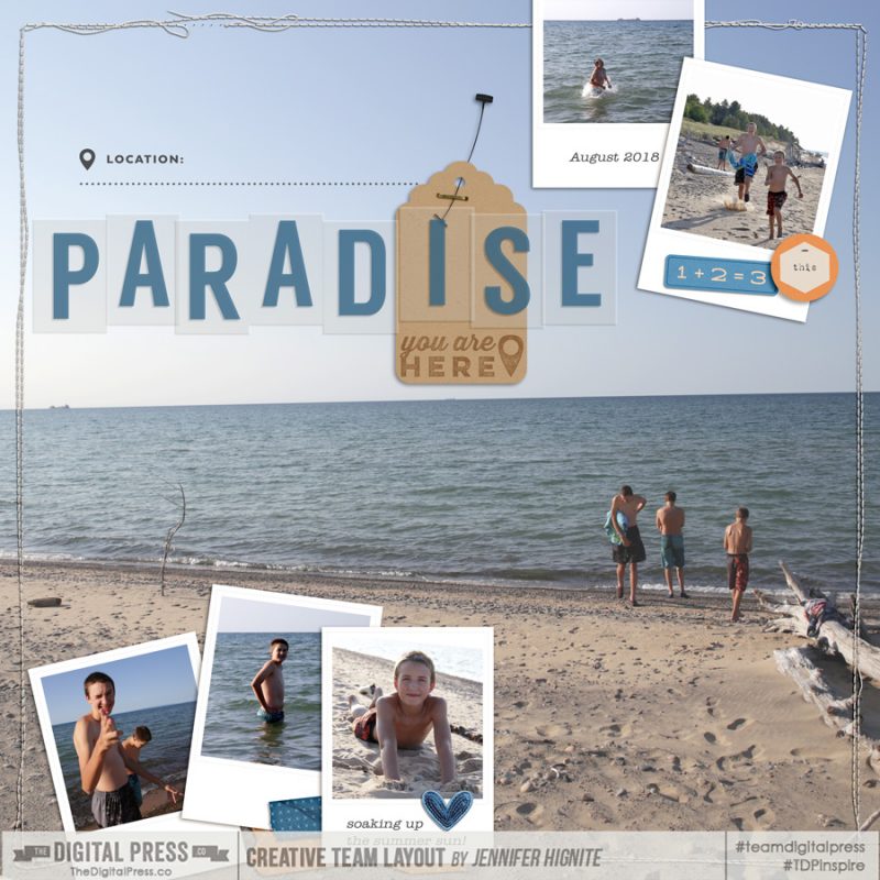
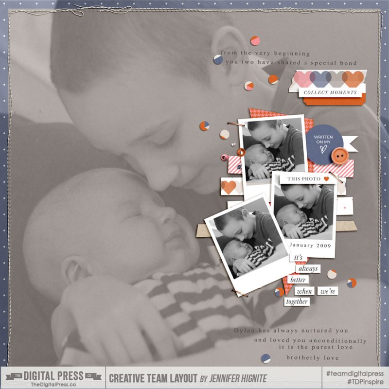
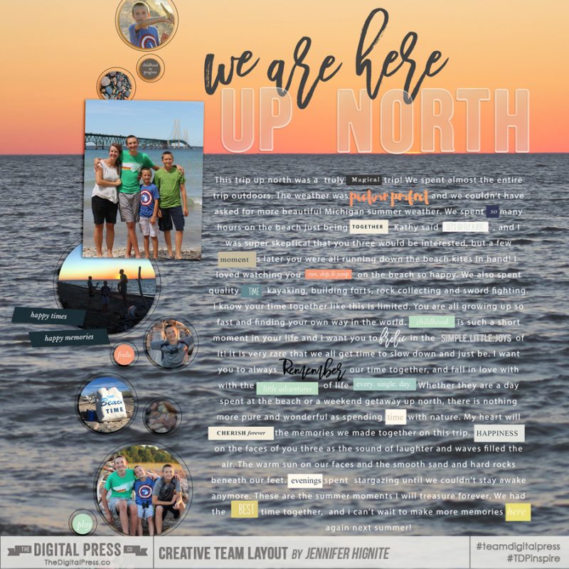
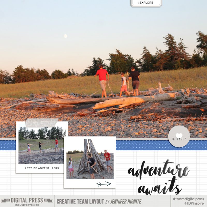
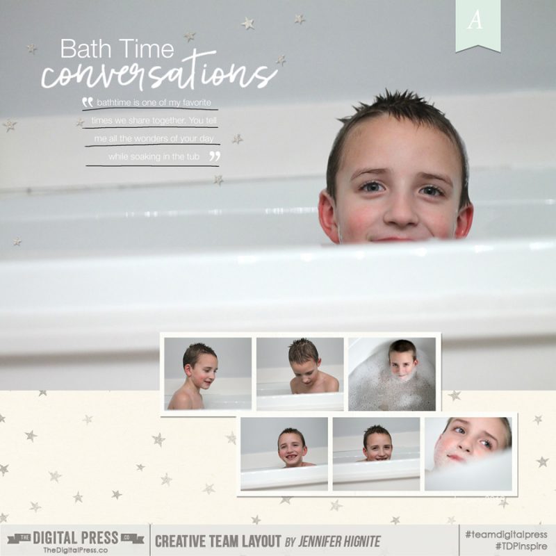
Jennifer Hignite is a mom of three boys and new homeowner with her fiance in the mitten state of Michigan. When she is not scrapbooking, she enjoys photography, watching her boys play sports, decorating, and shopping at Target.