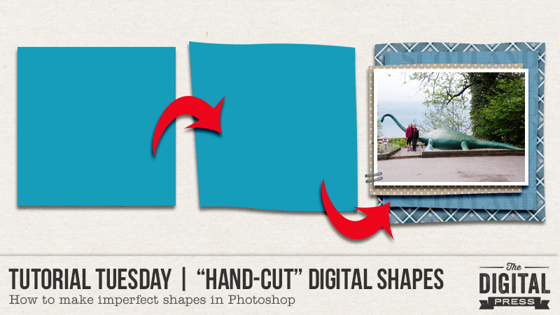
Hello, and welcome to another edition of our Tutorial Tuesday series here on The Digital Press blog! Today I’m here to show you how to create a “hand-cut” look on your digital pages.
I have a confession: I was once a paper scrapper… and I still have all of the stuff, even though I haven’t made a paper layout in probably a decade. Back then, I could literally spend an entire weekend (before I had kids, of course) on a single 12″ x 12″ page. For me, lines had to be as straight as possible, the corners to 90 degrees, and everything had to be *just right* before it got glued or stapled or stitched down. Again, back when I had time for these things.
When I switched to digital, I loved that all the lines were automatically straight and the corners were always perfect. I loved that my 2-day process had become a 2-hour process. Then, as I started printing my pages, I realized that I actually missed the little imperfections of paper scrapping: the slightly crooked lines, the not-quite-90 degree corners. Oh, the irony. So… let’s delve into ways to make those perfect digital shapes look “hand-cut,” or imperfectly perfect.
The first step, as always, is to open a new project / canvas in Photoshop. Fill your background with a solid color, or drag in a paper, just to provide some background contrast. Alternatively, you can also apply this technique in a page/project you already have open. If you’re working in an existing project, though, just start here…
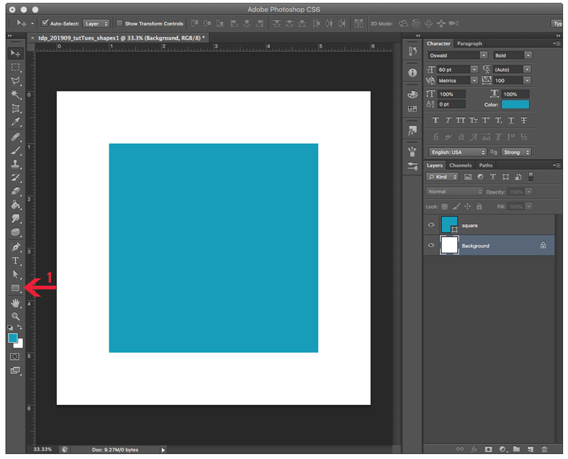
1. Make a new, empty layer (I’m a fan of CMD+N (Mac) — or CTRL-N (PC)… but Layer > New > Layer works, too). To this new layer, let’s add a shape. To do this, select the Shape Tool (number 1 in the image below). The actual shape on the shape tool icon will vary based on what you used last. You can change this to the Rectangle by right-clicking on the icon and selecting the Rectangle Tool. Next, add a nice square. Two options for that… right click and type in the dimensions you want, and click OK — OR — hold down the shift key and drag out the size square you want.
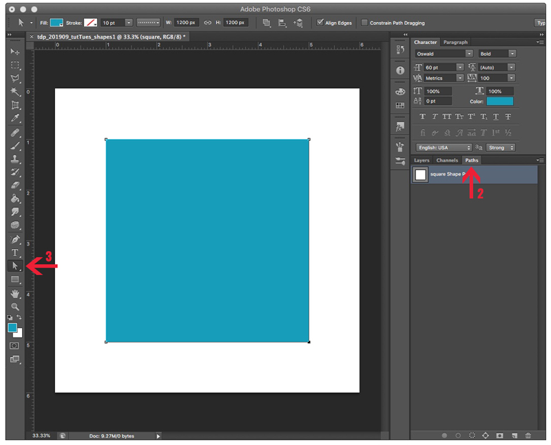
2. Making sure that the layer with your shape is selected, click on the Paths tab (number 2 in the image below). A single layer should show up under paths, and it should have been autonamed “square Shape Path” (assuming that you made a square). Right click on that layer (not on the words, or the icon, but in the space just to the right of the words). This brings up a pop-up menu. Select Make Selection, then click OK to close the new menu that pops up. You should now see “marching ants” around your shape. The ants absolutely do not show up in my screen grabs.
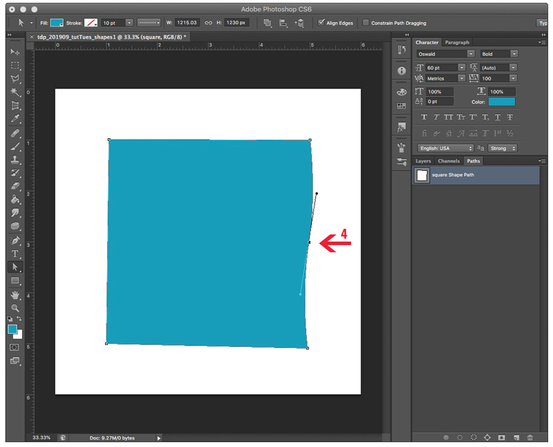
3. Now, let’s get to work on making this shape look hand-cut. Right-click the Direct Selection Tool (number 3 in the image above). You’ll now see corner points – called Anchor Points – on your shape. You can click and drag any of those corner points just about anywhere. Pretty neat, eh? Looks kinda like the paper slipped when you were trying to use the paper cutter. You can stop here, click back over to the Layers menu, rasterize your shape layer, clip a paper, add a shadow, and be done. Or, you can make it look like you cut the shape with scissors …. make one or more of those sides a little wavy.
4. To make a wavy side, you’ll need to add a new anchor point. To do this, right-click anywhere along the side of your shape, and select the top option – Add Anchor Point. When you do that, you’ll get a new anchor point balancing what look like barbells for those marching ants. Go ahead and click on either one of those barbell ends, and drag it right or left. That will change the depth of the wave. Dragging one of those barbell ends in toward the new anchor point, or out toward one of the corner points will modify the horizontal area of the wave. You can add as many anchor points as you want. When you’re done, click back over to the Layers menu, rasterize your shape layer, clip a paper, add a shadow, and you’re done.
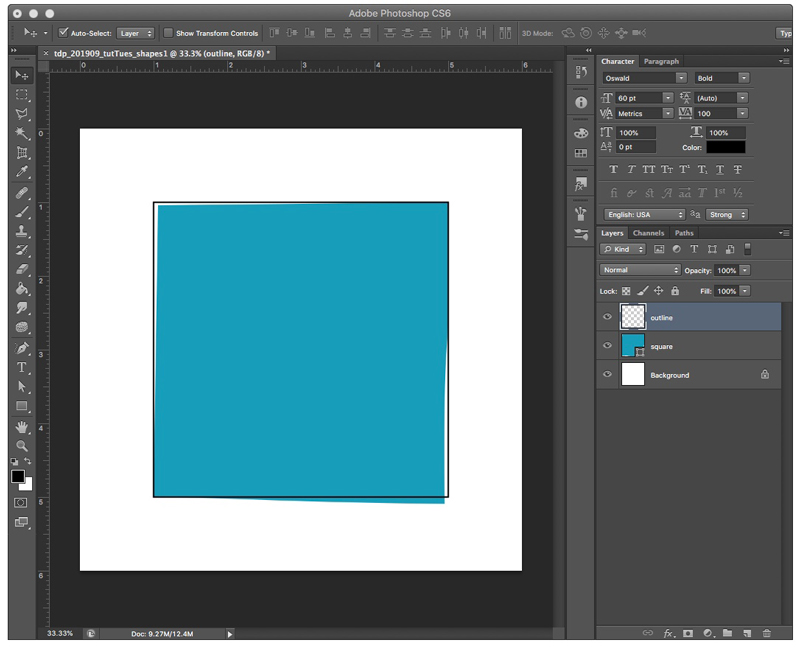
Just for comparison, here’s an image with a stroke of my original shape, and then my final, imperfect shape in teal. The changes I made aren’t drastic, but I think they add a little imperfection that make my 100% digital page look less than 100% digital….
Lastly, here’s a sample of a couple of these imperfect squares stacked underneath a photo…
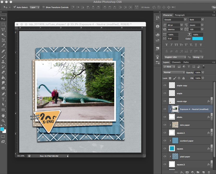
*NOTE* I did each layer separately… but flipping, rotating, resizing, or cropping a single layer would work, too. The layer with the blue paper that says “Scotland” is the one from my example, above.
This technique can be applied to more than just squares and rectangles. You can apply it circles, triangles, hexagons, and even letters (I do recommend a sans serif font that already has squared-off or slightly rounded edges).
I hope that you’ll give this technique a try. I’d love to see your imperfectly perfect shapes!

About the Author Carrie is a creative team member here at The Digital Press. She and her family enjoy spending time outdoors, year-round, near their home in Colorado. In addition to scrapbooking and the occasional hybrid home decor project, Carrie also reads voraciously, accumulates fabric, makes soap, brews beer, grows hops, and tries to keep indoor plants alive.
Super tutorial Carrie! I like how you use the paths and point tool instead of warp or puppet warp. For these crisp edges I think this works better and still gives you a lot of control over the amount you wish to move. Thanks!