Hi, all! Heidi here with a simple little trick that will help make your shadows a little more realistic.
I don’t know about you, but I am a sucker for premade shadow styles. Push a button and done. So today we are going to be using Sabrina’s new Shadow Styles. One thing I have discovered though, is that sometimes, the COLOR of the shadow just isn’t right. And if the shadow looks bad, where is your focus? On what is “wrong” with the layout instead of your focus being on your subject.
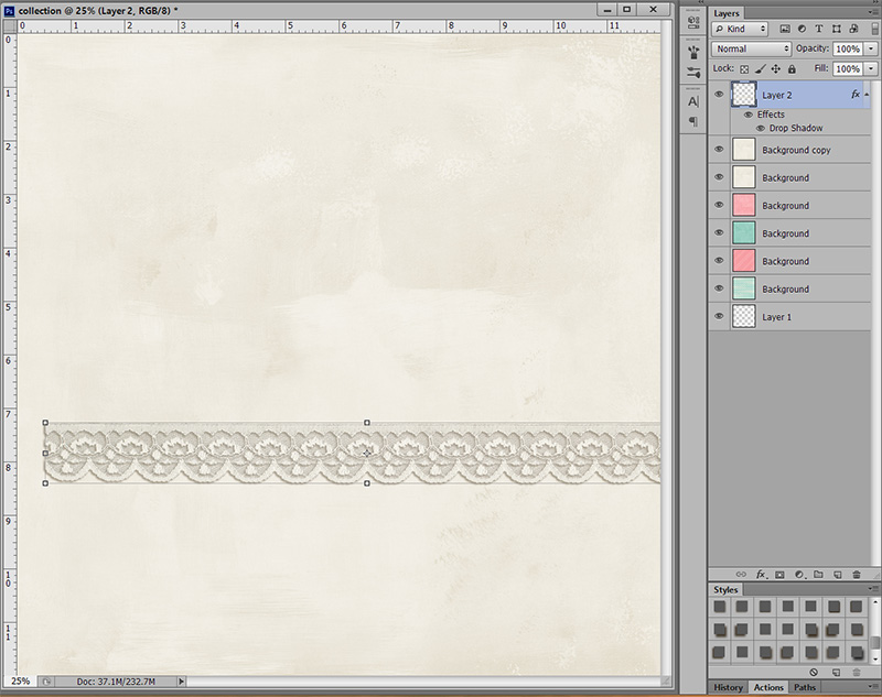
So in the screen shot below, the shadow on the lace is from Sabrina’s Shadow Style. It is the perfect size, but the color is way to dark for the paper I am using.
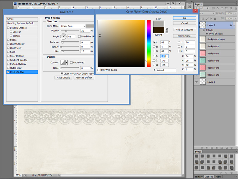
To change this takes less than 30 seconds … ready? Double click on the Drop Shadow effect (circled in red on the screen shot). It will pull up your layer style box.
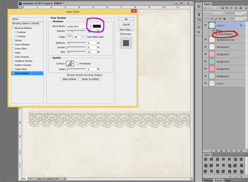
Once you have the layer box open, make sure “drop shadow” is highlighted like mine is in blue. Next, you will click on the color box circled in purple below. That will open up the box to be able to change the color of your shadow.
Photoshop should now look similar to this:
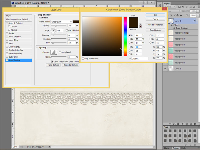
Notice the small white circle in the color box (bottom right)? That is the color of your shadow. It is way to dark for the paper I am using, so my next step is to move my cursor over my paper that I have my lace on and click on the paper. Notice how the white circle moved to the top right and the actual color changed from an orangish color to a little more yellow as well?
That means I now have a more accurate shade to create a shadow from. Also, notice how my shadow pretty much disappeared? It is now the same color as the paper, so it is hard to see an actual shadow.
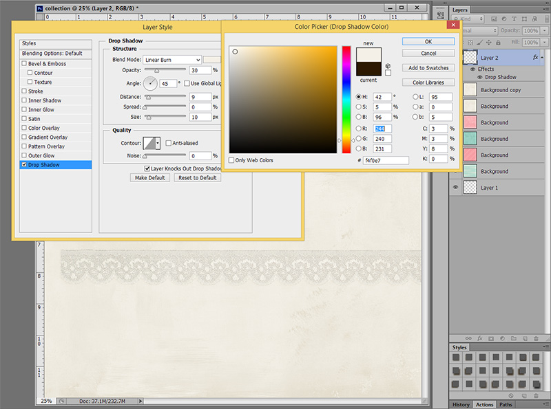
What I want to do is move my cursor back up to my shadow color box and pick a new shadow color. When I have a hard time finding a realistic color for my shadows, I stay with a grey color. Look at shadows around you right now … grey is probably what you will see. Sometimes, I can stay within the brown color for my shadow, but just pick a lighter brown. Play around with it. Click on lighter greys, darker greys, which color works for the paper you are using?
Here is the color I finally picked:
Much softer and a little more realistic right? Don’t believe me? Look at my first screen shot again. That shadow is way to dark. 😉
I usually use this method with pink paper. Brown shadows overall work great! Which is why Sabrina chose the color she did. But every once in awhile, you get that one perfect paper and horrible looking shadows. Now you know how to fix it fast and put the focus where it should be!!
 Heidi has been scrapping for 17 years. Her passions include dark chocolate, photography of her family and reading Christian fiction. When not doing one of these activites, she can be found working at an elementary school library or enjoying being a SAHM.