Tutorial Tuesday – Wave Shadowing Tutorial

tutorial5

Today I want to share a technique that I use to give my shadows a realistic look. Yes, I do warp my shadows. But if you do that for every paper on the page, then the time taken for each shadow quickly adds up. Thats why I use the wave shadowing technique for most of my pages. The effect is super cool and its a time saver too!

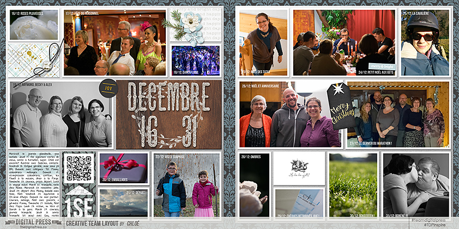
So, I will first start with my finished page.

Tutorial1


I like the shadows on the page. However, if you look at the cream background paper, the way the shadow falls on the polka dot blue/green background paper, looks a little flat. Thats where the wave tutorial comes in.

Here are the steps.

  1. Apply your usual shadowing layer style to the paper you want to use. (As I am a very slow scrapper, I believe in saving time, therefore I use a style for shadowing all my papers as a starting point and then tweak. In case you apply shadows from scratch, please go ahead and apply your usual shadows to the chosen paper)
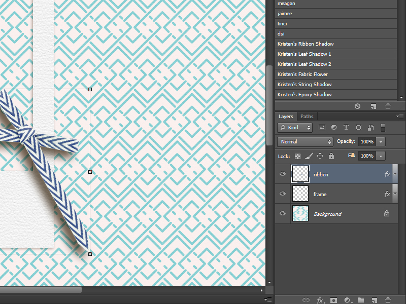
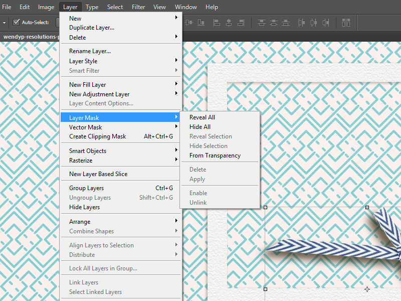
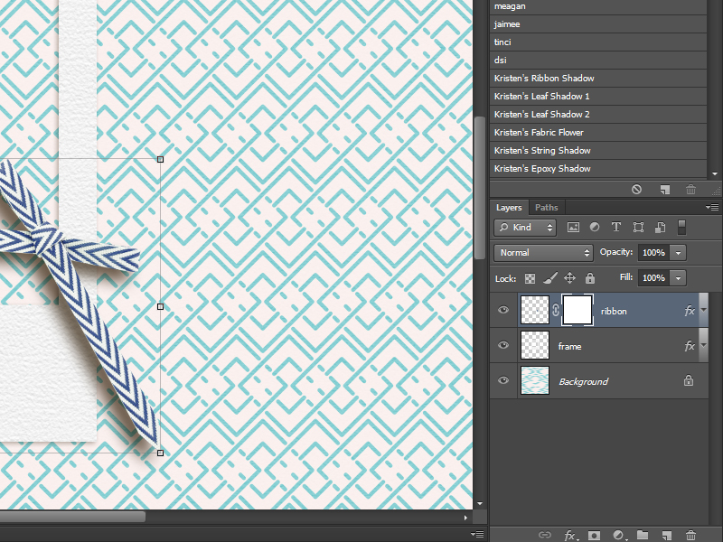
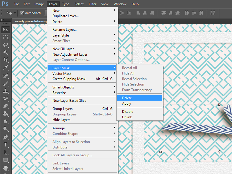
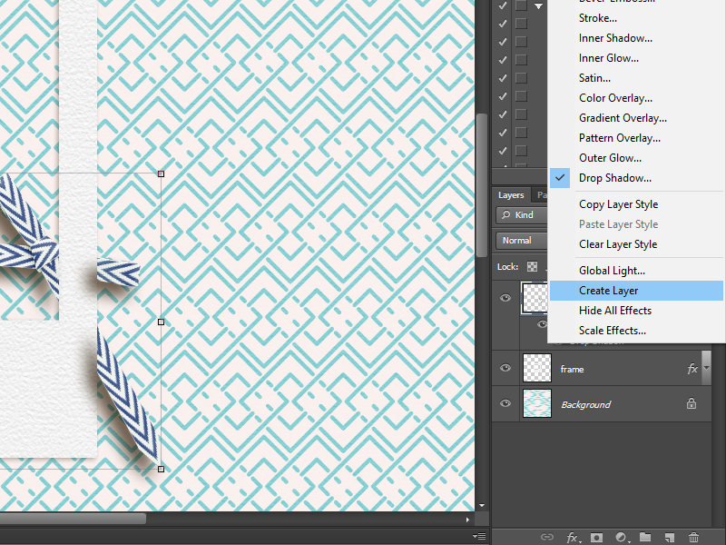
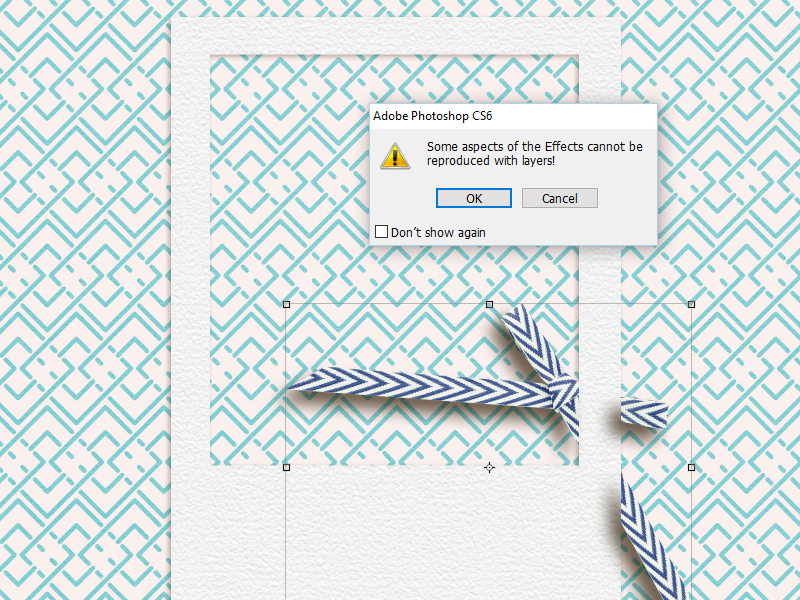
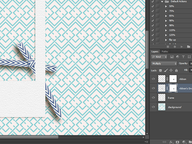
  2. Create a separate layer for the shadow so that it is on a layer of its own. In PS, if you look at the layer of your selected paper, there will be a ‘fx’ sign on that layer. Right Click on that ‘fx’ sign to open up a drop down menu. Choose ‘Create layer’ option from the drop down menu. Now your shadow will be in its own separate layer.
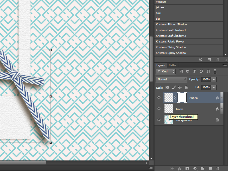
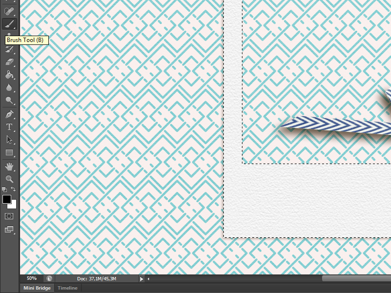
  3. Make sure you have selected the shadow layer from the layers panel.
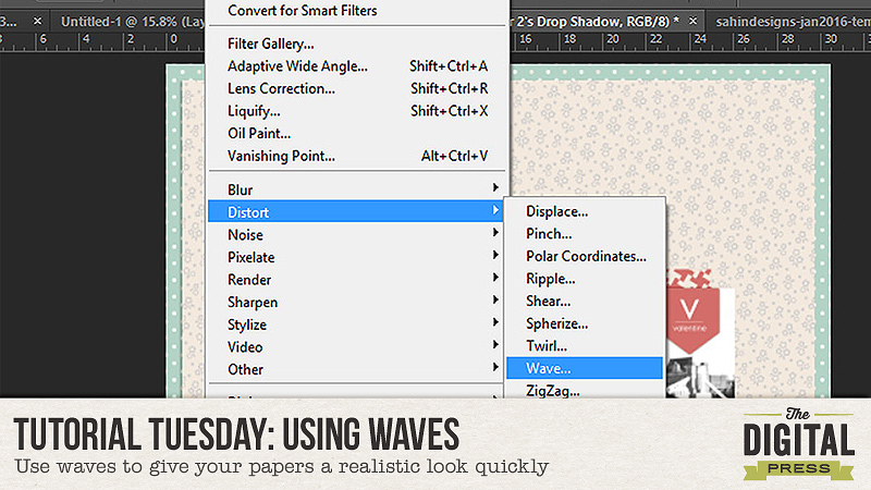
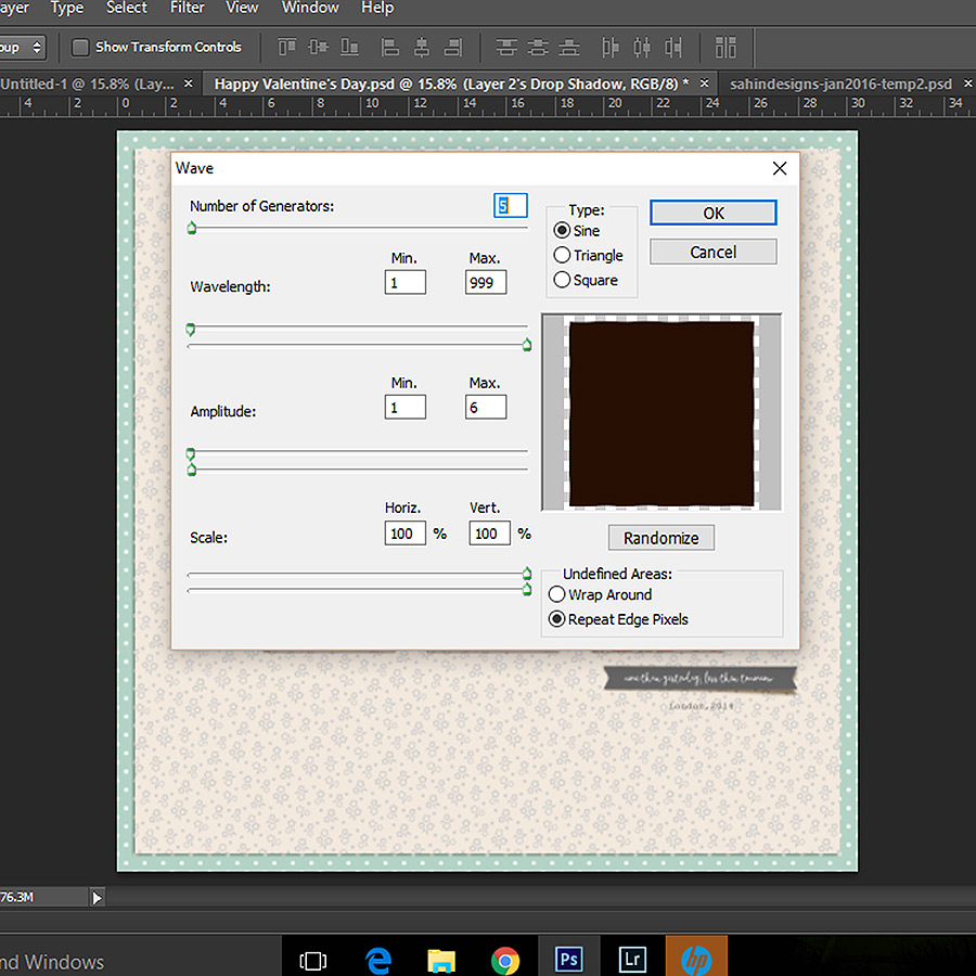
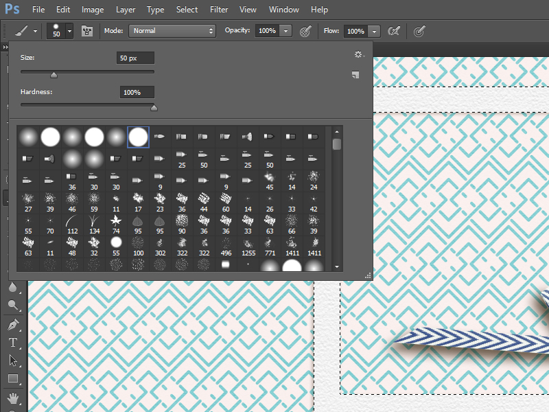
  4. Now use these following setting in the Filter menu.


tutorial2

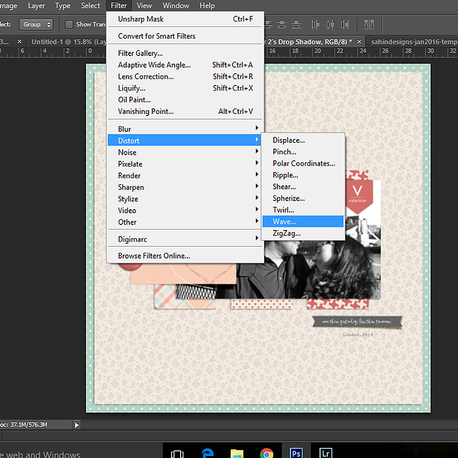
5. The Wave menu will open up. I use the following values in the wave menu –

Tutorial3

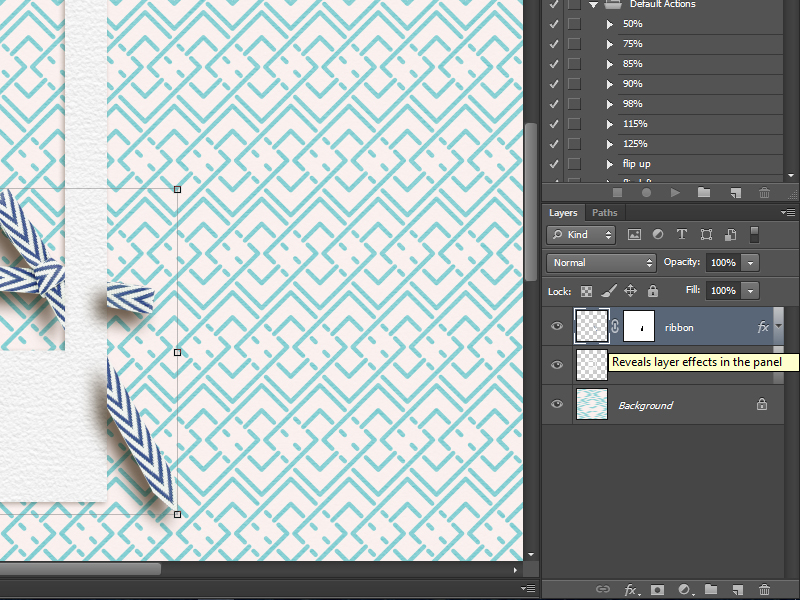
6. And voila! Your perfect paper like shadow is ready!

Tutorial4


If you look at the cream paper now, there is an uneven-ness in the shadow that gives it a realistic look.

Sometimes, when this shadow doesn’t come out right – like if it shows that the paper is raised while it is just under a heavy element, – I just cancel out the effect and apply it once again. That gives a different look and after playing around a few times, I generally am happy with the effect.

I used PS5 for my page. However, you can follow the same steps in PSE as well. Just creating a separate shadow layer in PSE requires some extra steps.

Do play around with this fun technique and see your pages take a realistic look instantly.


PallaviPallavi resides in Mexico City with her husband and her ever growing little son, Rajveer. She has previously lived in Calcutta, Pune, San Francisco, Chicago and London. She reflects all these places in her pages as she captures her everyday stories. She is an alumni of Northwestern University. Currently she is learning photography and working towards getting to a healthy weight. Her days are full and she loves it that way!


Renew Your Love (and Motivation) for Long-Term Projects

Renew Your Love (and Motivation) for Long-Term Projects

We scrappers usually love long term projects. They bring this comforting feeling that come with routine and habits, without mentioning the joy of recording those memories… but they can also be challenging at times!

These sorts of projects come in all shapes and forms:

  • Everyday/Photogaphy-Centered Projects: pocket-scrapping (Project Life); Project 365 (P365; one photo a day); Project 52 (P52; one photo a week); Project 12 (P12; one photo a month). For example, here’s a look at my last layout from my P365 project in 2015:

  • Themed Projects: All About Me (AAM; one page a week or month about yourself… with the mandatory selfie, of course!); “letter to my kid(s)” (or any other loved one); a year of _____ (fill in the blank; it could be about a hobby, about your pet, or about anything that you’re passionate about!); monthly resolutions-check up layouts; words of the month throughout the year, etc. This year, for instance, I plan to do such a page every month (in addition to my P365-ish) that contains a look at what happened, how I felt, how I progressed on my goals / resolutions, new things I learned, things that worked or didn’t work, etc. I think this will make for a great album! I haven’t started yet, but I found this gorgeous page by TDP creative team member Sabrina, which I found to be totally inspiring:

  • Technique-Centered Projects: these would be about one technique or scrapping style, like Art Journaling layouts, ATCs, journaling-focused layouts, trying a new technique every month or week, hybrid projects, etc.

If you’re anything like me, you’ve probably started and stopped those projects many times over the years. For instance, you might have started an annual album — but now you have an unfinished pocket-style scrapbook project that is making you feel guilty. Well, first of all, please stop feeling guilty… right now! Even if you only have one page done, it’s one more page than nothing. It is still a documented memory! Put it in your book. And rather than focusing on the memories you “missed,” focus instead on the ones you did record. That is already amazing — and there’s no such thing as “failing” in memory-keeping!

I’ve completed everyday-type projects every year since 2011, and here are some tips that have helped me get through each of them:

  1. Knowing WHY I am doing the projects. When I’m clear about my motivations, it’s easier to keep going even when I am busy, when I lose my scrapping mojo, when I feel like my life is boring and not scrap-worthy. I’ve often scrapped those motivations and/or thoughts about the project, and used those as the first page in my photo book. It’s a fun way to make an intro to the album!
  2. Keeping things simple. The first 2 years, I used a template I created with a spot for the daily photo and some journaling, plus a journaling spot for extra info. That way, the planning and design was all done and I simply had to switch my photos from horizontal to vertical when needed… clip my papers, add a few elements, add my journaling… and I was done. I’ve since switched to pocket scrapping, and I’ve used actions (more on that later) to create personalized templates for each page that fit my photos perfectly. I also simplify things by using one kit or collection for the entire month… and the same fonts throughout the whole project (one for journaling, and one for the dates on my photos, and that’s it!). This not only helps me scrap faster (as I don’t have as many creative decisions to make), but it also brings some unity throughout my whole album when I get it printed.
  3. Trying to scrap regularly. It’s much easier to go through one or two pages at a time, rather than catch up and finish 5 months in a row. If you want to use your “big girl camera,” keep it as easy to grab as you can (just make sure little hands can’t grab it too easily! Gaaaah!). You’re way more likely to use it if it’s right next to you, than if you have to search for it or go grab it from somewhere far from where the action is happening.
  4. Automating things as much as possible. Technology is fantastic… let it help you! I’ve created actions in Photoshop to help me scrap my pages as quickly as possible. I originally started with a commercial use pocket-templates maker, and eventually tweaked it so that it not only creates the photo spots but also the double page spread, the background just like I like it, etc. I have another action to save the JPG and the web versions of both the double-spread and each page individually. Same goes for journaling: I use an app to record my journaling, and I’ve set up reminders every evening. When I forget to do it at night, I go through my social media accounts and my calendar to help me remember what happened (I have the worst memory ever!). I call my smartphone my second brain for a good reason: it’s an amazing tool to help me remember to take a photo, write down a few sentences about what happened that day, even record video (as I explained in a previous post here on the blog). Set up processes to upload your photos regularly, edit and rename them as you upload them, back them up (it goes without saying, right?), etc. Anything that helps you go faster through repetitive tasks is a great help!
  5. Let go of perfection and the guilt that comes with it. There is no such thing as a scrapping police! I used to call my projects “P365-ish” …because I do miss days here and there! If I can, I quickly change the date on my camera (that way the metadata shows the previous date too!) and take a picture for the day(s) I missed. And if I can’t, then so be it! No big deal! I’ve started many P365 projects over the years, taking my daily picture religiously for… 2 months, and I finally switched to a pocket-style project because I stopped taking daily photos. Again, no big deal. I’m getting memories recorded either way, right? I’ve had 2-page spreads with tons of photos for one week (especially for Christmas when a lot is going on), and other times I just have one page with only 2 photos for a 2 week period. I’m fine with it. I usually take photos with my DSLR, but I’m definitely OK with phone photos, too! The most important thing is to enjoy the project, both while doing it and when it’s completed.
  6. Don’t forget to print your pages! This is incredibly rewarding and I love to go through my books from the previous years. I usually wait to create them until there’s a sale because I love a great deal (who doesn’t, right?). Sometimes I buy a credit and use the deadline as a motivation to finish my pages (That’s what I did with my 2014 PL: I finished it in May 2015 since I had a credit for a book that I refused to lose! I’m pretty sure it wouldn’t be printed yet if it weren’t for the credit! LOL)

I hope those tips will help you enjoy one (or many!) long term project in 2016.

If you’re feeling inspired now… please head over to the forum where there’s a challenge to go along with today’s post!


Chloé

About the author  Chloé is in charge of PR and communication for her small town by day, and is a digiscrapper “by night” and a photographer whenever the light is beautiful. She lives with her man and fur-babies in a small town of Alsace (in the northeast of France), where she loves to read, watch good TV shows (TWD being her absolute favorite), and just hang out with her friends — no matter if they are close by, online, or away in her Swiss hometown.

Tutorial Tuesday: Using the Layer Mask

20160119

Sometimes when I am working on a layout I want to tuck a bit of ribbon behind a frame or weave a bit of a string through a button but I don’t like using the eraser tool at all. Mostly because if I am not completely satisfied with how the ribbon or string looks, I have to delete it, find the element on my harddrive and re-add it to the layout and it takes time I’d rather spend on actual scrapping. So I went to look for an alternative way to erase parts of an element and I found it. Now when I need to do that I use a layer mask. It is so easy. Here’s how it works.

In this case I want to make the ribbon go behind the frame. Make sure the element that you want to ‘remove’ a part from is on the layer above the element you want to weave it to. The ribbon is above the frame layer. Select the ribbon layer by clicking on it.

01

Now we are going to add a layer mask. Go to layer, layer mask and click on reveal all.

02

A white square appeared on your ribbon layer (Make sure you have your layer window visible otherwise you probably won’t see this. Go to window and then click on layers. This will make the layer window visible.)

03

Click on the white square to select it. Nothing will happen yet. Now we are going to select the frame thumbnail layer while holding the ctrl-key. Now your frame is selected.

04

Before we go further make sure the foreground colour is set to black. Now select the brush-tool. Mine is 50px and hardness 100. Now we can remove parts of the ribbon. Just use the brush on the selected part of the ribbon and see what happens. I’ve removed a little bit as you can see….

05

06

07

If you are not satisfied with the result and you want the erased part of the ribbon back, this is what you do. Change the foreground colour to white. (Make sure the layer mask is still selected and make sure you still see the ‘marching ants’ (the animated outline when you select something in PS). If you don’t see then click on the layer mask and after that click on the frame thumbnail layer while holding the ctrl-key.) Now use the brush again and you will see the ribbon part you erased re-appear. That’s how easy it is. De-select the frame and you can continue with your layout. If you want a quicker way to get your ribbon back make sure the layer with the layer mask is selected. Go to layer, layer mask and click on delete.

08

I decided to make a little video so you can see in one go how using the layer mask works.

After writing this tutorial I noticed one thing that I wasn’t too happy with. The cast shadow from the ribbon on the frame. It is not very nice to look at so I tried a couple of things in Photoshop and here is how you can get rid of the shadow that’s cast on the frame.

The first thing that you want to do is reveal the layer effects of the ribbon layer. Just click on the little arrow next to ‘fx’ on the layer.

09

Look for the shadow effect, right click and click on ‘create layer’.

10

You might get this warning but just click OK.

11

Now select the ribbon’s Drop Shadow layer and create a layer mask. Go to layer, layer mask and click on reveal all. Now we are going to pretty much the same thing as we did with the ribbon. Make sure your foreground colour is black. Select the layer mask on the ribbon drop shadow layer. Ctrl-click on the frame layer (you will see the marching ants appear around the frame again). Select the brush and remove the shadow that is left on the frame.

12

De-select (ctrl-d) and you can continue the scrap your layout. Remember that you can always get the shadow back by using the brush & white foreground colour or by deleting the layer mask.

I hope you’ve learned something you didn’t know yet. I’ve used this a lot and I just love this technique.


bianckaAbout the Author Biancka is a creative team member here at The Digital Press. She is a stay-at-home mom (SAHM), wife to Edwin, and mom to Jasper. She lives in the east of The Netherlands (about 30 minutes from the German border). She is addicted to scrapping, but also enjoys baking, reading books (mostly thrillers), watching her favorite TV shows, and photography.

Chore Chart Hybrid Project


I am sure you have heard the saying, “desperate times call for desperate measures.” Well, things in my house are getting pretty desperate!

One thing that I have wanted to do for a while now is to get my children a little bit more on board with helping out around the home. They do have ONE job to do around the house each day… but as they are getting older and more capable, I think it is time for them to accept responsibility for a little bit more!

Until now, we have used a very basic job chart…

Yep, pretty basic, huh?!

I think I originally drew it really fast, with the only 3 colored pencils that were on hand! It has worked well enough — we simply move the names down one place each week so that the children rotate around the best and worst job — but the chart has got rather tatty now, and poor Eden has lost her name altogether (she has tried getting out of doing her job by telling me that her name isn’t on any of the jobs listed, which must mean that she doesn’t have to do a job!).

So the time has finally come for an all-new and improved job chart (or “chore chart,” if you prefer!). This time, I wanted to include the daily jobs that I expect the children to do… but also a reminder about keeping their room tidy and their clothes put away. I also wanted to add a new weekly job for each of them, as well.

LJS Designs released the My Crazy Life  collection a couple of weeks ago, and I knew it was just what I needed for my project. I love the cheerful colors and the cute elements/images (it contains elements like a sink full of dirty dishes, a mother carrying a mountain of dirty laundry, and a stack of beautifully-folded, neatly-ironed laundry, too! So perfect for a chore chart!).

To make my chore chart, I used the My Crazy Life papers and elements, and Lorie (the designer behind LJS Designs) also honored a special request from me and kindly made-up a special CHORE CHART FREEBIE (<–click here to download it!). This free download is available for everyone, and goes alongside the kit to help illustrate even more chores! Finally, I also used a few elements from her Family Dinner kit, as well.

Here’s a look at everything I used… and please note that the kit names (above) are all linked to each item in The Digital Press shop, and/or to the direct download for the freebie… 🙂

Supply-wise. all I needed for my chart (apart from the two pieces of printed material), were my trusty scissors, and a split pin — nothing too tricky!

It couldn’t have been simpler… I just created both the base chart and the top/rotating chore “list” in Photoshop (as though I was creating a digital scrapbook page), and then I printed both pieces out.

Next, I used the scissors to cut out the circle of the top piece… and then attached the circular top piece to the main chart with the split pin (thus allowing it to spin/rotate from person to person each week). And then, hey presto, a new chore chart was born! I am sure you can imagine the gasps of delight as I unveiled the completed chart to my family…

I also used a few cute papers from Lorie’s My Crazy Life to make some little daily check cards (shown below). The children can write their name in the top box, and each day when they have completed their daily jobs, they can bring the card to me and we will tick the little circle, or punch out a shape with my little paper punches. It’s just something to add a little more fun to the process… at least until these jobs become a habit.

If you are thinking of renewing your goals of a clean and tidy organized home this year… why not try making a chore chart for yourself or your family? If you would like to use the chore chart elements freebie from LJS Designs, the just CLICK HERE TO DOWNLOAD IT.

Meanwhile, please come on over to the forum and join this week’s hybrid challenge that is inspired by this blog post!

I’d love to have you come join in the fun, and show me what you end up making!


Corrin
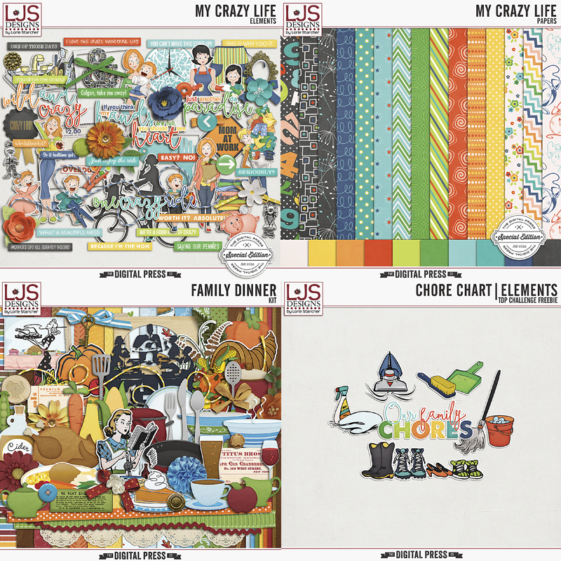
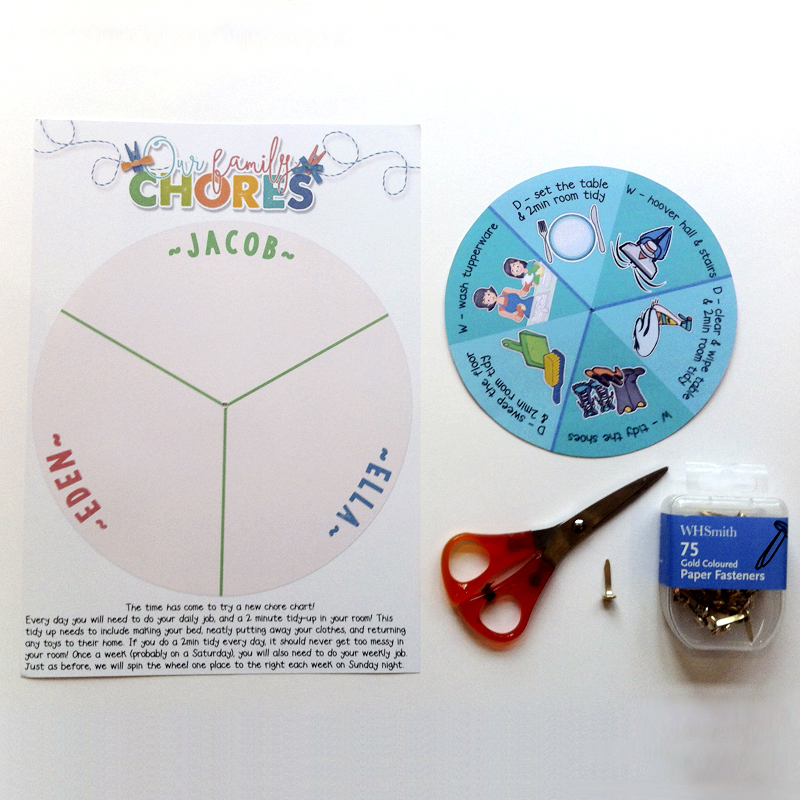
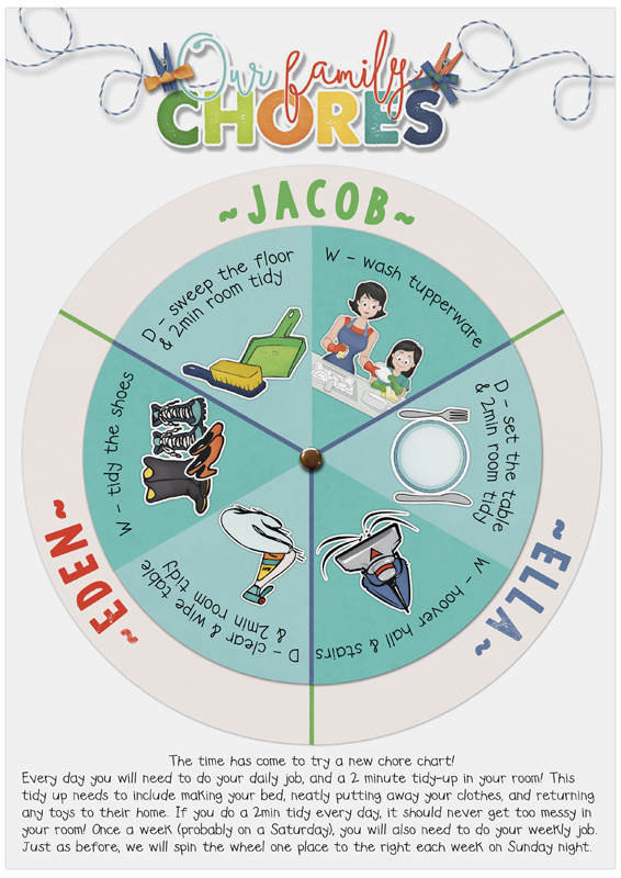
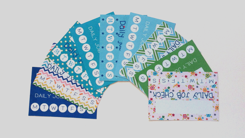
About the author  Corrin is on the creative team here at The Digital Press, and is a fan of the Big Bang Theory and a lover of cozy pajamas. She lives in the chilly South of England with her husband and 4 crazy kids, who regularly discover & plunder her secret chocolate stashes! She is still trying to get the house straight after moving 2 years ago. Who knows… maybe this will be the year she reaches the bottom of the laundry pile!

Renew And Repurpose Digital Elements

tdp-janblog

One of the most fun things about digital scrapbooking is that we are able to re-use digital products over and over, making our hobby even more economical and more fun when we renew and repurpose our favorite papers and elements.

I love to discover new ways to use elements from kits, providing more versatility for the products. I admit I have a love of Christmas/winter-themed kits, and love to find new ways to use the elements… not just for my Christmas season pages, but all year round for a variety of occasions.  Do you have some older kits that you have used so many times they no longer pique your interest? Today I hope to give you some ideas on how to use some of the elements in new ways, to see your elements in a new light, and to find different ways of using them in future projects. I’m excited to share a few ideas that I’ve used in the sample pages that appear below. I used Photoshop to create my pages.

The first page I’ll share — “This Is My Happy Place” — was created with a kit by River~Rose called “This Is Your Day.” If you are creating a birthday page, this is a fabulous kit to use. I wanted, however, to use this kit for an everyday life page about my dog, Taz. The papers fit the color/design I wanted to use, but I wanted to change some of the elements to better suit my page design and my topic. Here’s a look at the page…
happyplace-800
To create the page shown above, I repurposed a bunch of different elements from the kit, as follows:

  • I chose two candles from the kit… rasterized these layers after adding them to the page (you can also create a smart layer)… and then with my marquee tool, I selected and deleted the ends of the candles. I then selected edit > transform (Ctrl + T) to shape them into long thin bars, placing them at the left and along the bottom of my photo.
  • I also chose a layered flower and chose the blend mode “subtract” to give it a flat look with a beige edge color/dark center. I placed these flowers on the left and at the bottom of my layers, which I duplicated to also place at the bottom right, under my photo.
  • I chose the ribbon and with the lasso tool I selected and deleted part of it to shorten it up.  String from the balloon was selected and extracted to place along the bottom of my photo.
  • The yellow heart made a fun little flower, by duplicating and turning the points in toward each other. I duplicated the flower so I could place one at the bottom of my photo and the other off to the left of the photo.
  • I used the marquee tool to select the inner square of the giftbox element and tucked it under the paper layer to the left of my image.
  • The last repurposing was with the word art “this is my day” …I erased the last word and created “happy place” with a font, adding a white stroke around it.

This second page I’ll share today — “Playtime” — was created with a kit by Anita Designs & Sahin Designs called “Dear Santa“. It’s a beautiful Christmas kit that contains some gorgeous papers and elements that I wanted to use to create another everyday page about Taz at the park. Here’s a look…
playtime-800
Here’s a rundown of the repurposing I did while creating this second page:

  • First, I chose a tag and duplicated it twice. I merged all three together, created a clipping mask and clipped my image to it.
  • Next, I chose the Santa element and with the magic wand, I selected one of the stars. I zoomed in as I was selecting with the wand to make sure I was only getting the star. I extracted the star, duplicated it twice, and placed the three stars at three points around the image.
  • I used the magic wand again to select and extract a diamond shape out of the blue bulb (I liked that it looked like vellum). I duplicated the layer and placed both of them on the upper part of my image.
  • The leaf from the kit was a darker color than I wanted so instead of recoloring it, I changed the blend mode to luminosity which took in the colors below it which was the blue/grey tones of my image.
  • Out of the star matte I cut out a circle with the elliptical marquee tool and duplicated it, placing both at the top right of my image.
  • The last repurposing was with the word art “it’s christmas time”, replacing it with “endless energy”. So by repurposing some of the elements, this Christmas kit worked well with my non-holiday page design.

I hope that I have given you some creative ideas on renewing your stash and repurposing elements to use with new/different kits. Now you can experiment and try extracting, recoloring, re-sizing, blending, etc. It’s a lot of fun!

Come to the forum to check out today’s challenge that goes along with this post! You can earn challenge points that can turn into awesome discounts from TDP’s shop if you participate in the challenge system throughout the month!


RaeAbout the Author  Rae Clavett is part of The Digital Press creative team. She is a Canadian, living on the west coast of BC with her husband and labradoodle, Taz. She loves photo walks, coffee, chocolate, and her newest addiction — jelly beans.

Tutorial Tuesday | Better in Black and White

I love the look of black and white photos on a scrapbook page. They have the aura of looking “artistic” and work particularly well when mixed with colored photos.

If you are wondering how can you improve your black and white photography to make your photos pop… today’s Tutorial Tuesday is for you! 😉

Here are a few simple tips:

1. Take your photos in color.

Don’t use your camera’s black and white conversion option. Your favorite photo editing program (whether it be Lightroom, Photoshop, or some other similar program) provides a lot of flexibility to convert a color image into a black and white image. These options are much more limited, however, if the original photo is taken in black and white.

2. Look for contrast.

The best black and white images are taken by those who know how to look in black and white. Look for contrast in light and shadows. Look for a large range of lightness or darkness. Look for lines.

Black and white images are often more effective if they contain a true black, true white or both. What does this mean? It means that you need a part of the image to be “white” or “black” to ground the image. If this is not possible, you will definitely still need a wide range of grey; otherwise, the image will appear flat.

If you look at the following two image examples… the first contains black to ground the image, while the second contains white…


3. Look for patterns and texture.

Textures and patterns often look far better in black and white, because color does not compete for attention.

In the following photo, you can see the wonderful texture in the foreground sand and the shape of the old tree threatened by the rising ocean…

Likewise, the texture of the sand and geometric pattern of the wheel actually look more clear without color in this next image…


4. Try not to over or underexpose.

You can use your photo editing software to recover areas that are underexposed or overexposed, but it often creates noise in the photo which has the appearance of splotches or grains of discoloration. Noise will also appear in photos taken at high ISO settings. These defects are more visible in black and white than in color. It really does help to get the correct exposure in camera before taking the photo (and if necessary, using a tripod to steady your camera in low light).

For the following image, I used a tripod and long exposure (6 seconds) to soften waves at the beach…

It helped that my partner had no idea I was taking the photo. 😉

I hope that these tips can help you to take some better black and white photos. Please have fun experimenting with black and white! I’d love to see what you can do, so definitely feel free to link me up to any of your photos in the comments below. Next month, I’ll follow-up today’s post with another that will give some tips on using your photo editing program to convert color photos to black and white (and how to make these images really pop!).

I have one last photo of mine to share today… and this is one of my favorites. It shows our darling 12-year-old rescue greyhound, Zsazsa. She is good in any color.


About the author  Carolyn lives with her partner, eldest daughter and 3 rescue dogs on 5 acres of paradise in the hinterland of the Sunshine Coast, Australia. Her camera, along with an assortment of lenses, is never out of sight. When not taking photos, she loves cooking and gardening. Her new organic vegetable garden has been well photographed.