Pursue Your Happiness Color

PursueYourHappinessColor

When I look out my window right now all I see is White. I have to say I love winter, but there are some days I would love to see some more bright blue skies. I should take a walk through a stand of pine trees and pursue the color green from the needles.

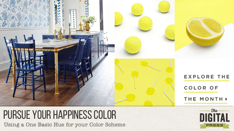
Do you have a favorite color? Does it change depending on what time of year it is? I know mine sure does. My Happiness color right now is Blue. In the spring I love all those pretty pastel colors. Summer, hot pink calls to me. And in the Fall all those beautiful earthy oranges. Christmas season is all on its own and I’m the traditional girl of the bright red.

PursueYourHappinessColor

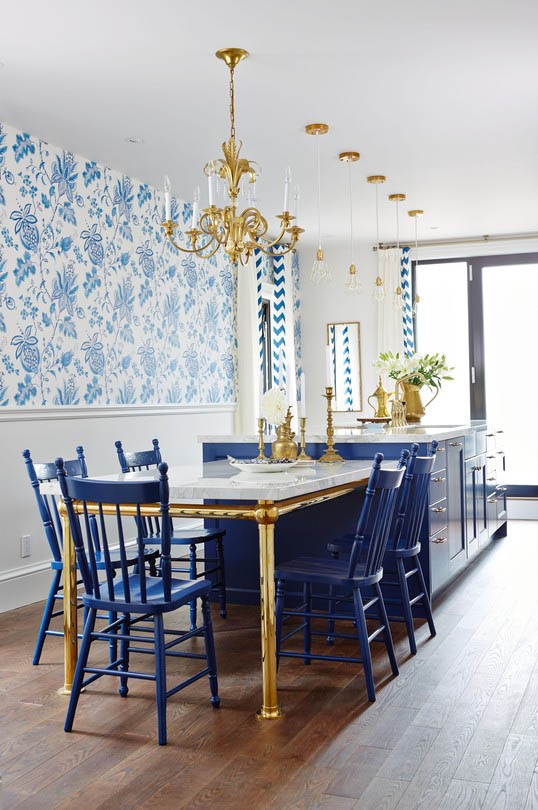
This room is a great example of using a monotone color scheme to any layout or card you create.  See how dark blue the chairs and cabinets are, and how they pop against the white of the lower part of the wall! Then they placed a wallpaper on top that uses a pattern of many different shades of blue.  Use this concept for the project.

PursueYourHappinessColor

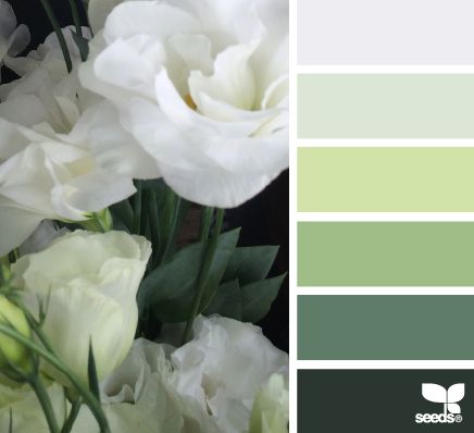
The hues used in this photograph are a great example for you to go by. See how the top color is white. Then they have added different colors of green going from the softest to the very darkest of the hunter green on the bottom of the scale.

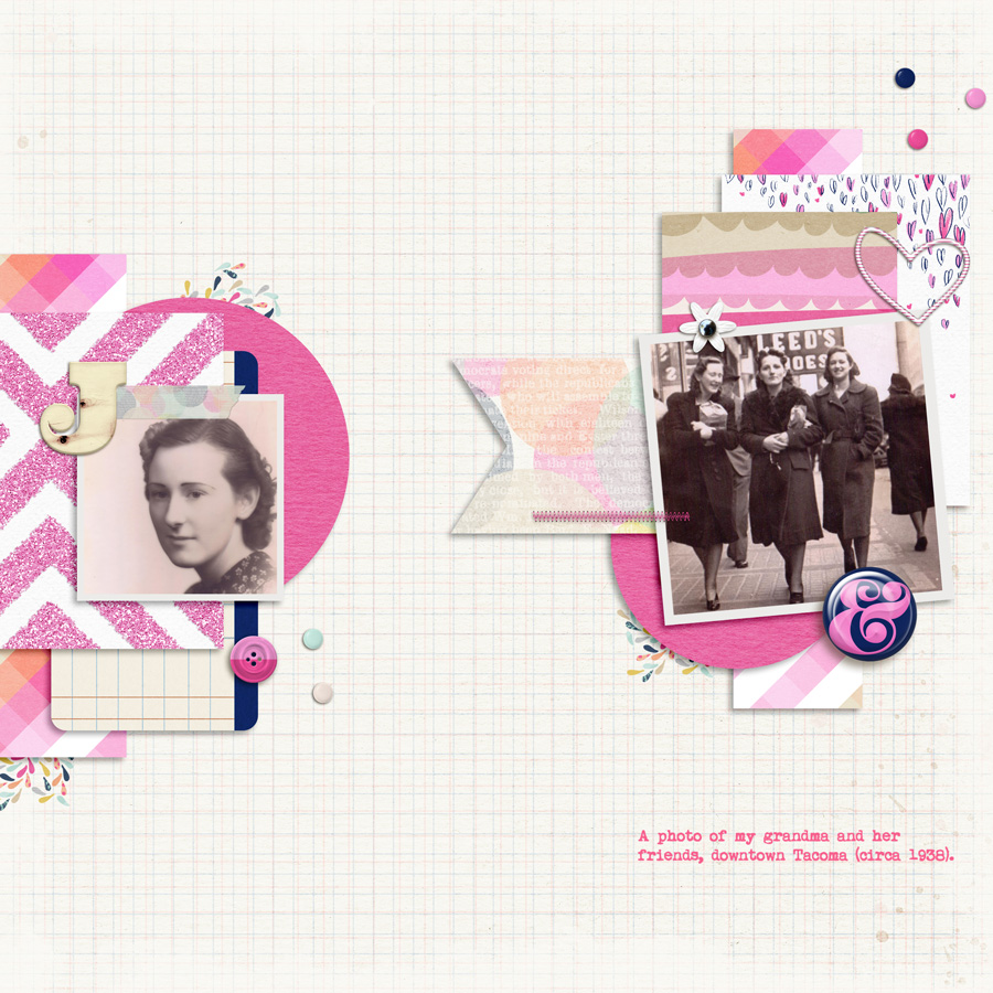
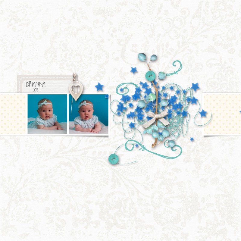
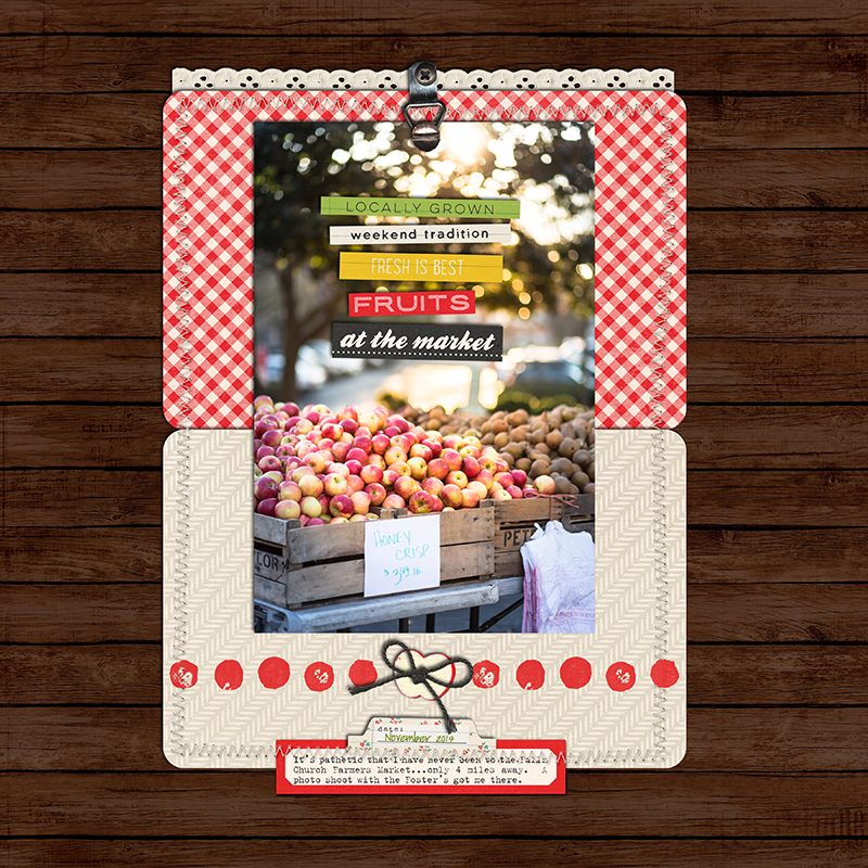
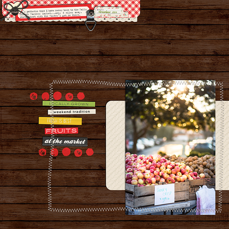
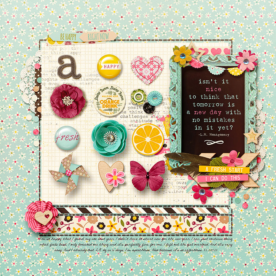
Maybe you are using your photograph as your jumping off point for your color. In my layout I have these photos of my grand niece (isn’t she adorable!) she is wearing blue and the background is also blue.

So for my layout I picked a white background but also used white pattern for my squares of paper too, then used elements ranging from white to a royal blue,  baby blue and decided to add a blue/green tint to make it have more depth.

PursueYourHappinessColor

But sometimes the easiest way to add the color you want to a layout is to just convert your photograph to black and white. Or maybe you want to add color to your layout by using your color with papers, and all white elements. It is all up to you. Just remember for this challenge you need to use a white background and then a monotone color scheme. As long as your colors used on your layout are all within one color family your are good to go, and have fun playing with this design feature. This is a great way to compliment your photographs. And most of the time that is what we should remember. Showcasing our photographs!

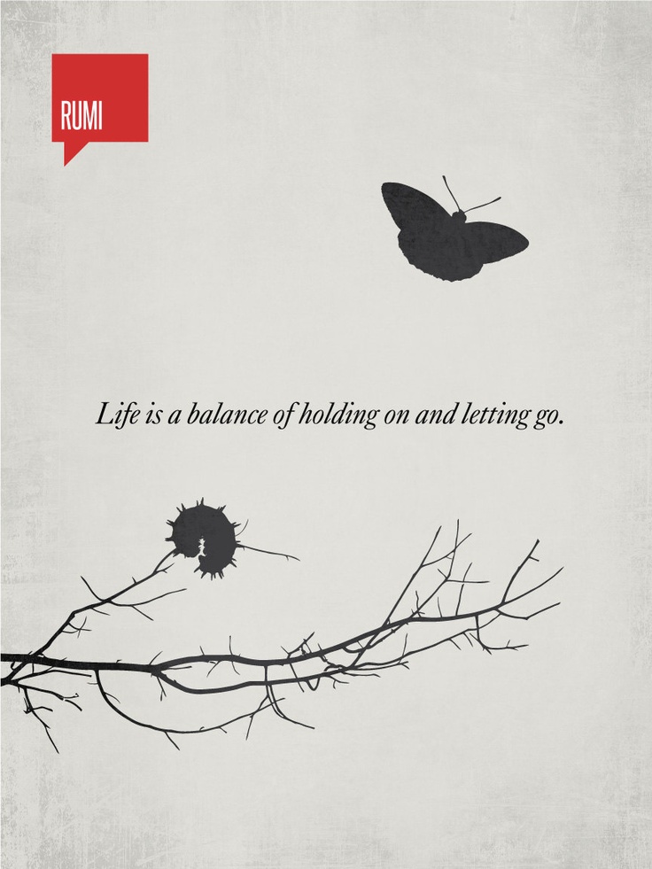
a couple of quotes to ponder:

Expand your vision. Often we have blinders on. We’re concerned with just getting uptown or downtown. If I expand my vision by even 10 degrees, I notice new details, new color harmonies.  by Cindy Coleman

I wonder if any element of interior design is more personal than color? Nothing can more quicly reveal aspect of personality and character than the choice – or absence – of color.

by Van Day Truex
People have often said to me, “But you don’t use much color.” This is not so at all. I build a simple background – usually of white or of a very light shade – for the use of color.

by Michael Taylor

So come and play! You can find the Pursue Your Happiness Color challenge  HERE


Barbara About the Author: I started paper scrapbooking in 2001, then in 2009ish I had an online friend who dared me to give digital a try. Wow! life changing in my busy day of being a stay at home mom to six children. In my free time I also love to visit antique malls for treasures, reading, meeting friends for tea and then my woman’s bible study group is a highlight of my week.


Hybrid Pockets Made Easy

Hybrid Pockets Made Easy

I never loved traditional paper scrapbooking. Mostly for all the same reasons you usually hear about why someone fell in love with digital; no mess, not spending an arm & a leg on supplies or tools, and the speed at which you can finish layouts! After several years of creating strictly digital pages I realized I had nothing to show for it. I had only printed a handful of layouts. I also found that I was only recording the big moments such as birthdays, holidays, and happy events. The snapshots, out-takes, and less than happy moments weren’t included and that was a big problem for me because I wasn’t being authentic in my memory keeping. I knew I had to make a change.

After taking a moment to assess where I was and where I wanted to be I decided that the best thing for me was to start printing at home. I also decided to jump on the pocket scrapbooking bandwagon because it felt like a great fit that would allow me to include pictures that I might not want to devote a whole 12×12 layout to, but were still important parts of my family’s daily real life.

When I set out to create my first hybrid pocket page I spent way too much time trying to get going. I really wasn’t sure where to start, but after a bit of trial & error over the course of several attempts I finally found a workflow that made hybrid easy for me. Today I’m sharing my process for making quick, but beautiful, hybrid pocket pages.

Step 1: Start With Your Layout

I find it’s easiest to create a template which matches the pocket page layout you’ll be using. For my example layout I’m creating for my 6×8” album and the pages are two 4×6” spots on the left and four 3×4” spots on the right. Create the appropriately sized boxes and arrange them in the correct places. These will be your clipping masks for creating your cards.

Hybrid Pockets Made Easy

Step 2: Add pre-made cards or papers & embellish

I like to treat each card as a mini layout. I look through the cards that come with the digital kit I’m using and drag them onto my layout. Sometimes I’ll also fill a space with a patterned paper. Then I look for frames in the kit that will work with the pictures I’m using. Once I’ve laid out where I’ll be putting my pictures I work on embellishing each card with some of the kit’s elements.

Hybrid Pockets Made Easy

Step 3: Add Photos and Text

Now I edit & add my pictures to the cards. Finish things off with some text and I’m almost ready to print.

Hybrid Pockets Made Easy

Step 4: Merge & Print

Once all the individual cards are ready it’s time to merge the layers. I hold down CTRL while clicking on each layer that I used for one of my cards. When they are all selected I hit CTRL+E to merge the selected layers. After I’ve merged all the cards I then create a new document sized to the print dimensions. I almost always print on 4×6” photo paper because it let’s me get away with the least amount of cutting. At this point I select & drag each card into my new document. The 3×4” cards fit 2 to a page nicely. Set your printer settings and print. I go down the layers list hiding the cards as I print them.

Tip: You only need to do the printer settings on the first print job. After that you can choose File>Print One Copy to bypass the print dialogue box!

Hybrid Pockets Made Easy

Step 5: Cut & Put Cards in Pockets

Cut your 2-Up 3×4” cards in half and pop it all into your pockets. All done!

Hybrid Pockets Made Easy
Real Life in Pockets | I Love You Harder by Mommyish and Just Jaimee


Hybrid style scrapbooking can be overwhelming at the start, but the instant gratification of having something tangible in your hands right away makes it well worth the effort in my book! I hope I’ve inspired you to give hybrid and/or pocket scrapbooking a try. I’d love to help you overcome any hurdles to hybrid that you’re facing. Leave a comment if you have a question or comment!


Amber About the Author: Amber Funk enjoys a vast assortment of interests such as scrapbooking, photography, getting crafty with her Silhouette Cameo, reading, and playing video games. She is a Wife and Mother of 2 living in Northern California and blogs her crafty adventures at http://perfectly-fabulous.com/

Pursue a Balance

2_20blogheader

Hi, I’m JennV and I’m excited to be here to talk about what many argue is the first principle of design….balance.  I’ve been scrapping for 10 years and I never tire of designing a page.  I’m one that will turn my layers on and off in photoshop a hundred times with my finished file using only half of the layers that are buried in there.  I will play with this design, then that design, add this flower, balance it out with a word strip on the other side.  When I design a page, there is nothing more important to me than the balance of it or in some cases, the lack of balance!!  This quote from Matisse sums up my thoughts perfectly….

cc17f70b8296fad8c857a782c9b9b0d4

Technically speaking, balance is the equal distribution of visual weight around a midline axis/point.  As humans, we like to see what is called bilateral symmetry.  This is essentially the repeating of the reverse of a design on the opposite side of the axis/point, in essence, each side becomes a mirror image of the other.  This balance is considered formal, ordered, stable and quiet…but can also be boring.

To show this design principal in action, I designed a layout for each balance type using the same kit with the exact same elements for each layout.  Here is my layout showing symmetry.  I used At The Farmer’s Market by Mari Koegelenberg and Sugarplum Paperie.  All the elements and papers are distributed down the vertical axis so that each side is a relative mirror image of the other side.

Print

While symmetry achieves balance through repetition, asymmetry achieves balance through contrast. Asymmetrical, or informal balance, involves different elements that have equal visual weight. Many things can influence visual weight, such as position.  The further an element is from the center, the “heavier” it feels.  So you can balance a large center object with a smaller object on the edge.  Some other factors that will influence visual weight we intuitively know…a larger element and/or element with an intense color feels “heavier” in a design.  The more complex a shape, the heavier it will feel.  A diagonal orientation carries more visual weight than a horizontal or vertical one.  Finally, multiple smaller objects can balance a larger one.  Asymmetrical balance is considered more casual, interesting and dynamic than symmetrical balance, but it can also be harder to pull off.

Here you can see an example of asymmetrical balance.  I balanced the heavy photo with a bold colored paper strip at the top of the layout.  I framed the word strips with the painted dots and added in the lighter colored background behind the photo to draw your eye to the photo.

Print

Finally, we have the last balance design …and it is breakdown of balance…the end of all things sweet and good….it’s called Discordant balance!!

Discordant is defined as disagreeable, at variance, conflicting, clashing, jarring, grating….essentially it doesn’t sound good!!!

However in terms of design, a discordant balanced design can suggest movement or flow.  It can be used to make a statement or just catch someone’s eye.

Here is an example of a a discordant layout.  Again, I used the same elements as in the previous two layouts.

Print

Whether we like it or not, there is a balance in everything we do.  We hear about work/life balance ad nauseum. We eat good foods and exercise, but might balance that out with an occasional trip to Krispy Kreme!!! Study, study, study for that Algebra test and then watch Amazing Race the next night. We scrap all day and night and feed our kids cereal for dinner as we try and finish the “last” layout…..wait, that would be an example of no balance….LOL!!!

Too much of one thing never works. Whatever your design preference for balance, it is important to try new things and switch it up every now and then.   I’ll leave you with one of my favorite quotes on the matter of life and balance…….

life-is-a-balance-of-holding-on-and-letting-go-3


JennV About the Author:  JennV is a lover of history and art (luckily she lives 5 miles outside of Washington, DC) and an accountant by training.  She currently stays home with her two boys and is pursuing a career in photography, when she is not busy volunteering for every school and county initiative!!

Pursue Health And Fitness

Pursue Health and Fitness


Hi there!  Kacy here with a post about the pursuit of health and fitness (and documenting it, of course!).

I work out every day and try to watch my weight.  Some of that is definitely vanity, but I’m also approaching 40 years old, battling some chronic health problems (underactive thyroid, endometriosis), long days sitting at work, and an absolutely insatiable love of junk food.    I have included pictures from the gym and some of my hiking adventures in my project life album, but have never really documented a workout, a health problem, or even what I love to eat aside from an occasional layout about cupcakes.

MMMMMMM, cupcakes!

Um… where was I?  Oh – a layout with only photos of food or pictures of my feet on a treadmill doesn’t really appeal to me.  This got me thinking about other ways to scrapbook my workouts and the various health challenges I’m dealing with.

FITNESS

When I’m out hiking, I usually turn on the GPS on my phone and use the My Tracks Google app to track my workout.  I’m an engineer and I love numbers and graphs, so I like the visual representations of the data collected during my workout.  I also figure it might come in handy if I ever get lost.  How about using some screenshots from the app to go along with some photos of my hike?

Fitness

Supplies Used:  Days of the Week Saturday and Days of the Week Friday  by Mari Koegelenberg and Sugarplum Paperie

Phone or computer screenshots from Runkeeper, MyFitnessPal or even your Fitbit might help you tell a more complete story.  If you don’t use any of these apps or websites, try including a Google map of your latest adventure in one of your layouts.  What other ways can you think of to document your pursuit of fitness?

DIET

What do you eat?  What do you like to eat?  There could be two very different answers here!  😉  Since my diet is mostly devoid of any nutritional value, I borrowed this layout from fellow CT member Alina to talk about her Way of Eating (or WOE, which is how most of us feel when watching what we eat).  I thought it was great that there were no food photos in the layout – or am I the only person who can’t get the pretty food blogger-type photos to turn out?

Diet

Supplies Used:  A Fresh Start by Zoe Pearn and Digital Scrapbook Ingredients

Another great idea I’ve seen is a copy of the recipe in the layout, having someone take a few photos of you while you cook something special, or even getting the kids involved.  What other ways can you think of to document your “WOE”?

MOTIVATION

You can tell a lot about a person by what is on their IPod.  Mine has more Britney Spears than I like to admit and much more gangster rap from the 1990’s than you’d think! I think a good playlist is a fantastic way to keep yourself motivated at the gym and to distract you during a long and boring run on the treadmill.  What’s on yours?

Playlist

Supplies Used:  Spin the Record by Amanda Yi Designs and Two Tiny Turtles

If music doesn’t float your boat, maybe you are motivated to reduce your cholesterol, or by a pair of pants you want to wear, or an upcoming reunion/wedding/trip.  What is your motivation?

HEALTH

As scrapbookers, we sometimes gloss over the things that aren’t going particularly well or make us unhappy.  I am totally guilty of this – if you only knew my from my scrapbook layouts (especially the ones posted online), you would think I’m an active, happy, energetic, organized woman who lives with a cute cat.  If you actually know me, you are now rolling on the ground and laughing. 😀

I thought it might be interesting to look back in a few years and see the crazy that is my daily medication schedule.  Every day I take my thyroid meds, vitamin D, an antidepressant, probiotics, magnesium, more thyroid meds in the afternoon, birth control pills, multivitamin, L-tryptophan, melatonin, and a Benadryl allergy tablet.  These are all scheduled around what time I ate or the last pill I had to take.  It’s beyond irritating, but I have to keep on top of it to function “normally”, so I suck it up and get on with it.

Schedule

Supplies Used:  A Fresh Start by Zoe Pearn and Digital Scrapbook Ingredients

I think it might be interesting to include copies of blood work results or my doctor’s notes after an appointment.  What other ways can you think of to document some of the health issues you are dealing with?

I hope this post has given you some ideas to work with.  Wishing you good health and happy scrapping!

KacyAbout the Author:  Kacy is an Environmental Engineer living in Arizona with a elderly, cranky, pudgy, but insanely cute calico kitty.  She enjoys scrapbooking, crocheting, dancing awkwardly to electronic dance music, Grumpy Cat, Scottish accents, drag queens, cupcakes, bacon,  Stephen King books, smirking, very crude inside jokes, and men in kilts.

Pursue The Perfect Shadow – The Zen of Shadowing

Pursue The Perfect Shadow

I think that most of us seasoned scrappers went through phases with shadowing on a page. I remember my first pages, where I simply skipped the shadowing. I maybe just didn’t know that there was a shadowing feature and most probably I was ignorant that shadows would make a difference. After a while I found the shadows feature but just didn’t know how to use it properly and in review these pages don’t look much less awkward than my first attempts. After a while of shadow dabbling I found shadow styles and gosh, they made my scrapping life so much easier and rewarding. In this tutorial I will show you one technique to go even further and bring you closer to your Zen of Shadowing.


As much as anything in art, shadowing styles are a matter of taste. I personally like my shadows to be noticeable and giving depth to the page. I love it when I achieve a close-to-paper look. It’s still a hit and miss and I’m working, tweaking, changing my ways constantly to try something new and „better“ in this realm.


Pursue The Perfect Shadow or The Zen Of Shadowing - Smudging
Every item’s shadow on this layout has been smudged. Look at the paper’s edges, the photos and the tassels.


My latest obsession is „smudging“ the shadow. To do this, you have to be able to put your software-generated shadow on it’s own layer. I do this in photoshop cs6 by 1. right-clicking on the fx icon of the layer and 2. clicking „create layers“. If you can’t do that, you can always separate the shadow manually. Look up google for „Putting a Drop Shadow on Separate Layer„ for your graphic software.


Pursue The Perfect Shadow - The Zen Of Shadowing - Smudging
How to put your shadow on a separate layer in PS CS6

Before you can separate a shadow, you surely have to apply one. It’s up to you how you do that. I use shadow styles all the time and sometimes tweak them before separating, sometimes I do it afterwards.

So with your shadow separated, you 1. click on the new shadow layer 2. click on the smugde tool, which is housed with the blur and sharpen tool. 3. Select a big round brush with about 20% hardness. The size of the brush depends on the size of the item your shadow belongs to. I usually go with a 825 px brush for the most items and adjust for very big or small items. 4. Look closely which part of the shadow you want to smudge. Put the middle of your brush to that part and pull a tiny bit into the direction where the light falls (away from the virtual light source).

Pursue The Perfect Shadow - The Zen Of Shadowing - Smudging
How to smugde a shadow

All the settings are just a suggestion and you may want to play around with this feature to get acquainted and make it your friend. The tool is not always easy to handle and especially when your software is going slow anyway, you may have some terrible fun waiting for your machine to calculate your move.

On a more detailed note (I love details!) some things I consider when working with shadows:

1. What is your global light doing? When the virtual lightsource is on the upper right corner, it usually makes no sense to stretch the shadow into that direction. Follow the path away from the light to stretch your shadow and create depth by applying the shadow how it would fall in a natural setting. If in doubt, go to a window, place a paper somewhere, crunch the paper a little and see how the shadow is falling when you turn the paper. It’s a great exercise for any visual artist.

2. Are there elements grounding your item? I personally don’t like it (blame it on my mild scrap ocd) when my shadow is spread where it naturally wouldn’t be spread. I smudge the shadow more to the inside of the item in these cases. Also the parts that are close to the grounding elements can’t be as far away from the background in my imagination.

3. Is the shadow strong or weak enough? As stated above, I like my shadows stronger, so most of the time I adjust the fill up to achieve a deeper tone. For more distance between item and background I might lighten the fill a little.

4. Smudge several times on one item if you want. As you see in the layout, I smudged the shadow of the photo several times. It still goes with the direction of the light, though. This makes the photo pop out of the spread even more.

Pursue The Perfect Shadow - The Zen Of Shadowing - Smudging
Details for smudging.

Let’s try this! It’s easier than it looks and it can make a huge difference on your page!

Happy smudging!

PS: I use ctrl z all the time when smudging (or using any other feature…)


AlinaAbout the Author: Alina enjoys sitting in front of her large computer screens too much. Apart from that she loves walking her dog and watching sunsets while being amazed of life in general. She is married to her best friend. Tries to manage the needs of her two cats and her dog and badly fails when they all want their cuddle time at once. Everything else is scrapping, taking photos and currently crafting. Having said that, she needs a bigger craft room.


Pursue History

Pursue History

Hi everyone! I am so excited to be here with you today to talk about one of my favorite subjects – scrapbooking family history! A heritage/family history scrapbook album is wonderful way to document your family’s history and create a lasting gift for future generations. Some people find scrapbooking family history to be a challenge so I thought I’d help out a bit by offering a few different ways to document your family history in your scrapbook pages.


One of my biggest tips regarding family history scrapbooking is to just get started. It’s easy to be overwhelmed with the photos and memorabilia from the past and wanting to be sure each and every page is perfect. I have found that just jumping in is one of the best strategies for getting the pages done – find a photo or a story that you really want to document and JUST DO IT! It’s often a good idea to start simple – using neutrals and muted tones which are more traditional colors for historical photos. Trying to focus on keeping it simple can help you get started. Neutrals and traditional motifs can help you create beautiful but fairly easy pages that don’t require a lot of fuss! Here are a few examples of pages using ‘traditional’ heritage supplies to create beautiful pages for your family history scrapbooks!


Layout by farrahjobling
Layout by Stacia


One of the things that I often hear people say about heritage scrapping is that they don’t scrapbook family history because they do not have photos about the events of their family’s past. Although I certainly understand the trepidation that comes from not having photos, I have a few suggestions about how to document those events and experiences from the past  despite not having photos with which to base a scrapbook page! My first suggestion is to think outside of the box and scrapbook a page that tells the story of the major historical events have impacted your family. One example of this technique, is a page I created about the fact that my maternal grandfather was stationed at Pearl Harbor when it was bombed by the Japanese and how that experience affected him and his family. It was a difficult page to create because it outlines some very personal and difficult experiences but I love that it tells the story of our family within the larger context of the world around them. I didn’t have any photos of my grandfather at Pearl Harbor so I googled photos of the Pearl Harbor bombing and found this photo which was perfect for the theme of my page! Don’t be afraid to search for relevant photos online that might capture the themes of your page!


Pearl Harbor
Layout by Amy Melniczenko (anrobe)

Other ideas for scrapping family history pages when you don’t have photos include the following –

  1. Document pop culture of the past
  2. Tell stories from the past and use scrapbooking supplies on the page that will reinforce the theme of the story you are telling! One of the main things future generations will be interested in is the stories you have to tell so be sure to document them regardless of whether or not you have pictures that go with those stories.
  3. If you have memorabilia from the past, you can always use that in lieu of a photo to tell a story.
  4. Do you have any furniture, glassware or art that you’ve inherited from a family member? If so, take photos of all of those precious ‘things’ so that you can tell future generations about the things from the past.
  5. If your family has certain family recipes or foods that are significant, be sure to document those in your scrapbooks. You can make the dish and use a photo from today to document those recipes or you can do a photo-less page that outlines the recipe and why it’s significant to your family’s heritage.

Another thing that I have often heard people say they struggle with in scrapbooking the past is that they prefer using modern supplies (vibrant and bold, for example) which we don’t tend to see used with older photos. I love to use more current kits and supplies on my heritage layouts – so I definitey recommend you give it a try! No one said that older photos had to be neutral and muted! Add some color and use more modern motifs to add that extra something to your pages! Here are a few examples that might help inspire you to use more modern supplies and motifs on your family history photos!


Layout by AlinaLove
Scrapsandsass
Layout by Scrapsandsass
LegendaryLove_900
Layout by Amy Melniczenko (anrobe)


I really hope these suggestions and ideas are helpful to you and allow you to begin to document your family’s history! Don’t forget that  there are no rules for scrapping the past – it’s your scrapbook & you should create pages that resonate with you!

So, now it’s your turn! I would love to see what you can do to pursue history by using one of these suggestions to create a family history page.  I’m hosting a challenge over on the forums and I hope you will come play along!  Check it out at The Drawing Board: Challenges.

Amy
About the Author: Amy lives in Reston, VA with her husband of 13 years and their 9 year old boy/girl twins. Their 18 year old daughter is in the midst of  her second year at West Virginia University!  Amy has been scrapbooking since the early 1990s but discovered digital scrapbooking in 2005 when her twins were born and has primarily scrapped digitally since that time. She is passionate about telling her family’s stories and documenting their life together! Amy is a huge reader (mostly literary fiction) and is a pop culture junkie! She also LOVES all things beauty & makeup!