Listen to Your Children

Listen to Your Kids


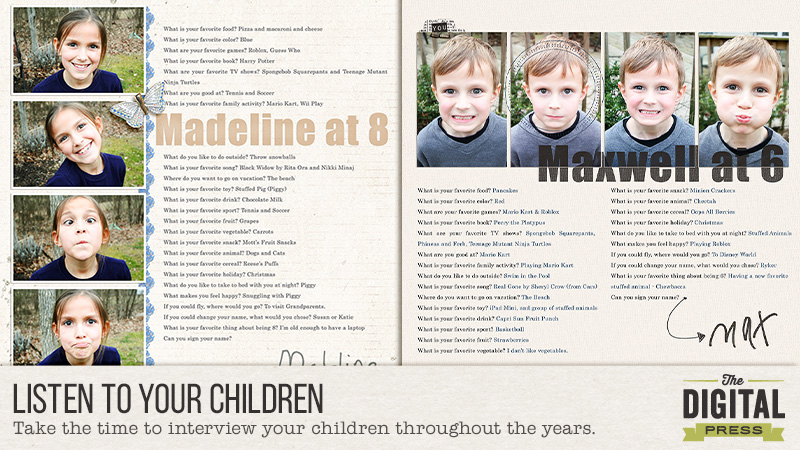
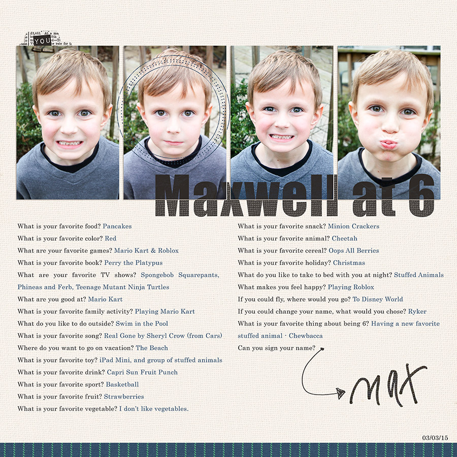
Kids say the cutest things. They also change their minds very quickly regarding things that they like in their lives. In the past I have scrapped interviews I have given my children and love to look back on those and read all about what was important to them at those times in their lives.


5 Favorites at 5


Favorites at 3


The above are just a couple of examples of such interview pages. My how things have changed with my kiddos, while some have stayed the same.


This is not just limited to kids. Why not interview your spouse or another family member and capture a moment in time with them? I have, in the past, done just this thing and scrapped a conversation I had with my husband regarding his perspective on how we met. I love it!


So, what can you ask? Of course, there are the basics – colors, foods, books, toys, etc. You may choose to use the same questions year after year or the limit the questions as I have above to the number that corresponds with their age. There is no specific way this must be done – you are limited only by your information.


Recently, I decided I was going to start asking more questions of my children. I have also decided that I am going to stick with these same questions going forward because I feel like it covers most everything. The fact is, as long as I am capturing these little looks into their lives, I am accomplishing something amazing.


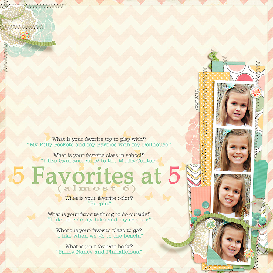
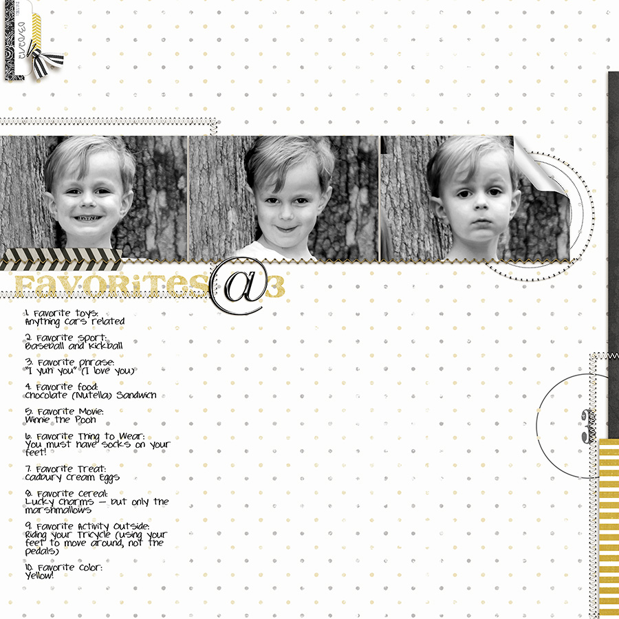
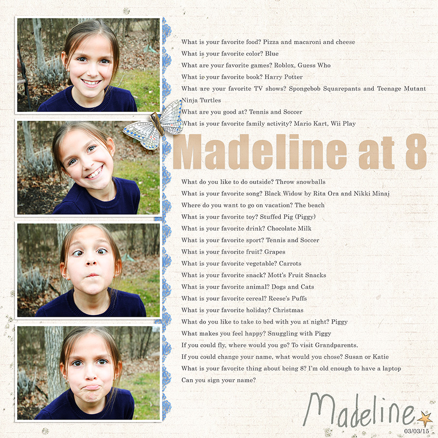
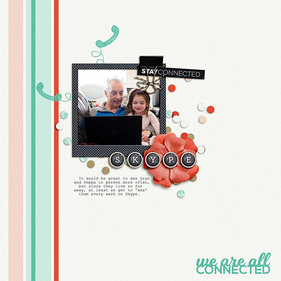
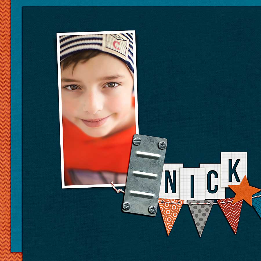
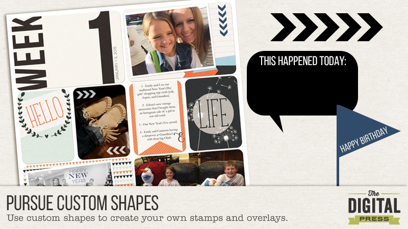
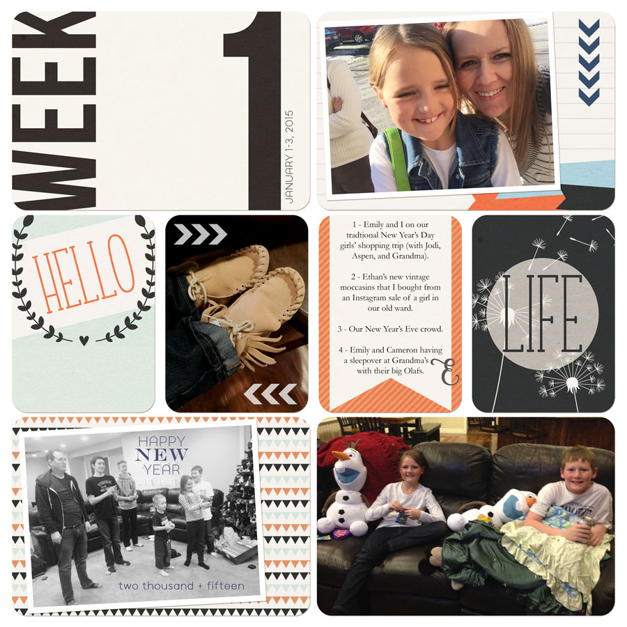
Here are recent pages where I did this.


Maxwell at 6

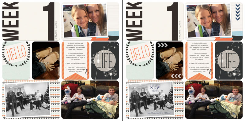
Materials used: All Boy Kit by Dawn by Design


Madeline at 8

Materials used: Pretend Kit by Creashens 


What are you waiting for? Go out there and start interviewing people and documenting it. In fact, if you join us in the forum, we have a challenge all about this. You can find it here: March 4: Listen to Your Children


About the Author: Rachel Alles is on the Creative Team here at The Digital Press.  She is fortunate to share her life with her loving husband, Doug, and two blessings: Madeline and Maxwell.  The three of them are her main source of inspiration for her pocket and traditional style pages.  When she’s not scrapping, she enjoys anything Disney related, learning more about photography (and attempting to turn the dial off Auto) and dabbling in home decor projects.

Listen to your Inner Artist

blog_header


It is good to occasionally step out of your comfort zone and do something different on your layouts, right? Today, I’m going to show you how you can easily turn a photo into a pencil sketch in Photoshop and an idea on how to use the finished sketch on a layout.

First, open the photo you want to work with – mine is my favorite selfie (it was a fantastic hair day!). Then, duplicate the photo into a new layer. I like to use Ctrl-J (cmd-J on a Mac).

2

Change the blending mode for the duplicated layer to Color Dodge.

Blending Mode

Your photo will look a bit washed out, like this:

4

With the duplicated layer still selected in the Layers panel, we want to invert the image (Ctrl/cmd-I). Your photo will now look really strange.

5

We are now going to blur the layer, which produces the pencil lines. Using Gaussian Blur (from the top menu choose Filter, Blur, then Gaussian Blur). Play with the blur settings a bit until the fake pencil lines on your photo look the way you want. I used a setting of 37.4, but your results may vary widely.

6

Now, we need to convert the layer to black and white. In the layers panel, choose the half-filled/half empty circle icon at the bottom (Create new fill or adjustment layer) and choose Hue/Saturation. In the panel, turn the saturation down to -100.

7

Your photo will now look similar to this:

8

I think this might look good as a drawn-in background on a layout. I flattened the image and copied it over to my background paper (lighter-colored and plain backgrounds seem to work best).  I used a gradient fill as a clipping mask behind my photo, and then the eraser tool (brush mode, 5% flow) to blend the edges on the clipped layer to get the photo to blend into the background seamlessly. I use a low flow on the eraser brush because it’s harder to mess it up when you are only erasing 5% for each brush pass.  😉

9

10

My photo, blended into the background, looks like this:

11

I added some journaling and embellishments, and I’m done!

Almost 39

Credits:
A Day in the Life:  Solids
by Sugarplum Paperie
A Day in the Life:  Essentials by Sugarplum Paperie
Hello, I Love You by The Digital Press Designers

Kacy About the Author:  Kacy is an Environmental Engineer living in Arizona with a elderly, cranky, pudgy, but insanely cute calico kitty.  She enjoys scrapbooking, crocheting, dancing awkwardly to electronic dance music, Grumpy Cat, Scottish accents, drag queens, cupcakes, bacon,  Stephen King books, smirking, very crude inside jokes, and men in kilts.

Listen to someone’s story and get connected

I recently completed a family history project and had so many letters that ancestors had written and family members have kept. I started to think about how many letters I’ve actually written in the last year and the answer is ZERO!  The days of writing long letters to send to loved ones on the other side of the world are long gone and have been replaced with emails, texts and quick chats.  It’s important to stay connected, to listen to the stories of those we care about, no matter how we do it.  I may not write pages of handwritten text, but I’m great at sending off quick emails, texts and Facebook messages.

My husband’s family is spread all over the world and it’s the best feeling to be able to Skype with them. We also have friends from coast to coast on every continent.  Skype offers so much more than just a telephone call or a written piece. To actually be able to see our friends and family in real time gives us the feeling that they aren’t so far away after all.

This month’s Shop Collaboration is themed towards listening to our loved ones and staying connected. The challenge is to make a new layout using the March Shop Collab- Get Connected. The full kit is on sale until March 4 for $4, and don’t forget to hop on over to our Facebook page for a sample.

get-connected-4


facebook-sampler-ad

Now, for the rules…

  1. Pages must be created using 100% TDP Products and loaded in the gallery no later than midnight EST on March 31st, 2015.
  2. Please link your gallery listing in this challenge’s thread
  3. Link your comment in this thread in the monthly challenge tracker thread. You can find it here: March Tracking Thread
  4. Have fun!!!

Here is my LO of Mike and Claire on Skype with Mike’s family in England.

03.01.15-connected

FarrahAbout the Author:  Farrah Jobling is a member of the Creative Team here at The Digital Press.  She lives in Denver with her amazing family, Mike, Nicholas (8), Claire (5) and Hope (7 mo puppy).  She works from home as a photographer and enjoys scrapping her personal photos.

Listen to Your Creative Voice this March

Welcome to March. Spring is on the horizon now! The thought of spring always makes me feel more alive…

Our word for this month is “listen,” one little word that can mean so many things…

listen to your creative voice :: the digital press

via Pinterest: (1) (2) (3) (4) (5)

We have gathered even more inspiration for you here on Pinterest: Listen to Your Creative Voice

Here at The Digital Press, we are going to be talking about listening to your own creative voice and listening to the stories of those around you. We are story-tellers and memory-keepers… as scrapbookers, we are listeners. But don’t be afraid to shake off your fears as you create the types of pages that make YOU happy. Make sure that you are always following your own creative voice and staying true to your heart as well.

We have some amazing and inspirational posts coming your way right here on the blog. You will also find new challenges on the forums to spark your creativity and help you to make pages you really love!

You’ll find all the details of our challenge system laid out for you here: Everything You Need to Know about Challenges

Our new month of challenges starts tomorrow. We hope you’ll join us then!


Nicole About the Author: Nicole Seitler is a designer here at The Digital Press, creating kits under the name Sugarplum Paperie. In her free time, she loves to to work on her Project Life album, knit or craft with her kids. But she doesn’t have much free time, since she’s also a stay-at-home homeschoolin’ momma of four. Her life may be a little crazy, but she wouldn’t want it any other way!

Pursue your subject: 10 photography composition rules

Pursue your subject: 10 photography composition rules


Have you been drawn to a piece of art and wondered what is it about that particular piece that you love over any other? There are lots of reasons why you might be attracted, but the most likely reason is in the subconscious. Sometimes you’re drawn in by things you can’t quite put your finger on. It’s all about composition!

In photography, it’s not just what you shoot that counts – the way that you shoot it is also important. Poor photo composition can make a beautiful subject look boring, but with a little thought, you can create a wonderful image from the most ordinary of situations. Don’t feel that you’ve got to remember every rule and apply them to every photo you take. Instead, spend a little time getting familiar with each one one of them individually and they’ll become second nature. You’ll soon learn to spot situations where the different rules can be applied to the best effect.

Here are the top rules of composition to think about:

  1. Rule of Thirds – probably the most common rule you’ll hear about from photographers. Imagine that your image is divided into nine equal segments by two vertical and two horizontal lines. Try to position the most important elements in your scene along these lines, at the points where the imaginary lines intersect. This will add balance and interest.
  1. Balance – Placing your main subject off-center, as with the Rule of Thirds, creates a more interesting composition, but it can leave a void in the scene, which can make it feel empty. Try to balance the weight of your subject by including another object of lesser importance in the empty space.
  1. Leading Lines – When we look at a photo, our eye is naturally drawn along lines. By thinking about how you place lines in your composition, you can affect the way the viewer sees the image, pulling them into the scene and towards the subject. This gives the viewer a virtual journey through the scene.
  1. Viewpoint – The viewpoint has a tremendous impact on the composition of a photo. As a result it can greatly affect the message that the photo conveys. Rather than just shooting from eye level, consider shooting from high above, down low, from one side or the other, from afar, or close up.
  1. Background – The eye is great at distinguishing between different elements in a scene, but a camera will naturally flatten the image into a two-dimensional image. Pay attention to what is in the background, and try shooting at a wider aperture to add dimension to the scene.
  1. Symmetry and Pattern – We are surrounded by symmetry and patterns, both in nature and man-made. They can make for very eye-catching compositions, particularly in situations where they are not expected. Another great idea is to break up the symmetry or pattern with your subject to create tension or a focal point in the scene.
  1. Depth – Depth can be created in a photo by including objects in the foreground, middle ground, and background. Another way to create depth is by overlapping or deliberately obscure part of an object, in focus, or out of focus. Either way, the viewer will naturally recognize an overlap and mentally separate the layers, creating more depth.
  1. Framing – Sometimes, we all need a boundary. By using natural frames, such as trees, archways, or holes, you can isolate your subject and focus the main point of interest.
  1. Cropping – The crop of your photo can greatly change the mood of your overall image. An image at full crop can give the viewer a sense of the whole scene, while cropping in tight will result in the undivided attention on the subject. Don’t be afraid to fill the frame with your subject.
  1. Breaking the rules through experimentation – now that you know the rules, you can practice each of them and find situations in which each will work the best. You can also experiment and try new things. Try combining them, making your own, or throwing them all out of the window! It’s really about personal preference and having fun!

Here are a few examples of the rules above:

Rule of Thirds
Rule of Thirds
framing
framing
balance
balance


The challenge is to make a new layout using a photo that follows one of the first NINE composition rules above

Now, for the rules…

  1. Pages must be created using 100% TDP Products and loaded in the gallery no later than midnight EST on February 28, 2015.
  2. Please link your gallery listing in this thread: CHALLENGE
  3. Link your comment in this thread in the monthly challenge tracker thread. You can find it here: February’s Tracking Thread.
  4. Have fun!!!

For my LO, I’ve decided to go with “fill the frame” I LOVE close-ups of my kids’ eyes and this one is no exception.  I used Scotty Girl’s All Geared Up kit.

Nick

FarrahAbout the Author:  Farrah Jobling is a member of the Creative Team here at The Digital Press.  She lives in Denver with her amazing family, Mike, Nicholas (8), Claire (5) and Hope (7 mo puppy).  She works from home as a photographer and enjoys scrapping her personal photos.

Pursue Custom Shapes

11

I love to use brushes/stamps on my photos, just to give them that little bit of extra. I love it when these are included in kits, but even when they’re not, it’s super easy to create your own using fun fonts and the custom shapes tool.

Take a look at the two pages below. They are the same page, but the first one doesn’t have the little extras I created using shapes and fonts. On the second page, I added a little, chevron arrow pattern (repeated a few times) and some custom text.

Cards from Project Weekly and The Simple Life by Amanda Yi Designs

Here’s a quick tutorial on how to use custom shapes to make your own stamps to use on your own photos.

  1. Create a blank document. I usually use a 4×6 or 3×4 document, since those are typically the size of the “pockets” I use for my scrapbooking.
  2. Over on the tool bar, click on the corner of the shapes tool to bring out the flyout menu, and click on the one that says “custom shapes tool.”

1

  1. The shape options will show up on your top toolbar. If all the shapes aren’t showing up, you can click on the little tool icon to bring up this menu. I like all of my shapes to be showing, so I select “ALL”.

2

  1. For the page above, I chose to use this cute, little chevron-shaped arrow. Click and drag on your page to draw the shape. If you hold down shift at the same time, it will keep the same proportions (which matters for some shapes and doesn’t for others).

3

  1. For this one, I duplicated the arrow so I had five copies of it. Here’s one of my favorite tricks. Select all 5 arrows, and make sure your move tool is selected. Then, push the icon at the top that says “distribute horizontal centers” when you hover over it. It makes your arrows evenly spaced!

4

5

  1. At this point, I like to merge the shapes together. To do this, select all the arrows, right-click, and select “Merge Layers”. I also like to rasterize the shape (right-click and select “Rasterize Layer”). Now, you can drag the arrows over to your layout and use them however you want.

6

  1. For the top right pocket on this page, I rotated the arrows, made them smaller, and changed them to a blue color that matched my layout. I felt like I needed something next to the picture on the card, so I put the arrows there. I duplicated the arrows for the moccasin pic, but I decided that five arrows was too many, so I used the lasso tool to select two of the arrows, and deleted them. I also changed them to white for that pic and lowered the opacity to about 75%.

7

  1. The final step I took for this page was to add text to the bottom left pic. I had converted that photo to black and white, and I felt like it needed a little more. I just added some text boxes directly on top of the picture. Sometimes I will lower the opacity, or change the blending mode, but for this one I just changed the text to the same color as the top arrows. I liked it, so I left it that way.

Here is the final layout:

Cards from Project Weekly and The Simply Life by Amanda Yi Designs
Cards from Project Weekly and The Simple Life by Amanda Yi Design

There are so many fun shapes to play around with, so the next time you think your photo or page needs a little something extra, check them out! Here are a few more of my favorites:

8

JaimeAbout the Author: Jaime is a member of the creative team here at The Digital Press. She is a stay-at-home mom to 4 boys and 1 girl. When she’s not chauffeuring, volunteering at school, or helping with play costumes, she likes to digitally record her family’s memories, improve her photography skills, and read (there’s always a stack of books on her nightstand).