Last week, Eva Mendes, the actress, made an off-the-cuff remark about how sweat pants were responsible for most of the divorces in the United States. She was joking of course, but a lot of people got riled up about her statement. About the idea that someone can’t wear what they want in their homes, or in their relationships. How it sounded superficial and silly. There were a lot of women annoyed by flippant advice given by someone who makes their money being beautiful and has more resources than most women would know what to do with. And while I think that it is a comment that didn’t quite deserve the amount of attention it received, there are some words of wisdom lurking around in her response. Whether or not you would choose to listen to them… that is another story.
There are always people willing to dole out “good advice” for any type of situation. My 95-year old grandmother is notorious for giving me marital advice that generally sounds like it is 40 years past its prime. I’m sure my grandma would completely agree with Eva Mendes about the idea that you shouldn’t “let yourself go” with your significant other. There are times my grandma pops off with a piece of advice, and my instant reaction is to bristle or reject it out of hand as being old-school or not with the times. I tend to think that she doesn’t understand how things work in the 21st century. But when I really stop to think about it, there are some good messages in what she has to say, even if it seems completely outdated. Do I choose to listen to her words of wisdom? Usually. I listen to the deeper message, subtracting the old-fashioned imagery, and then I see how it applies to my life now.
In the online world we’ve all grown accustomed to, we see/hear so many different opinions all day every day. It can be overwhelming. So my little piece of advice? Don’t let it get to you. Take what is useful to you, and let the rest of it go. Even in the scrapbook world, we can end up feeling like we aren’t doing everything “perfectly” when we read about how someone has the perfect formula for catching up on Project Life, an amazing process for dropshadows, killer tips on how to shoot *the best* photos of your kids, or a must-follow workflow in Lightroom. We can spend so much time trying to follow the advice of other scrappers, we might lose sight of what we originally set out to do… capture and preserve our memories and stories (and/or create artistic expressions of them).
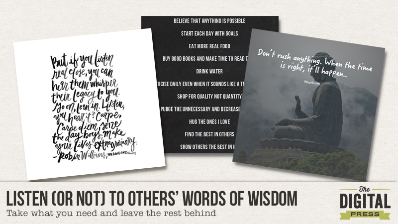
Here are some bits of advice/wisdom that I’ve been mulling over lately.
See? So much advice and/or wisdom. And none of it has specifically to do with scrapbooking (haha). But seriously, make it easy for yourself. When faced with advice or words of wisdom, listen with an open mind and filter out what isn’t practical for you and your life. Take in bits of wisdom where you find them, and let the rest of it go. Wear sweat pants or not, but focus on what is really important in your relationships and your craft. Be present and focus on what matters to you.
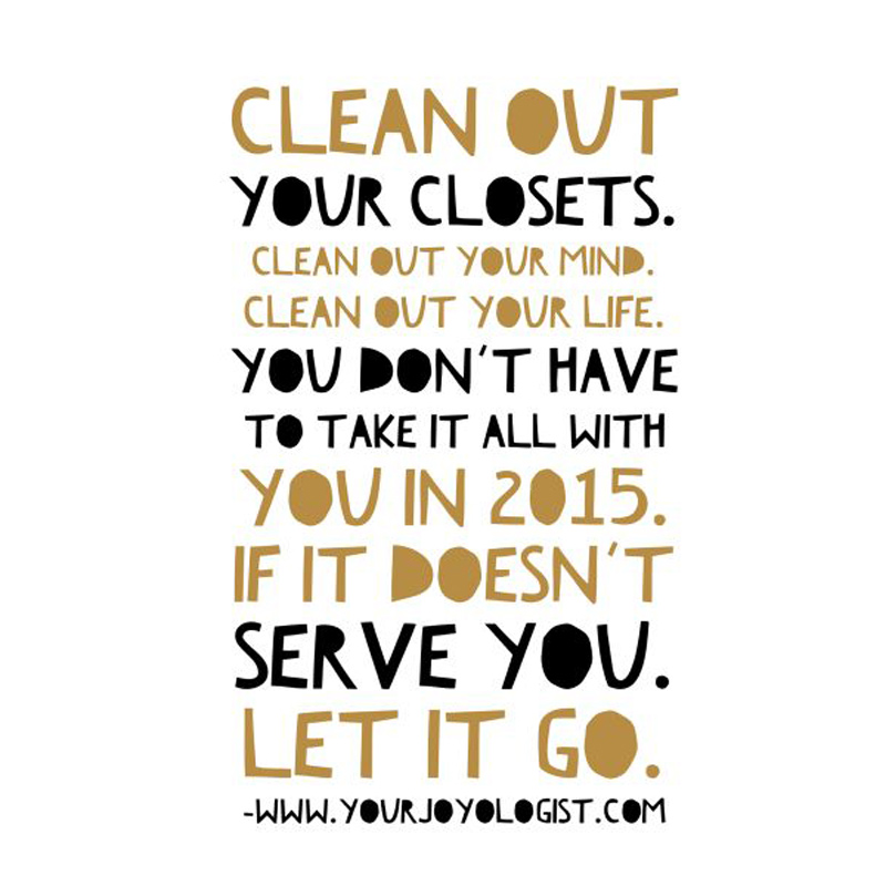
Don’t forget to head over to the Challenge Forum where a new challenge will go up today. You will create a page using a quote/piece of advice.

About the Author: Kimberlee is a lover not a fighter; a stay-at-home gran, a poet, and a lifelong learner. She grooves on saturated colors, Tuesday dance parties, optimism, glitter and sunshine. She colors outside the lines. She is a dreamer. She is a collector of moments. She is all about the story. Kimberlee completed her MFA in Creative Writing and is currently working toward a M.Ed. in Instructional Design.
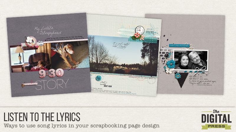
Listen To The Lyrics
It certainly is enjoyable to listen to your favorite music as you scrapbook but have you ever thought to draw inspiration from that music, specifically, the lyrics or title of a song? There are many ways that song lyrics can add to our page design process.
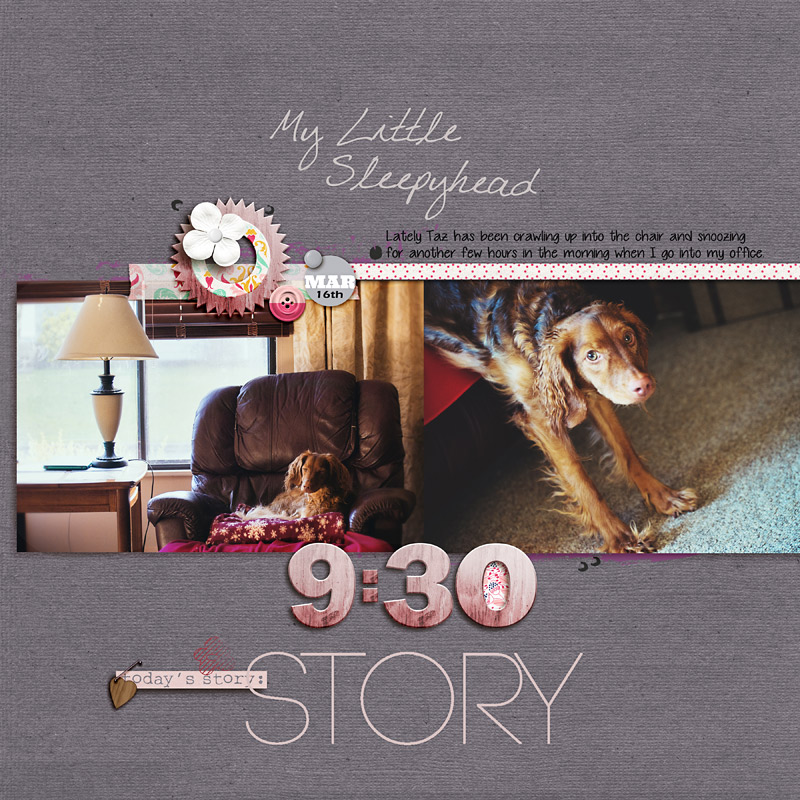
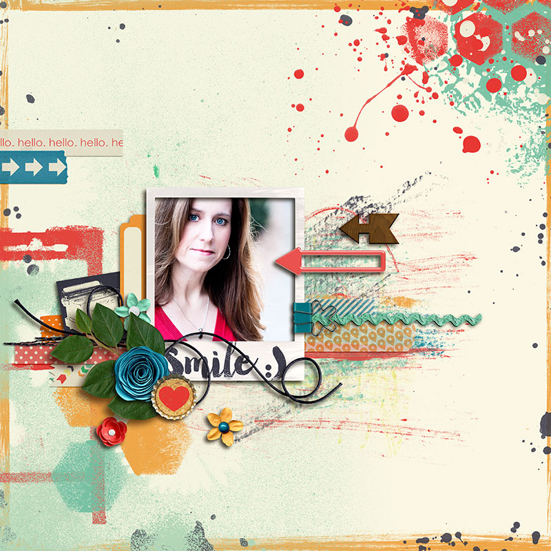
Sometimes the lyrics will inspire you; the feeling it provokes, the meaning in the words and they get your thoughts running in a certain direction. My first page design was complete; all it needed was a title. I knew where the title would go but wasn’t sure what words to use. I didn’t have any word art handy that seemed right for the page and I was at a bit of a loss as to what title would help to tell my story and get the idea across of what my page was about. (Taz was sleeping in the chair, being lazy and then finally drew himself into a long stretch, sliding off the chair.) I decided to search the internet for some ideas. Often I will Google a key word I want to use or a theme but many times I will go to a song lyric website such as lyricfinder.org, lyricsg.com or songlyrics.com which all come up with different results when searching. For my first page I came across a Diana Krall song whose lyrics/title weren’t quite what I wanted but it was enough to direct my thought process so I was able to come up with a title I liked, “My Little Sleepyhead”.
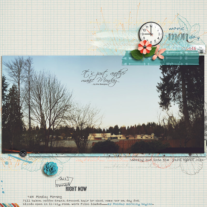
 For my second page, I knew I wanted to include “Monday” into the title and without even searching, an old song popped into my head from the Bangles, “Just Another Manic Monday”. Manic Monday was a perfect title for my page. Sometimes when doing a search, I will come across a lyric or title that catches my eye and I will jot it down in my binder for future use.
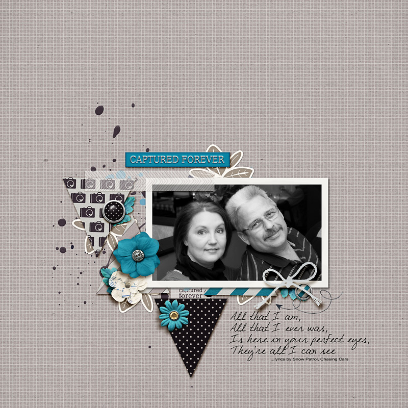
 Sometimes as I’m driving and listening to the top 40 or alternative/contemporary rock stations I like, I will hear a lyric that I want to use on a page so if I get a chance to jot it down I will and put it into my binder when I get home. If you haven’t figured it out already….I like to take notes, write things down LOL. I am a compulsive list/note taker. For my third page, I used lyrics from a song I’ve loved ever since I heard it playing on Gray’s Anatomy years ago and it remains one of my favorites. If you haven’t heard “Chasing Cars” by Snow Patrol, go give it a listen, it’s a fantastic song IMO. I used some of the lyrics for this page.
There are so many opportunities for drawing inspiration from songs and lyrics in your page design, possibly from some of your current favorites, maybe a childhood lullaby or even from a television jingle that you heard. Have fun with it!
Don’t forget to head over to the Challenge Forum where a new challenge will go up today. You will create a page using inspiration from song/lyrics. Have fun!
 Rae Clevett is part of the Creative Team at The Digital Press. She lives on the west coast of BC with her hubby and labradoodle, Taz. As a photographer and avid digital scrapbooker, most days she is either behind the camera or scrapping some of her personal photos. There is usually a cup of coffee on her desk and some chocolate treats, as she is a chocolate addict. Her laptop sits next to her computer so she can watch tv or movies as she scraps or edits photos. Taz usually lies on the floor beside her, playing with his toys. It’s a pretty sweet set-up, comfy and casual.
Listen to your Inner Minimalist
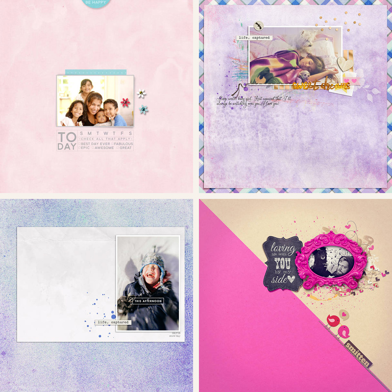
There is something special about a sparsely embellished page with a large amount of white space. The photos take the leading role and the elements support the photocentric expression. I want to challenge you to take a closer look at some minimalistic pages from our Creative Team, to get inspired for your own creations!
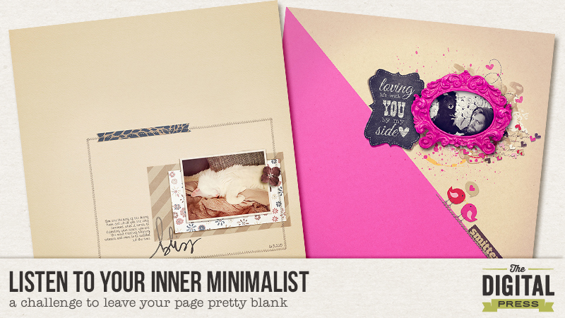
Does scrapping with lots of white space and only tiny picked elements come easy for you? For me this is foreign. I’m a little afraid of too much white space and I have to get the ellies on my page and make a mess. I feel so insecure with a close to blank page. And that is although I love a bold minimalistic spread! There are quite a few girls on the TDP Creative Team who really know how to get the “half empty” pages to work. I will show you some examples:
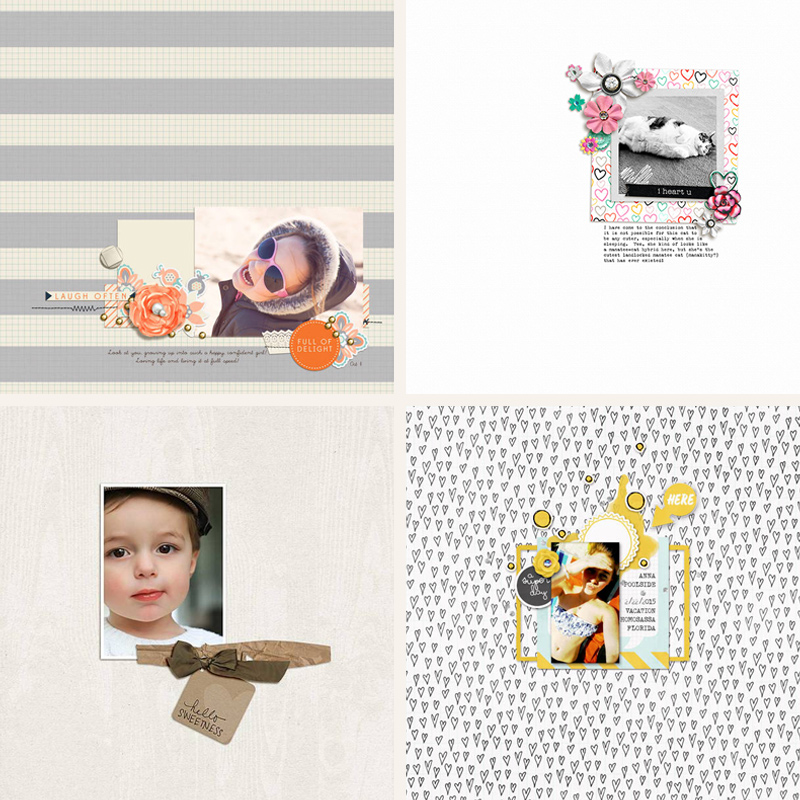
All of them have in common one tight cluster, a neutral colored background and only minimal embellishment. They all make a bold statement through their photos and embellishment placement. All of them promote a huge white space, even though the layouts by Jude and Sokee are using a strong pattern base. Farrah’s gallery is full of minimalistic pages and this one stood out because it was using only 3 further elements added to the photo and the background. Her tight photo crop adds to the striking impression.
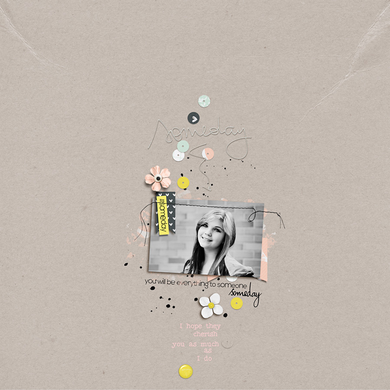
The background doesn’t have to be a neutral at all. I found some colored background minimalist pages in the Creative Team gallery as well:
Yes, these are my favorite colors (who can resist purple and pink?). What’s to see here? Bao has expanded her cluster by using a tag wordart on the top of the page. It creates a certain tension when looking at her layout. Cynthia even gave her layout a rim. You can see that this loosens the minimalistic feel a little bit as the airy impression is “earthed” to the page’s edges. Molly used a large mat for her photo and close to no embellishments to let her photo shine. And Alina’s page (oops, that’s me) uses a two tiered paper as a background. For me this was an easy one because the white space was lifted a bit by the diagonal line and the contrasting colors.
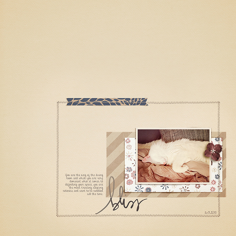
I want to show you one more. It’s a little different from the others, as it has close to no straight lines and the cluster is not tight but very loosened up, scattered and random. There is a certain lightheartedness following the arrangements of the elements. All accompanied by a pleasant smile and carefree and heartfelt wordart.
In preparation for this challenge I set up some rules for myself and had to try to make it work for me. If I can do it, you can do it, too! It took me as long as I usually tweak on my “everything on one page mess” layouts. It’s not faster per sé. I also realized that to make it look okay for me, I have to scale my cluster down a lot.
Are you prepared to listen to your inner minimalist? I’m sure it’s now whispering in your ear how your page could look, what elements you would use and which to leave. Listen closely, your inner minimalist doesn’t talk much. She keeps it short and simple 😉
You can find the challenge (click) in the forums. I’ll see you there. Have fun!
 About the Author: Alina enjoys sitting in front of her large computer screens too much. Apart from that she loves walking her dog and watching sunsets while being amazed of life in general. She is married to her best friend. Tries to manage the needs of her two cats and her dog and badly fails when they all want their cuddle time at once. Everything else is scrapping, taking photos and currently crafting. Having said that, she needs a bigger craft room.
Listen to your Lazy Side
I’m back again with another tutorial based on a question asked on my last post – how do you use a gradient as a clipping mask?
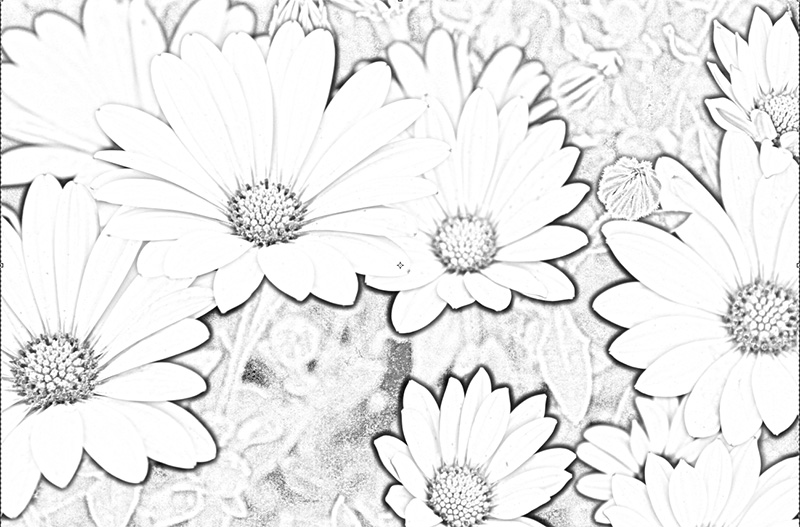
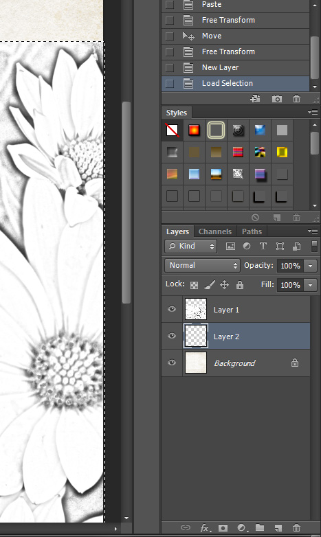
First, I converted a flower photo into a black and white pencil drawing as I showed you in my last tutorial.
I flattened the flower image and copied it into a new layer on top of this grey background paper I want to use for my layout.
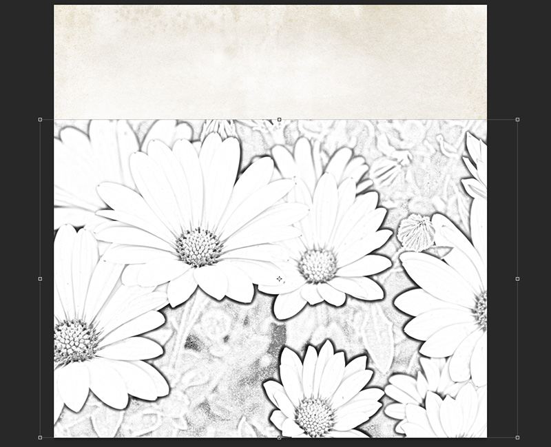
Next, I want the flower drawing to look like it is growing upwards from the bottom of the page, and I want it to be pretty big. After re-sizing, it looks like this:
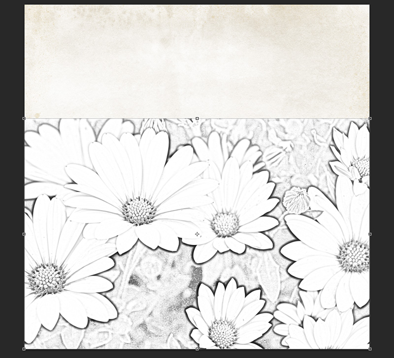
Then, I want to blend this into my background paper, but I’m a super lazy scrapbooker, so I’m going to use a gradient fill to do the heavy lifting for me on this layout.
First, create a new layer in the layers palette. The new layer should be between the background paper and your pencil drawing.
I don’t want to do a ton of erasing after doing the gradient fill, so I’m going to use the outline of my photo layer to make a boundary for the gradient. With the new blank layer in between your other layers selected, hold your mouse over the layer thumbnail of your pencil drawing layer in the layers palette and ctrl-mouseclick on the thumbnail.
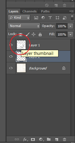
Your pencil drawing layer will have the dotted selection line around it, but in the layers palette, the middle layer will still be selected.
It will be easier to see what you are doing for the next steps if you turn the visibility of your pencil drawing layer off in the layers palette (click on the eye symbol associated with that layer).
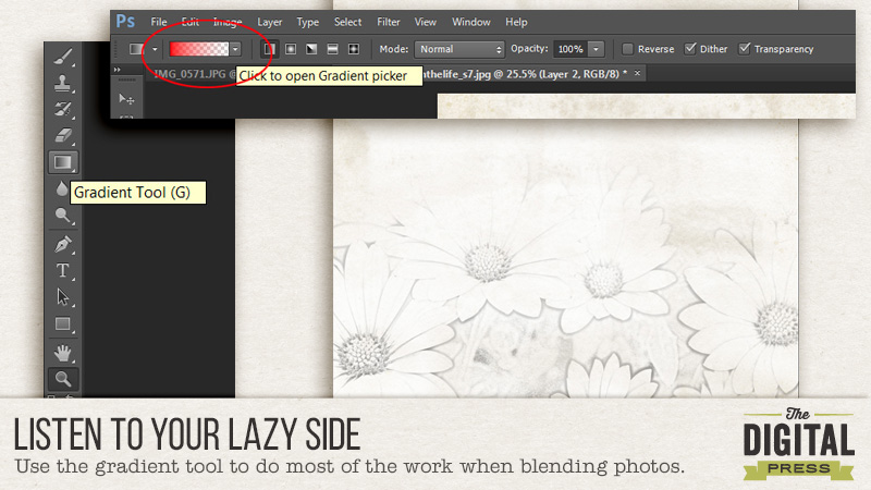
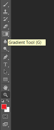
On the left toolbar, select the Gradient tool (or use the ‘G’ key as a shortcut).
In the top toolbar, click the Gradient Picker drop-down box and select the solid to transparent gradient. This will appear as a color on one side and transparent (the white and gray checkerboard pattern on the other).
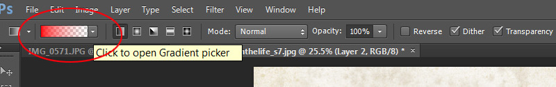
I’m using red as my main color here so that it’s easier to see. Since the gradient will be used as a clipping mask, it doesn’t matter what the main color you are using is. Make sure the Dither and Transparency boxes on the right side of the toolbar are checked.
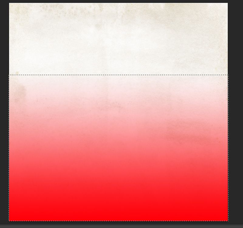
The Gradient tool draws a gradient from solid to transparent (in this case). So click first on the side of your line drawing that you want to be solid, then, drag your mouse in the direction you want the photo to fade. Because we are using the outline of your pencil drawing layer as a selection boundary, it will limit where the gradient ends to inside the selection. My document now looks like this:
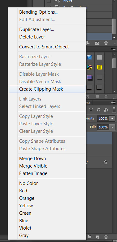
Turn your pencil drawing layer back on (click on the eye next to the layer thumbnail). We are going to clip this layer to the gradient underneath it. You can do this one of two ways:
- Hold your mouse between the pencil drawing and gradient layers and hold down the Alt key. Your cursor will turn into a box with an arrow pointing downward next to it. Click your mouse button and the top layer will now be clipped to the middle layer.
- Right click on your pencil drawing layer and choose ‘Create Clipping Mask’.
My layout now looks like this:
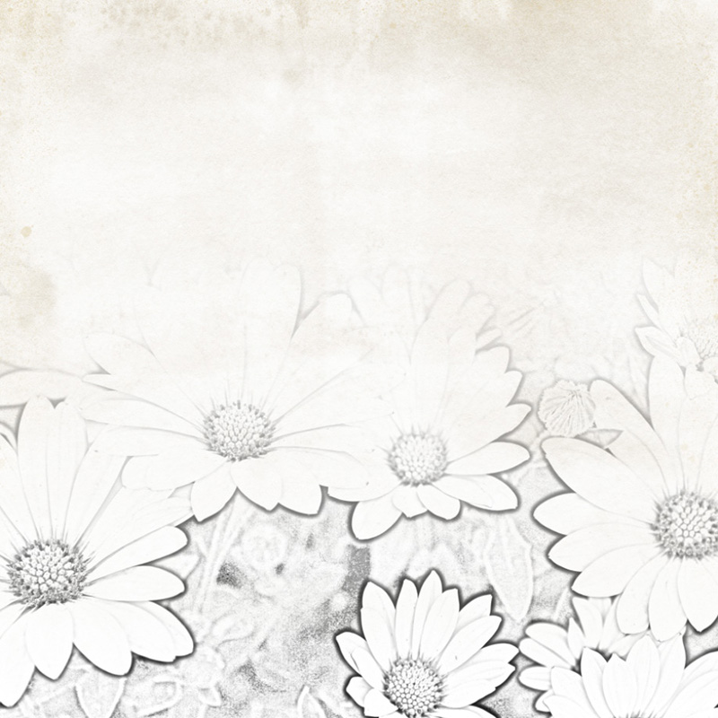
You can move the pencil drawing and gradient layers around until your layout looks good, and you can also use the eraser tool on the gradient layer to tailor the blending to your liking. For the eraser, I like to use a big brush at 5% flow – this only erases 5% of the area that I move my mouse over for each pass, so this blends well and it’s hard to see where I’ve erased.
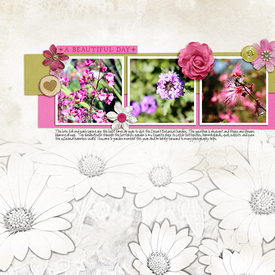
After some erasing at the top, and around each flower (where the flower petals appear to have shadows), photos, elements and journaling, my completed layout looks like this:
I hope this was helpful – happy scrapping!
Supplies Used:
Winter Berries by The Digital Press Designers
A Day in the Life: Solids by Sugarplum Paperie
 About the Author: Kacy is an Environmental Engineer living in Arizona with a elderly, cranky, pudgy, but insanely cute calico kitty. She enjoys scrapbooking, crocheting, dancing awkwardly to electronic dance music, Grumpy Cat, Scottish accents, drag queens, cupcakes, bacon, Stephen King books, smirking, very crude inside jokes, and men in kilts.
Listen to Your Artistic Soul: Overcoming Creative Blocks
Hello everyone! I’m back with a post about overcoming those dreaded creative blocks. You can find all kinds of great advice on the subject from using templates to perusing galleries to revisiting your favorite pages. But the one thing I’ve found helpful in this situation is to listen to your artistic soul and create what makes you happy. Here are some ideas for finding your creative happy place:
1. Working with a particular color.
2. Creating a specific style of page.
3. Learning a new technique.
4. Scrapping with your favorite photos.
5. Using your favorite elements.
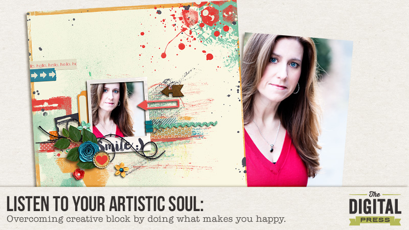
My favorite method for overcoming creative block is to pick a kit (or kits) that I love, put all my favorite elements on a blank page and then just play. Sometimes it clicks right away, sometimes it takes a little while longer, but creating with my favorite types of elements always seems to wake up my creativity. For example, take this page that I created as a way of working through a creative rut:
I started with a blank white background and used several categories of “happy” things when I was creating:
1. Bright colors
2. Paint elements
3. Leaves
4. My favorite selfie
Pablo Picasso was absolutely right when he said, “Inspiration exists, but it has to find you working.” The next time you find yourself in a creative rut, try working your way out of it by listening to your artistic soul and working with what makes you happy. Ready to give it a try? Whether you’re creatively challenged or not, be sure to join me in the Listen to Your Artistic Soul Challenge this month!
Until next time ~
Judie
 About the Author: Judie is a member of The Digital Press creative team. She spends most of her time engaged in creative endeavors of all sorts. Traveling, Starbucks, football and Harry Potter are just a few of her favorite things.
Creating Cards from Templates
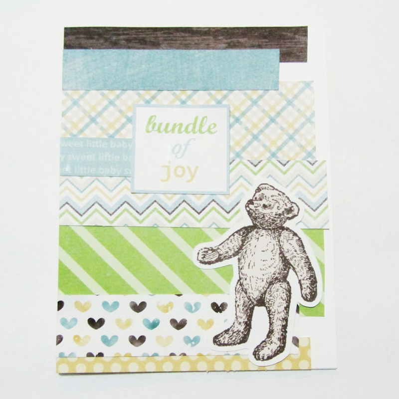
Hi, all. Sarah here. I’m always looking for new ways to use up my scrapping stash and recently I’ve started using 12″x12″ page templates to help me create greeting cards. There are quite a few templates out there that make great card fronts and I’m excited to share a couple of baby cards that I’ve created with you.
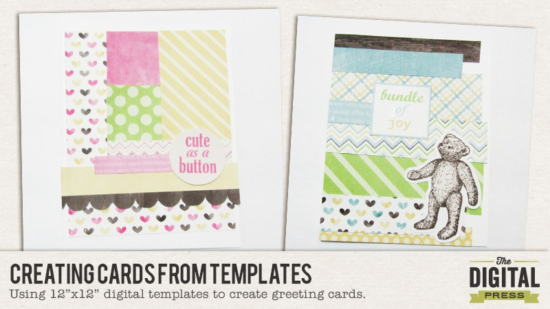
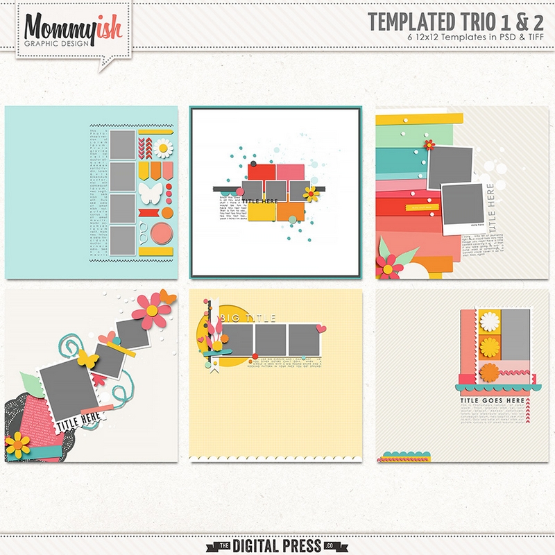
This is the template set I used. I love the grid format and paper strips used in the two templates to the right so I decided to use a portion of these templates for my cards.
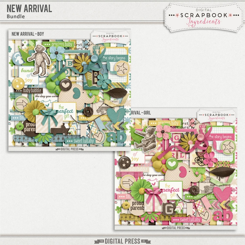
This baby collection is great because there are quite a few printable papers and elements and I love that I could make a boy card and girl card that would have the same basic look.
I imported the layers that I needed for my cards into my Silhouette software and then resized everything to be more greeting card size friendly. These cards were pretty easy to put together once I had everything printed and cut out. I created two card bases from a sheet of white cardstock and adhered everything down using the original template for guidance.
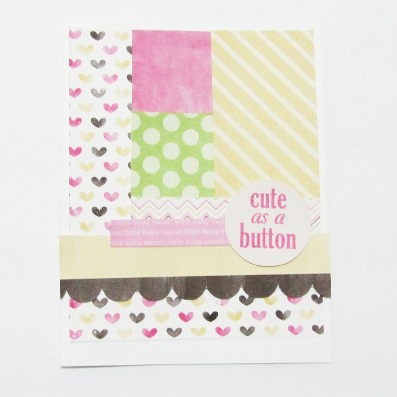
For this boy card I did have to trim a few of the strips down a bit as they hung over the edge even after resizing, but I think the original feel of the template was maintained.
These were so much fun to create and I love that I get to use my digital supplies in a new way.