I love to journal.
I don’t always share it with my posted layouts because it is often quite personal, but I love the added significance it adds to a page. However, I have this NEED to make my entire page flow, or mesh together in some way that is at least apparent to me (because I know there are times when it is not apparent to anyone else, he he). The hardest part of journaling for me is working what I want to say into the composition of a page so that it looks like it belongs. It drives me NUTS when I can’t make it work.
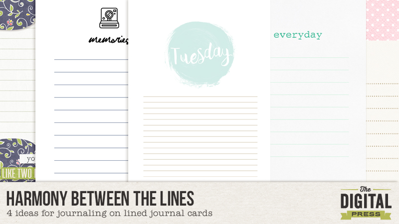
I find that pocket scrapping helps with this in that it is quite easy to set aside a certain space for your journaling without taking away from the overall appeal of the page. And, to make it easier, in pocket scrapping you can find loads of cute cards with the journal lines all marked out for you. I love those lined journal cards but I used to have a hard time getting my journaling text to line up with those lines. Obviously that is no big deal, but it really bothered me, so I researched and have collected some techniques for altering either my text or the cards so I can use those journal lines without creating too much distraction for my ever so slightly OCD brain.
(I work in Photoshop CS6, so any explanations I have come from that, but most of what I share should be possible in other programs as well.)
1. Change your line spacing.
The first method I try when wanting to use a lined journal card is to simply adjust the line spacing of my text.
To do this I first type out my journaling and get the wording just the way I want it to be. I also go ahead and choose what font I want to use as different fonts tend to be different sizes. Go ahead and do a spell check as well, because if you are like me some of those words are wrong and correcting them might change the lines up later. I usually end up with something looking like this:
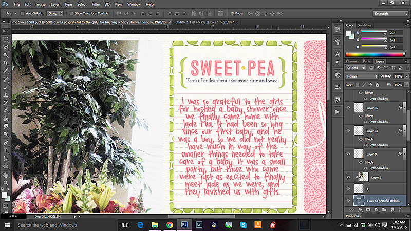
See how the typed text does not line up with the lines on the journal cards?
Now, with your type tool select the text you want to adjust until it is ALL highlighted. Then, to make it easier to see, type ctrl+h (this hides the highlight but keeps your text selected so you can work with it). Now go into your text formatting tool box and find the line spacing menu (mine says “select leading” when I hover over it).
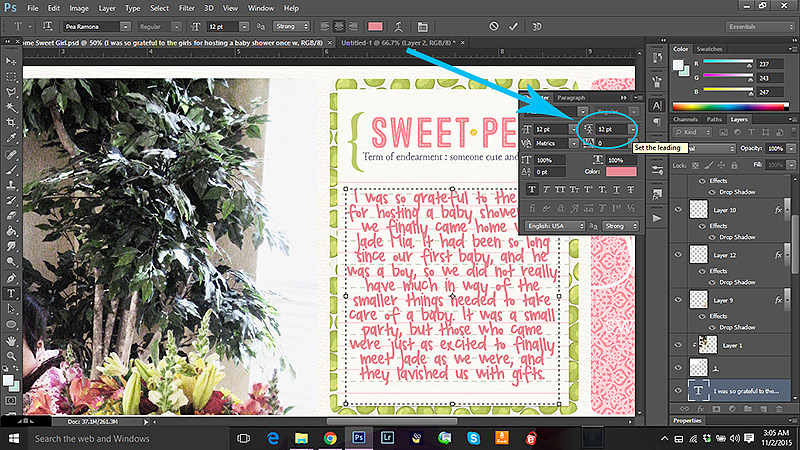
Play around with this a bit and see how it effects the placement of your text. Now in all honesty, I find that the rounded numbers the provide just don’t work most of the time, but you can type numbers in to the little text box so you can use and numbers in between, including decimal places.
For instance here I found that 19.3 worked the best for this particular card and font combination.

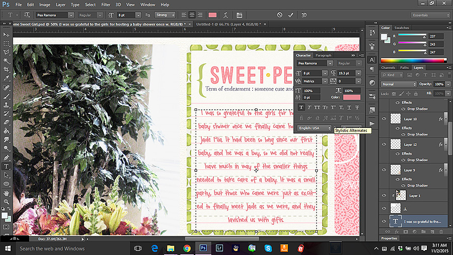
However, note that my text now goes off the card, so I want to adjust the text size until it all shows up. Like this. Adjusting the size might change your line spacing a little, but not much. You can adjust your spacing a bit more once you get the text the right size for the card.
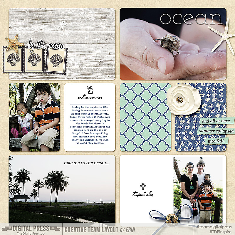
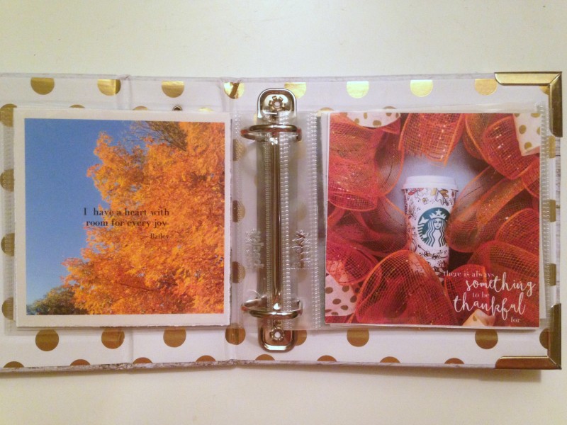
So here is a look at my finished page.
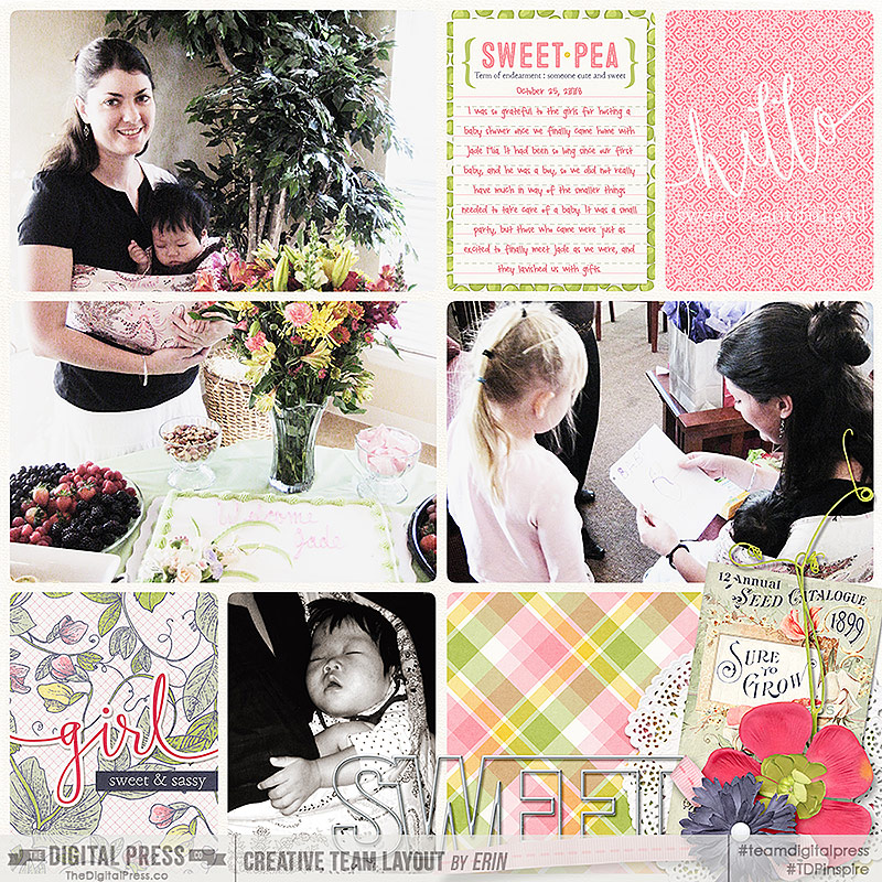
(credits: template by Karla Dudley: Pocket Pals 12×12 Bundle, Hello Sweet Pea: Collection by Kim B)
Most of the time this is the method I go with, but sometimes I can’t get this to work the way I want, or maybe I want to change things up a bit. Here is a quick look at a few other ways to play with lined journal cards.
2. Move the lines.
One way to adjust the journal card is simply to move the lines. This is most easily done on a journal card that has either a white background, or a background color that is easy to reproduce. If there is a lot of texture or pattern involved this method can get tricky fast, and I don’t recommend it unless you have loads of time and patience. But on a simple white journal card, it is easy-peasy.
I usually start by typing out my text on a layer over the card. I arrange it the way I want with spacing and size. Then I select the journal card layer and with my magic wand tool I select the line that I want to move. Make sure to have the “contiguous” option marked in your tool bar when using the magic wand tool – otherwise you will select EVERYTHING on that layer that is the same color as your line – including all the other lines. Here you can see I have selected just the line I wanted – I know it is selected because it has the marching ants around it (it shows up as dashes in the screen capture on the top line in the image below).
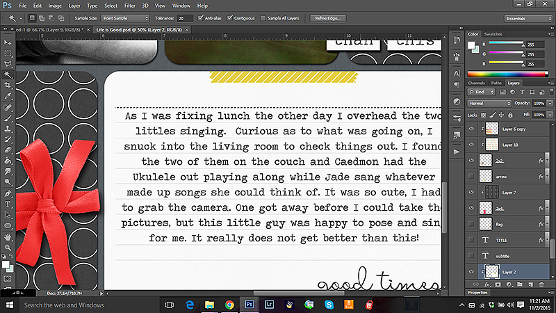
Now, with my arrow tool, I can grab that line and move it around as I like. I repeated these steps with all the lines until I had them right where they needed to be. You might notice that sometimes the line you moved leaves a hole in the card. That is easily remedied. I simply create a layer directly under the card and copy the background color of the card onto that layer, so any holes are no longer noticeable. Later I merge these layers if I want.
I did not have a lot of moving to do for this particular card, but there were two extra lines I wanted to get rid of, so I moved them to merge with nearby lines, and widened out the spaces just a bit.
Here is a look at my finished layout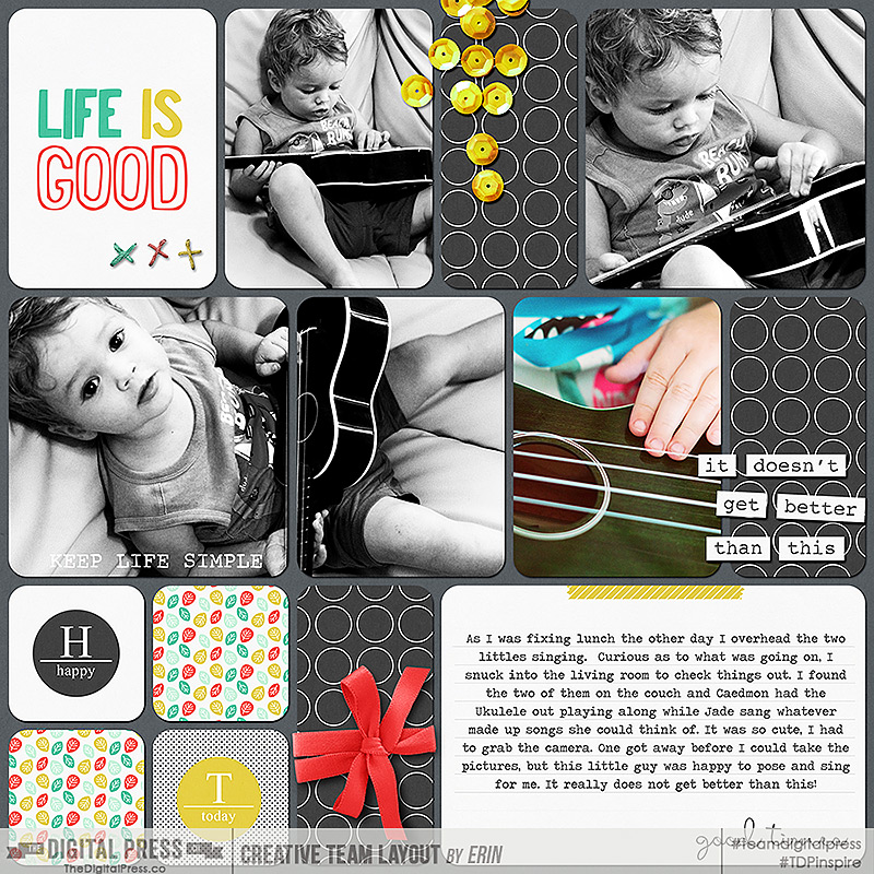
(credits: Template by Mommyish : Templates Trio 5; Dunia Designs Life is Good Paper, Elements, and Cards )
3. Erase part of the card.
A similar method would be simply to erase some of the lines. I find this method most useful when the amount of journaling I have is not proportional to the journaling lines provided, especially if I have a lot to say, and only a few lines to use. In those cases it is just not possible to fit my journaling into the lined space provided without making it too small to see. The same is true if I have just a wee bit to say, but the card allows for much more room, leaving far too many blank lines for my liking. Usually I know before I start typing that I am going to need to change the card, so I go right to the card layer and with my color picker I choose the background color of the card I am working on. (Again this is most easily done with a simple easily reproducible color, though you are more than welcome to give it a go on a more complicated pattern or texture.)
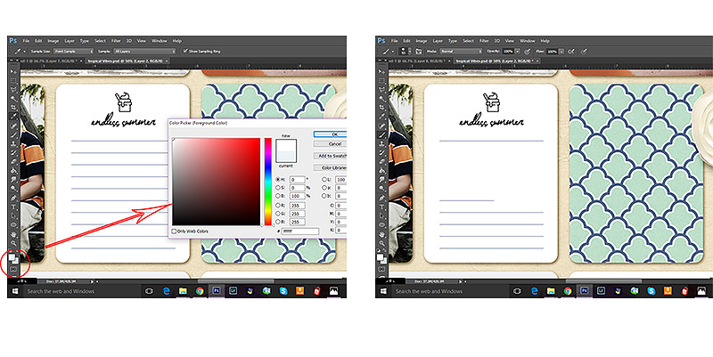 I then select my paintbrush tool, make sure I have a diameter size that fits with the space I am working on and I carefully paint the background color over some or all of the lines. In this case I decided to leave the top and bottom lines to serve as a semi-border for my journaling.
(credits: Template by Sabrina’s Creations Document Life Template Set 1 ; Sahin Designs Joyful Noises and Summer Wrap Up Pocket Cards )
4. Type line by line.
And finally my last method is probably the most simple, and yet I use it the least.
Simply type line by line.
This method is the easiest method to use if your card background is highly patterned or textured, or you just don’t want to take a lot of time matching colors.
In Photoshop you can either choose to use a text box, or type line by line depending on how you click your mouse when using the text tool. If you click and drag, you create a text bow with clearly defined and easily changed parameters. If you simply click, a text line will appear that goes on and on until you tell it to move down by pressing enter. Below is a screen shot of what each one looks like, the one on the left being the text box created by clicking and dragging, the one on the right is the text line created by simply clicking.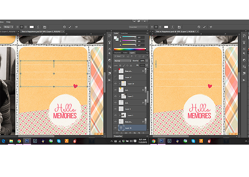 To type line by line you simply click on the first line, type your text, then deselect your text tool, re-select it and move on to the next line. In fact, many people prefer this method. I tend to avoid it because I find it rather tedious, especially when I have a lot of lines to type. There are times, however, specifically when I only have a few lines to type, like a date, a place name, or a simple explanation, where I do use this method successfully. It is especially useful on cards with really wonky journaling lines (which I LOVE) or when I want to be able to manipulate each line individually.
For example, on this page I used this method to type on the colored and textured journal card in the center row. I just loved the bright happy colors and how well they brought out the smiles in these pictures from years ago.
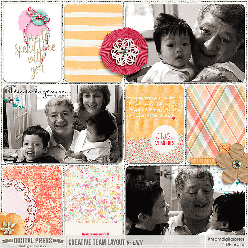
(credits: template by Laura Passage: Project Twenty Fifteen Templates Vol.2; Anita Designs The Best of Times Kit and Journal Cards and Days of the Week Journaling Cards)
So there you have it. Four ways to use those lined journaling cards to help mesh your journaling into your layout so they become one work of art. I know there are loads of other ways to do the things I shared above, and there are also many other ideas for using those cards, so feel free to let me know in the comments if you have any more methods or ideas you want to share. I would love to hear from you.
Happy Scrapping!

About the Author: Erin is a work from home mom of three living in Thailand. She loves playing with her kids and anything artsy. She can often be found knee deep in toys with paint on her face. She is slowly learning the meaning of living an authentic life, and enjoying every minute of the adventure.
 About the Author: Jennifer Hignite is a mom of three boys and new homeowner with her fiance in the mitten state. When she is not scrapbooking she enjoys photography, decorating and shopping at Target.


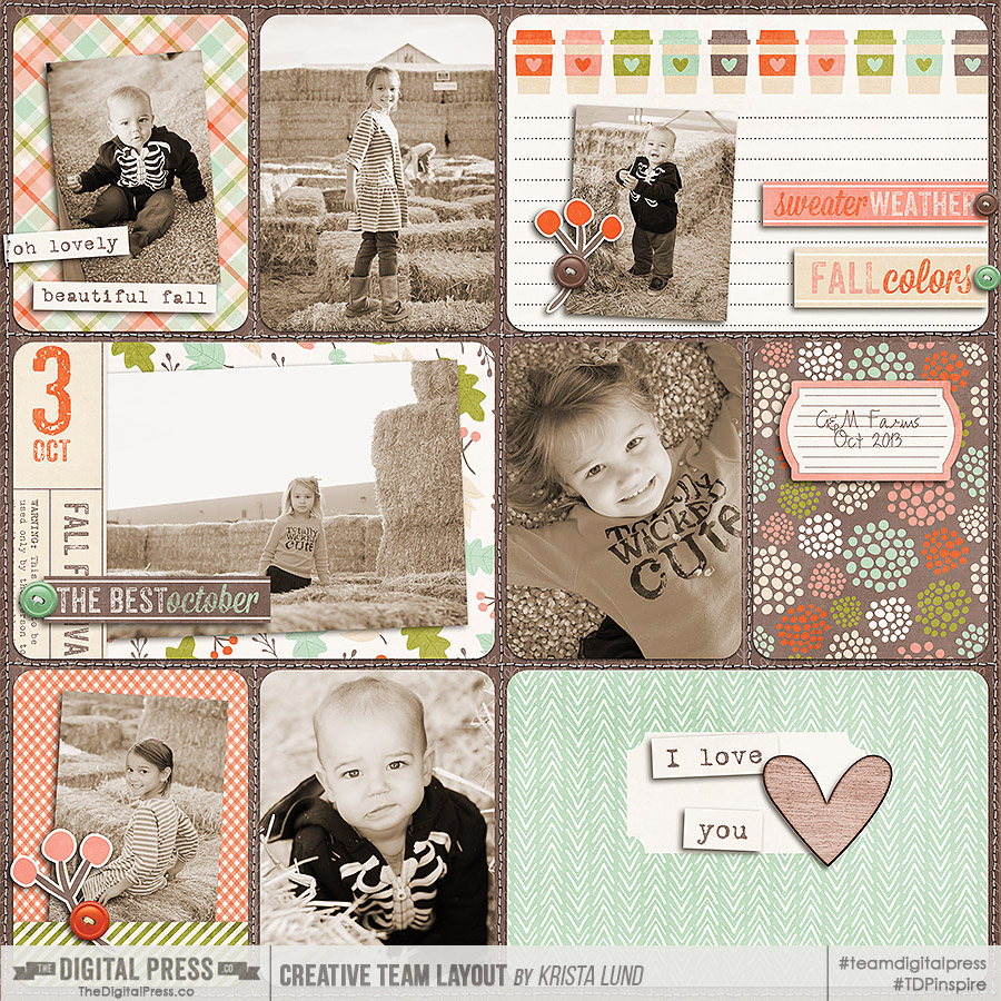
 About the Author: Krista Lund is a mom of 3, married to her High School Sweetheart living in the San Francisco Bay Area. Some of her favorite things are brownies, chips ‘n’ dip, taking pictures, and documenting her family’s story.


 About the author: Donna Espiritu is a mom to a little girl who just turned 1 year old and wife to a very supportive husband. She is currently living in the Kingdom of Saudi Arabia with them. When she is not scrapbooking, she likes to read books/e-books (sci-fi/romantic/time-travel) or watching old episodes of some of her favorite TV shows.