Author: The Digital Press

Hybrid How-To | Cushion Covers


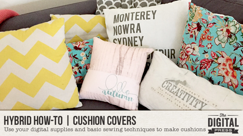
I know most of the world is coming into summer now, but where I live we have the most beautiful autumns and I wanted to make some decor to celebrate that.

I make a lot of my cushion covers; they are so easy to do. Today, I will show you how!

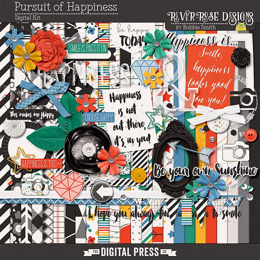
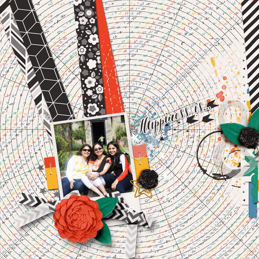
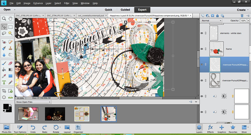
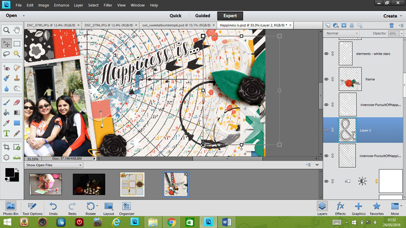
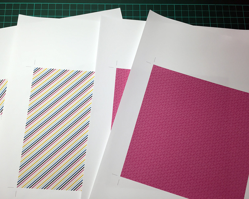
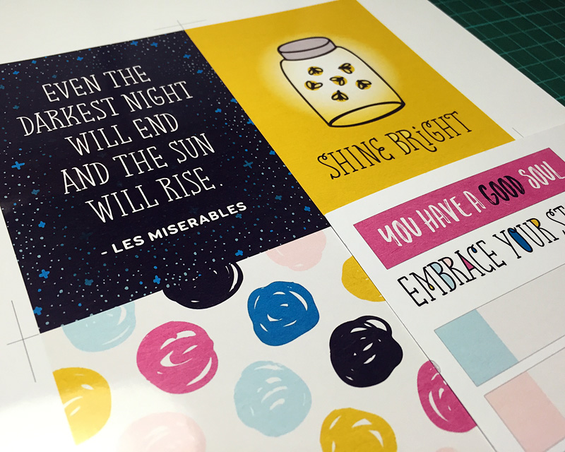
First, I design the cushion cover in Photoshop. My printer prints up to A3, so that’s the size of the page I start with. For this project, I used Grateful Papers by Little Lamm & Co. and Wondrous Stamp Sheet by Karla Noél.

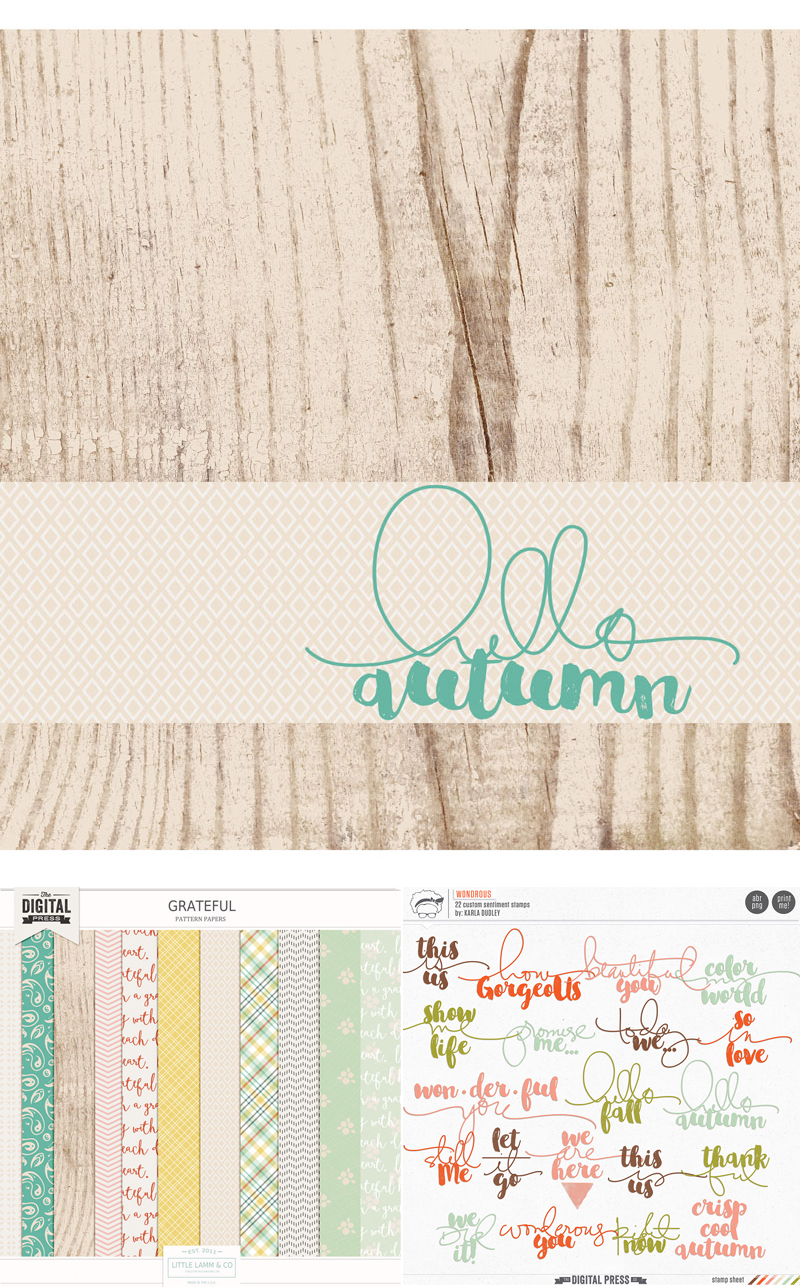
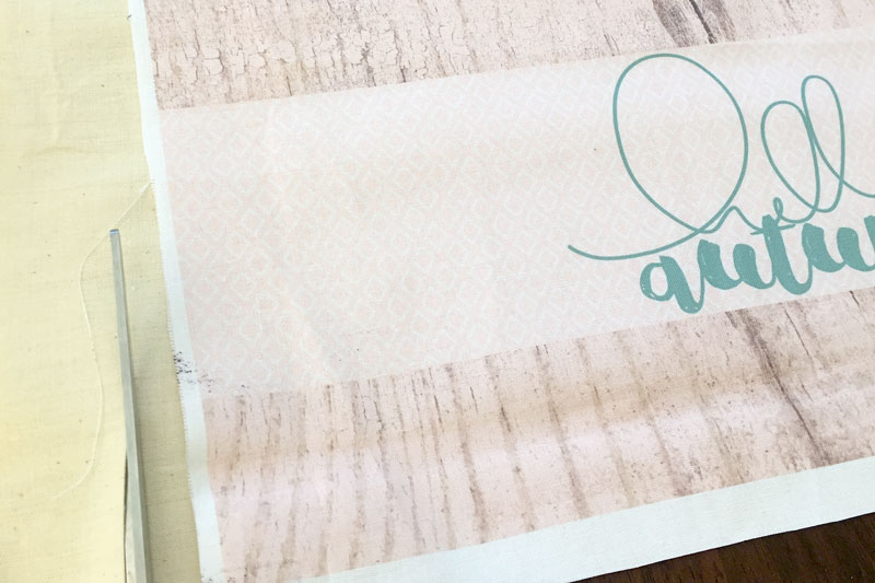
After creating the design, I cut fabric to A3 size. Make sure your fabric is ironed completely flat and stuck to the paper with double sided tape. The top edge should be stuck right to the edge of the paper. Print your design onto the fabric.

*NOTE* The ink will not be colorfast, so if it gets wet… it WILL run. You can use transfer paper if you want your design more colorfast, but I change mine around often, so its not a big deal for me. If mine gets wet, I just make a new one!

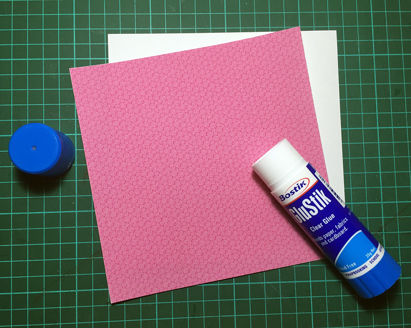
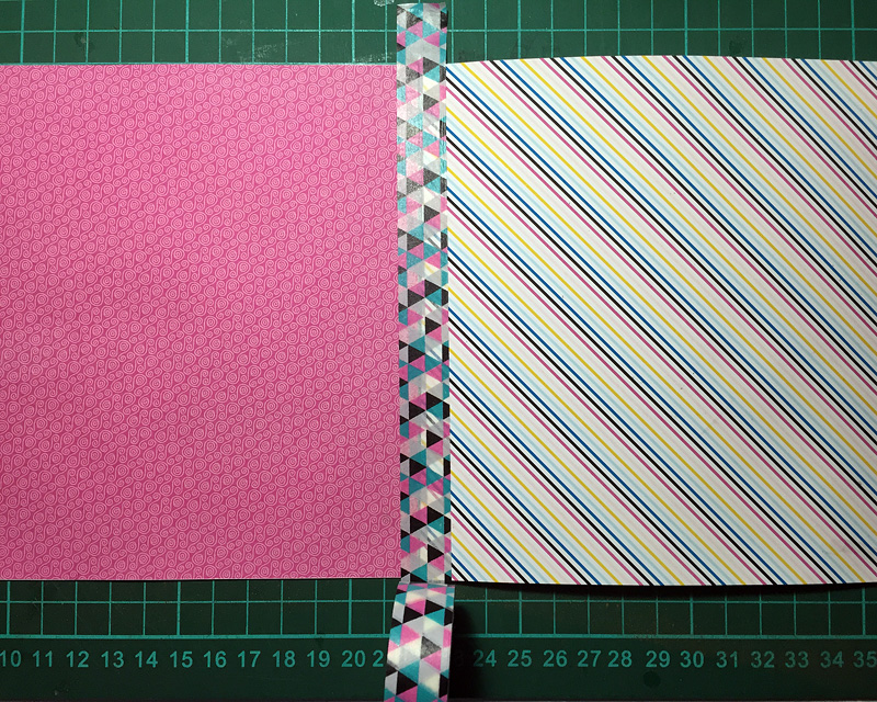
You will also need to cut a back for your cushion cover. I purchased a small cushion from IKEA that already had a pattern on it and wanted to make sure the pattern didn’t show through on the front, so I cut an extra piece of calico. Cut them slightly larger than your design to allow room for seams.

hybrid cushion covers

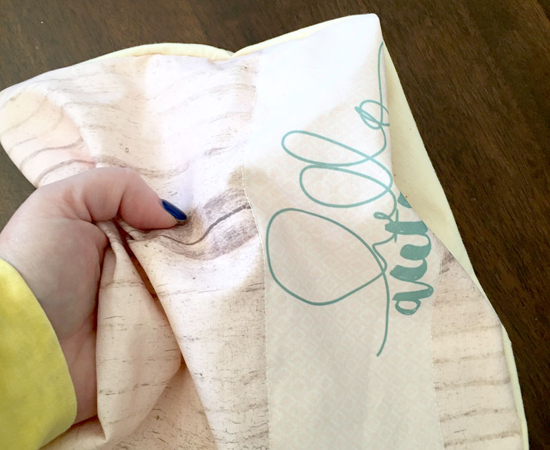
To make my cover look a bit more quilted I decided to sew where the different papers meet. Do this on the front so you can see where you need to sew.
IMG_4933

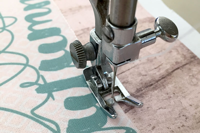
When you are happy with your design, put the ‘right’ sides of your fabric together and sew around the edges, making sure you leave a large enough gap to put the cushion in.

IMG_4937

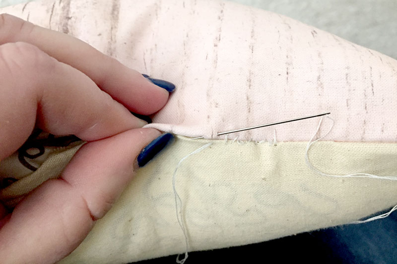
Turn your cover inside out, paying attention to the corners, stuff your cushion inside and hand stitch up the gap.
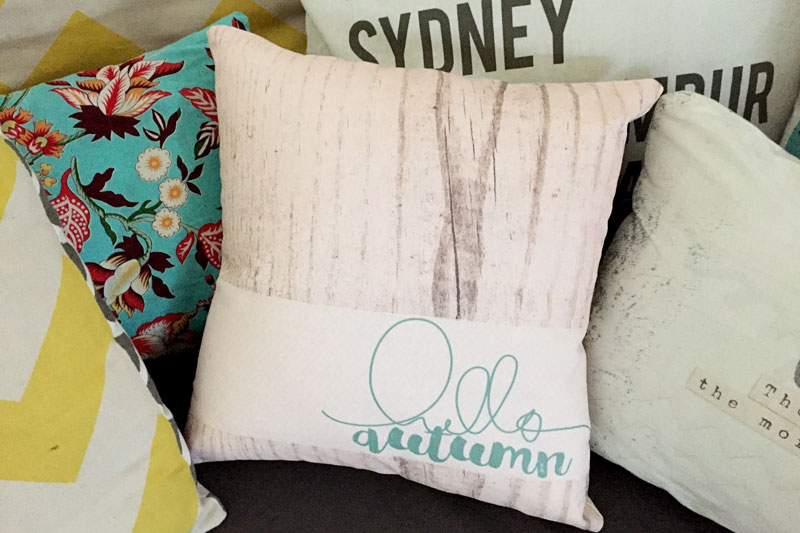
Untitled-5

Voila!

IMG_4941


Amanda

About the Author  Amanda found digital scrapbooking in 2006 as a paper scrapper who was frustrated with the limitations of paper scrapping products. She now loves to combine paper and digital products and techniques for her pages and projects. She is the wife of a Naval Officer and has two teenage children. She lives in Australia, and has also lived in the U.S and Malaysia and loves that she has had the opportunity to travel the world with her family.

Tutorial Tuesday | Shadowing Transparent Items


Have you ever noticed that the preset shadows don’t work so well with vellum and other transparent elements? I struggled with it for a long time, and although I can’t profess I have mastered it all… I do have a trick or two to share with you today.

For this tutorial, I am working on a layout using River~Rose’s fabulous new collection Pursuit of Happiness

In the following image, my layout is almost complete… and as you can see there are a couple of transparent acrylic elements on the page — the heart and the ampersand. With preset shadows in Photoshop, my layout looks like this…

Now the biggest quibble I have is that dark shadow showing through the transparent acrylic element. See how “grey” it looks? Logically, any transparent/translucent object that lets light through shouldn’t throw such a defining shadow. And that’s what we need to modify.

Step 1

First, you will separate out the shadow from the element (i.e. put it in its own layer). I do this using Photoshop CS2 (old free version of Photoshop!), and then open up my layout again in Photoshop Elements (PSE), which is what I’m showing my steps in for the screenshots in this tutorial. Once you have your shadow on a separate layer, you will press CTRL and select the element thumbnail in the layers panel. This will make the “marching ants” appear around the element, like this…

Step 2

Now, with that selection still on, you will click on the shadow to “cut away” the selection. Now you have two layers of shadow: one that shows immediately beneath the element, and the peripheral shadow that sticks out around it. We want this peripheral shadow to be pronounced — while at the same time downplaying the central part (see layer 2 in the screen shot).

Step 3

We can do this next part more than way…
a) Hide the shadow that appears under the ampersand entirely (as shown in the screen shot below)
a) Decrease its opacity (see top right of the layers panel and play with the slider till you like the effect)
c) If your transparent element is on a solid paper or background, it helps to recolor this part of the shadow in darker hue of the same color.

Play around till you are happy with the result you achieve.
Screen shot 3


And voila! …here’s my final layout. Compare this layout with the copy at the beginning of this tutorial, and see if you can see the subtle yet noticeable difference this makes…
Happiness-is-final layout


I hope you found today’s tips to be useful! If you have your own tricks about shadowing transparent items, please do share them. I would love to try out something new.

Until next time, then… happy scrapping!


Profile pic avatar small

About the author  Shivani Sohal is a donner of many alter-egos. A finance professional by day in busy London, she morphs into a seemingly normal mum of two in the evenings and weekends. She is constantly found with her fingers in too many pies and juggling the metaphorical balls. That is living on the edge for her; aided by the two ankle biters and a darling hubby who define the warm and mushy for her. She is ferociously dedicated to memory keeping – almost immune to any nay-sayers (or equally disruptive crying children or annoying house fires!!!); keeping her head down and forging ahead at all times.

Hybrid Saturday | Making A Flipbook

I have seen a lot of rise in snail-mailing lately, and one of the ways to do it is by sending flipbooks. basically a flipbook is a folded book with bits and pieces from the sender to the recipient. Usually a flipbook also includes a mail tag or a series of questions or requests, which the recipient would forward with the answer to another recipient or sender. Making flipbooks is very fun and it uses your physical and digital stuff in a new way.

For the project I am showing to you today, I used Dark Before the Dawn Collection by Scotty Girl Design for the papers, elements, and cards…

Start by printing out 6×6 inch pieces of paper. Since I don’t have a double-sided paper, I  print out 6 pieces of 6×6 papers, 3 of each patterns.

Glue the papers so it becomes a double-sided paper. You can use liquid or dry glue, I tend to work with dry glue because sometimes liquid glue warps the paper.

Create hinges by taping one piece of paper to the other using a washi tape. You can also reinforce this by running a strip of adhesive before taping down the washi tape.

Next is up to you on how you would like to decorate your pages. I printed out journal pages and also embellishments from the kit, and then hand-cutting them to fit the pages.

That’s it! Pretty easy right?


IndahAbout the Author  Indah has been a hybrid crafter for almost 10 years. She also loves collecting stamps and stickers.

Journaling Challenge | Vorfreude

Vorfreude


Hello friends! It’s Farrah here today, and I’m hosting a journaling challenge related to the anticipation of things to come.

Whether you are anticipating a baby, planning a big trip, or even just looking forward to the summer… it’s fun to document the anticipation. The German word vorfreude means “the intense, anticipative joy derived from imaging future pleasures.”

For me, the time I experienced the most profound vorfreude was when I was pregnant with my second child. It was a huge surprise after having gone through infertility and then BAM! What?? I found myself pregnant.  We decided to wait until the baby’s birth to learn the gender… but that didn’t stop me from wondering about it and thinking about it (as well as many, many others aspects of a new baby that create intense anticipative joy!). I have created many scrapbooking layouts about this, but here is one of my favorites…


08.14.09-grow


I have a journaling challenge for you today… related to this idea of excitedly anticipating something. I invite you to come check out the challenge in the forum, and join in! You can earn TDP challenge points, while also completing a layout for your personal album. Win-win! 🙂


FarrahAbout the Author  Farrah Jobling is a member of the creative team here at The Digital Press. She lives in Denver with her amazing family — Mike, Nicholas (9), Claire (6), Hope (2 yr old puppy) & Kringle (5 mo old bunny). She works from home as a photographer and enjoys scrapping her personal photos.


Tutorial Tuesday | Libraries


If you are like me and working on multiple albums at the same time, you will no doubt have experienced the following problem — in which you cannot remember the basic technical specifications for each of your albums. For example… you may be working daily on a pocket-scrapping project, and then also go back to do a page in your recipe book and find that you have forgotten what font you were using (or what shadow styles you were using, etc.). It’s frustrating to constantly need to go back to a previously-completed page to check out all this information before you can start a new page, right?

If the above description is you, then I have a great tip – Setup Photoshop CC Libraries.

I discovered this feature early in the year and now use it on a regular basis.

So what are libraries?

Libraries can be used in many ways, but for me they are basically collections of style presets for the photo books/albums that I am working on. They can be accessed in the top right-hand corner of the page, and are on a tab next to “Adjustments” and “Style” (*NOTE* to enable libraries you may first have to select Window/Libraries).

Here, you can see how I have setup my “Project Life 2016” library…

Image1

As you can see, I have added the “character” and “layer styles” that I regularly use to this library collection… but you can also add things such as “colors” and “smart objects,” as well.

HOW TO DO THIS

1. Set up your Libraries

Click on the Libraries tab, and then click anywhere in the text box to bring up the dialogue with “Create New Library.” Select this option and name your new library. You can set up as many libraries as you like. For myself, I have created libraries for my “Project Life 2016,” “Penang Travel Book,” “Recipe Book,” and “One Little Word Book.”

Image2


2. Add items to your Library

There are 2 methods that I use to add items to my libraries.

The first is to add all styles from a document. I used this at the beginning of the year when I had started my “Project Life 2016” book, and already had some complete pages. To do this… open your completed layout and (after you have created your library) select the first icon with the upward arrow at the bottom of the libraries panel. All styles from your page will automatically be added to your library. You can then go in and modify them by right-clicking on each library style item.

The second method — which happens to be the one which I use more often — is to add items individually to the library. To do this, you select the layer in the layers panel of the style you wish to add to the library. Then just click on the relevant icon at the bottom of the libraries panel to add it to the library. If you mouse over the icons, you can see there is one for Graphics, Character Style, Layer Style and Color.

Image3

Now comes the fun part…

3. Use your library of styles

I find the easiest way is to apply the style after adding the photo or text to a page. For example, I add text to a page using any font. Once text input is complete and text layer is still selected in layer panel, all you need to do is click on the font style you want to use in the library and the font automatically changes. Simple!

You can also apply the effect across multiple layers. So, for example, I have created my own templates for “Project Life 2016” …but each photo layer has a shadow layer style. To use these templates for my flat graphic style this year, I open a template in Photoshop, select all photo layers and then click on the “Grey Stroke no shadow” layer style within my library. This year’s stroke style is now applied to all my photo layers, instead of last year’s shadow.

Isn’t this easy? It’s such a time saver, too.

I hope that you find using Libraries as helpful as I have. Enjoy!


AvatarAbout the author  Carolyn lives with her partner, eldest daughter, and 3 rescue dogs on 5 acres of paradise in the hinterland of the Sunshine Coast, Australia. Her camera, along with an assortment of lenses, is never out of sight. When not taking photos, she loves cooking and gardening and, of course, scrapbooking.

Anticipate a New Day

blogtemplate_05-13


Anticipate. To me, this word means being ready for what’s to come (whether that is good or bad). Having a plan is the most important thing — especially with your mental outlook on anticipating things to come. Life can throw plenty of curve balls, and being prepared for those really does help tremendously.

I prepare for each new day by using my planner. I jot down my to-do’s, I write down little notes, and I periodically check it throughout the day. This helps me anticipate what’s to come, and be prepared for what I have scheduled or just need to do. I have two young children who demand much of my time, so my lofty goals and daily to-do’s don’t always get accomplished. I am prepared for them, however… and I anticipate everything that could (and does) happen. My attitude is also changing to accommodate sudden change and “lack” of accomplishments.

The following layout dates back to when I first started using a planner last year. I was so excited to start my planner journey and was “anticipating” it helping me get organized and accomplish more. So of course I had to document “when I became a planner girl”…
Planner-Girl-SP-OL


Here is another layout I created using some snapshots of my planner and my actual workspace. Using a planning system is truly the most effective way for me to anticipate each new day. It’s about having a plan… and knowing what is expected. Plus, it is so much fun and therapeutic to have a planner and an outlet for all of my thoughts, ideas, etc.

Me-Planner-SP-overlay
I spoke before about changing my attitude about sudden changes and “lack” of accomplishments… and for me, this year has been about learning to be happier, “choosing happy,” and expecting rough days (but being OK with encountering a bump in the road). I’m learning that it’s all about choosing happy… and being happy. Sometimes the best way to keep the good attitude going is a spontaneous dance party with yourself! Here’s a layout I created to remind me to embrace the day — good and bad — and about rocking it. This layout proves that it’s possible!

Me-Best-Me-4-12-SP-overlay
Lastly, I wanted to share another layout I created about “adulting” — one that captures me taking a “time out” after a long day. I was letting the kids run wild in the backyard, and I was sitting and breathing. Taking these few moments to myself helps me to decompress and get ready (anticipate!) the next part of our schedule.

Me-Adulting-4-17-SP-overlay

What I have found this past year is that planning ahead, changing your attitude, and taking just a few moments to breathe are the ways I anticipate life by planning for it. “Anticipate” …as in predict, look forward to, and be ready for what’s next.

I hope these tips help you anticipate and look forward to a new day. Come join me in the challenge forum here at The Digital Press and participate in the challenge I’ve cooked up for you that is related to this post! I can’t wait to see how you embrace each new day…


TDP_blog_sabrina
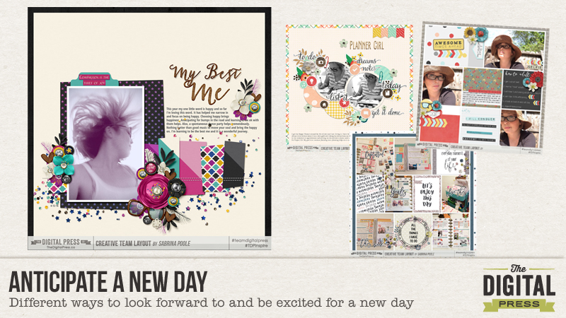
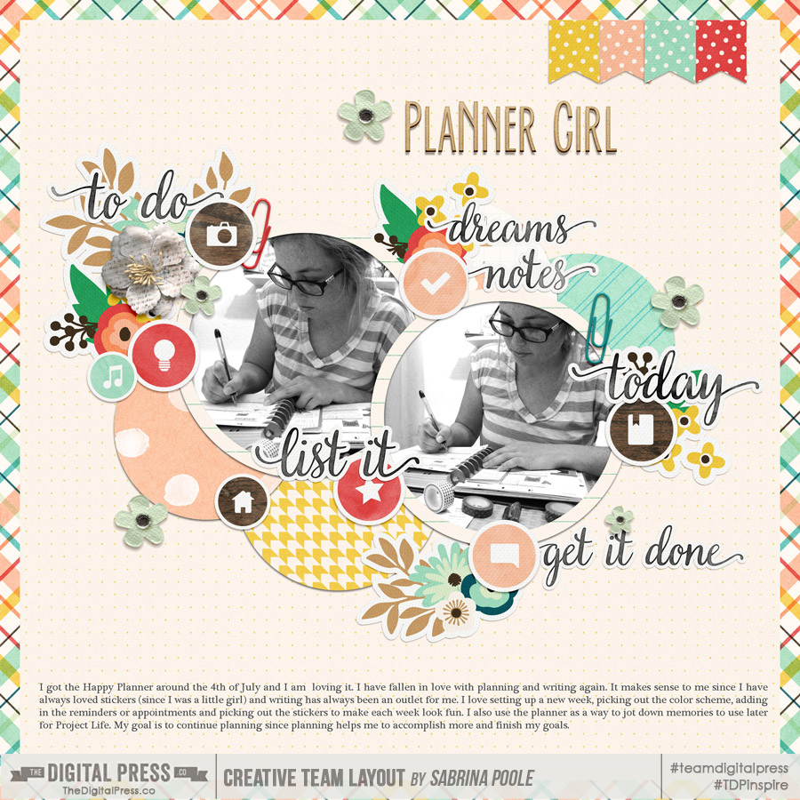
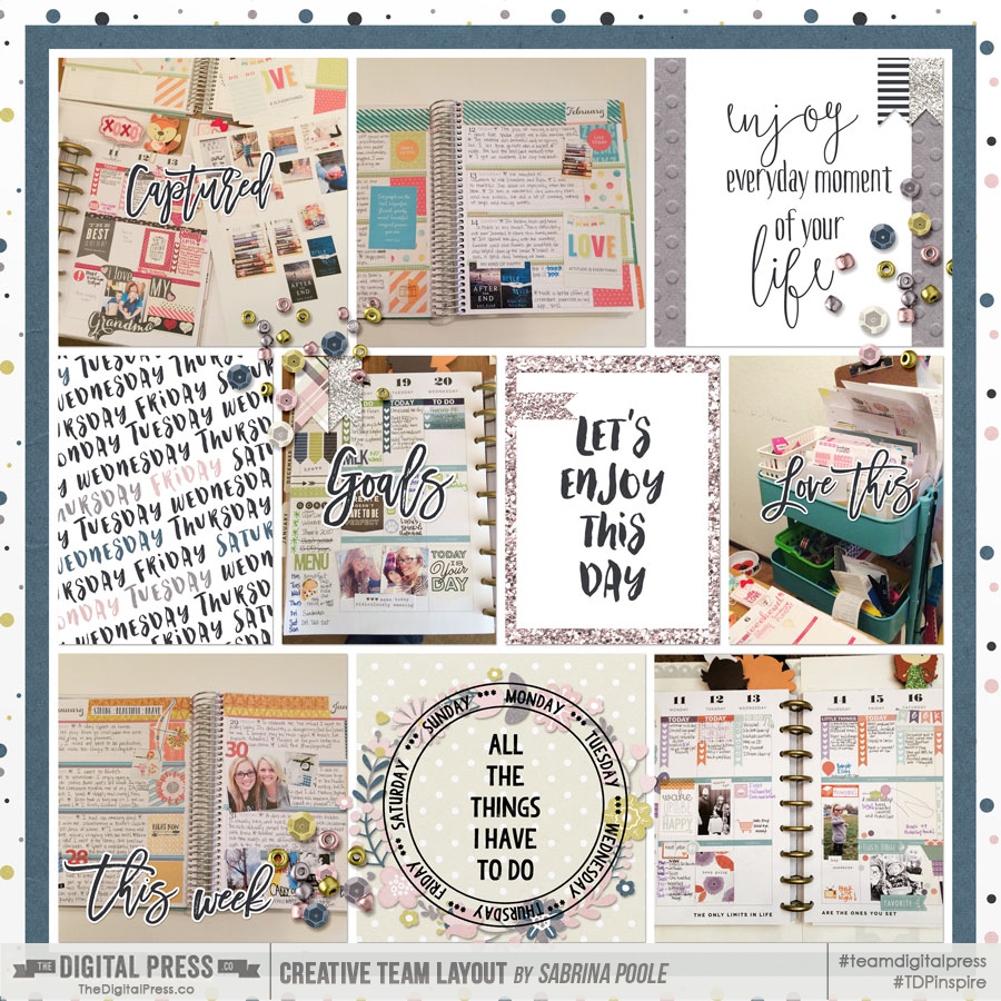
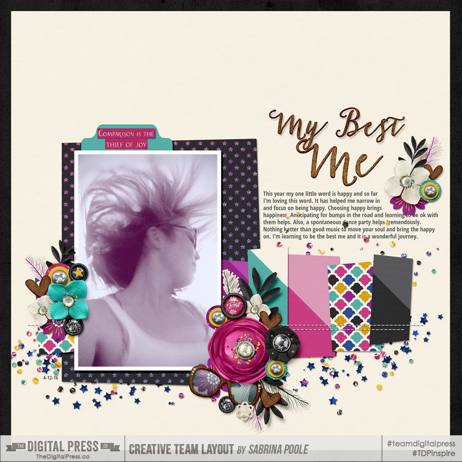
About the Author  Sabrina is an avid documenter of life — herself, her children, her hubby, and her everyday life. There is beauty in the ordinary moments, and they are what she loves to scrap. She is also always on the hunt for a quiet, peaceful moment, and she usually spends it reading.