Author: The Digital Press

Friday Favorites | November 29th, 2019

Hello and happy Friday! Welcome to the latest edition of our Friday Favorites series on The Digital Press blog.  While I love the excitement of new releases in The Digital Press Shop each week, I find it equally thrilling to scroll through the gallery and see the unique ways with which our fellow scrappers put digi scrap goodies to use.  Browsing the gallery is one of my favorite things to do when I find myself with a bit of scrappers block!  I’m so excited to share with you some of my favorite layouts from our amazing community of scrappers this past week.

(each image is linked up to the original post in the TDP gallery, which means you can click on the layout artist’s name or the image and check them out yourself, leave some love, etc.)

First I’ve selected this crazy fun page by southernmother. The main photo is big and bold and I love the added motion from the tilt of the image. Flowers and butterflies and so many other pretty details finish this layout off perfectly.

Next is this sporty layout by heidi.  The dark background paper contrasts nicely with the lighter colors of the photos, and I love how the series of images tell the story of the at-bat! Can you believe there’s only one little sliver of patterned paper on this layout? the elements and the photos speak for themselves!

And now this gorgeous and festive layout by MartinaL. So many beautiful details layered and stacked! The main rectangular elements are broken up by the circle frame over the photo (and peeking out of the corner), the epoxy snowflakes, and the circular flowers. Lovely design!

And next is a really fun and sweet hybrid layout by Ann-Sofie.  The rainshower hearts over the photo of a rainy dog-walk is too cute! And I absolutely adore the random scattering of circles on the right page.

And last but certainly not least, is this wonderful layout by helptheold is so sweet! I love the paint splatters and scorecard grid under the papers and the split design that makes amazing use of white space in the middle – just like a bowling alley!

Be sure to head on over to our gallery to check out all the amazing creations shared by our incredibly talented community members! And if you haven’t shared your layouts before, this is the perfect time to start! We’d love to see what you’ve been working on!


About the Author  Beckie is a creative team member at The Digital Press who lives near Austin, Texas. In addition to scrapping and photography, she enjoys spending time with her family, reading, and ignoring household chores. 

Tutorial Tuesday | PART 5: Use Products from TDP to Scrap on Your Phone

Hello, and welcome to another edition of our Tutorial Tuesday series here on The Digital Press blog! Today I’m going to show you a creative hack for using the Project Life App, something I like to call the “page within a page” technique. This technique is fairly simple and it’s a fun way to make your app-scrapped pages a little more creative. It’s also a great way to add more photos to your layouts without making them seem overly photo-heavy.

Before we get started today with my “page within a page” process… a quick recap, for anyone new to this series! You may recall that in my last Tutorial Tuesday blog post, I talked about some of the newer features of the Project Life App — like ‘Freeform Text’ and adding your own fonts. Additionally, be sure to read the entire “phone scrapping” series here on The Digital Press blog if you’ve never used your phone or tablet to scrapbook, and/or if you need a refresher on some of the things you can do.

And now, let’s get started with today’s project! Here’s a look at a page that I was working on in the Project Life app…

I use a light grey background from the ‘Project 52 2016’ kit and the white frame photo overlay is from the ‘Project 12 2019 May Overlays’ in the Project Life App. I really like the way the photos pop with the white frame on the neutral gray background.

Don’t worry about exiting out of the first layout, it will save in your library in the app. You could use any layout for this trick, I’m partial to the trio of 3×4 pockets into a 4×6 pocket, but the possibilities are endless. Get creative! Also, I leave the background white on this layout. I think It helps to coordinate with the frame overlay.

This step can get a little tricky. When you pinch and zoom in the app, it can be difficult to get it *exactly* centered. I think it’s easier to crop the photo before you bring it in to the app, either in your native photo editor, or even in Pic Tap Go (which is integrated right into the Project Life App). You can see I repeated Step 2 for the bottom left pocket.

I used k.becca’s Autumn Leaves & Pumpkins papers as pocket cards for this layout. She’s one of our favorite TDP Designer Alumni, visiting the site again this month for our 5th Birthday Reunion! Be sure to hurry and check out her shop while it’s open again during TDP’s birthday celebration (through 12/2).

Then I download the layout to my computer and open it in Photoshop to add embellishments, as well as any journaling or titles, if I didn’t add it in the app prior.

Here’s a look at the finished layout…

I love Karla Noel’s photo stamps! This one is from her Love Life – Sentiment Bits. The Thanksgiving title (recolored) is from Thanks – The Elements by Karla Noel too. I added other embellishments to fill in the white space on the trio of photos from Cornelia Designs – With a Grateful Heart kit.

I found some great layouts by our very own Meagan & Jenna from the Creative Team, in the gallery that used this technique.
Look at Meagan’s gorgeous layout. Now she used the Over app as well, but you can see how the middle photo pocket on the left side has the 3 square photos with the white space, that was done in the Project Life App. She used Rachel Etrog’s October Stuff kit. 

And this one by Jenna. She used Rachel Etrog’s At The Fair collection.

Can you tell we all love the neutral gray background with the white frame overlay on our photos? Great minds think alike.

Another fun trick is to “mat” your photos with a colored background using the ‘page within a page’ technique.

And here’s the finished layout after it got some embellishing in Photoshop.

Similar to my first page, I used Cornelia Designs – With a Grateful Heart kit, Karla Noel’s KN Touch font (for the title) and her Thanks – The Elements (the circle stamps). The coral colored background is from an app kit called ‘Brave Patient’

It’s a fun trick and a great way to add some color to your app layouts, but also what I’d consider white space, to allow for some embellishments.

Now are you asking yourself “Why doesn’t she just do ALL of it in Photoshop?” I know… I know. It’s a great question. Here’s my answer. I take the majority of my pictures on my phone and I love the ease of scrapbooking on the go with my phone. I can complete a layout while I’m on lunch break at work, while waiting in the doctor’s office, or even in bed! I used the Project Life App to get current after being perpetually 7-ish years behind. My love for the app runs DEEP. That being said, now that I’m caught up, I have the luxury of being able to spruce up my app layouts in Photoshop when I want to. However, if you want to do this all in Photoshop, here at The Digital Press, there is NO shortage of amazing pocket templates by our designers. Cornelia Designs has designed some stunning pocket templates in her Pocket Basics Template series, Anita Designs has quite a few template packs in her ‘A Story Captured’ series that lean toward pocket-style with an artistic flair, and Little Lamm Paper Co has a bunch of ‘Add-On Photoshop Templates’ that are great for adding multiple photos to one pocket.

Let me know if you have any questions about the Project Life App – I’d love to get you scrapping on the go! Be sure to post your layouts that use TDP products along with the Project Life app in the gallery! We’d love to see what you come up with!

Happy Scrapping!


About the Author  Ashley is a member of The Digital Press creative team. She lives in Utah with her husband, 2 young boys, and 1 lazy (but lovable) pup. She works full-time at a busy medical clinic. She has been scrapbooking since childhood… scrapbooking digitally for 10 years… and most recently (& obsessively) app-scrapping on her phone. 

Tutorial Tuesday | Using Masks and Overlays

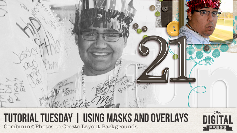
Welcome to another edition of our Tutorial Tuesday series here on The Digital Press blog! Today I’m here to share tips for using masks and overlays on your digital scrapbooking pages.

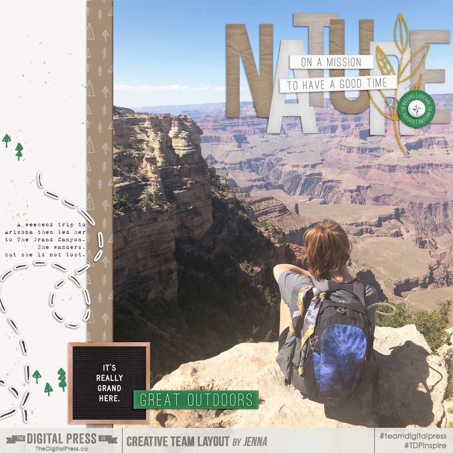
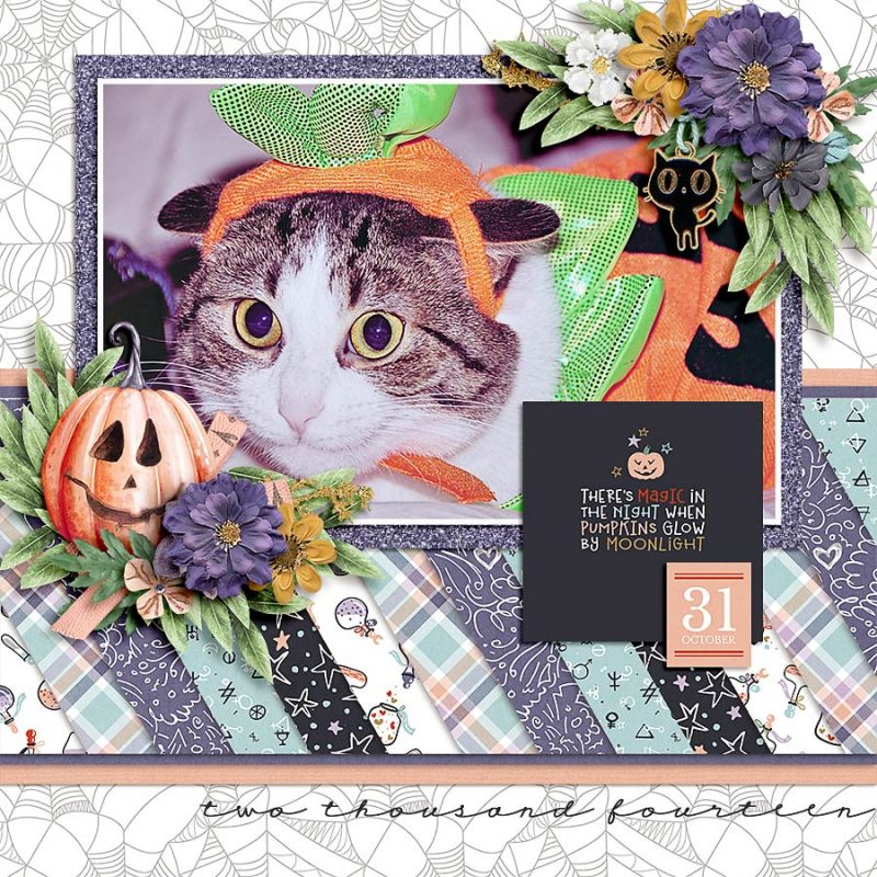
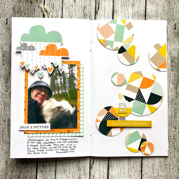
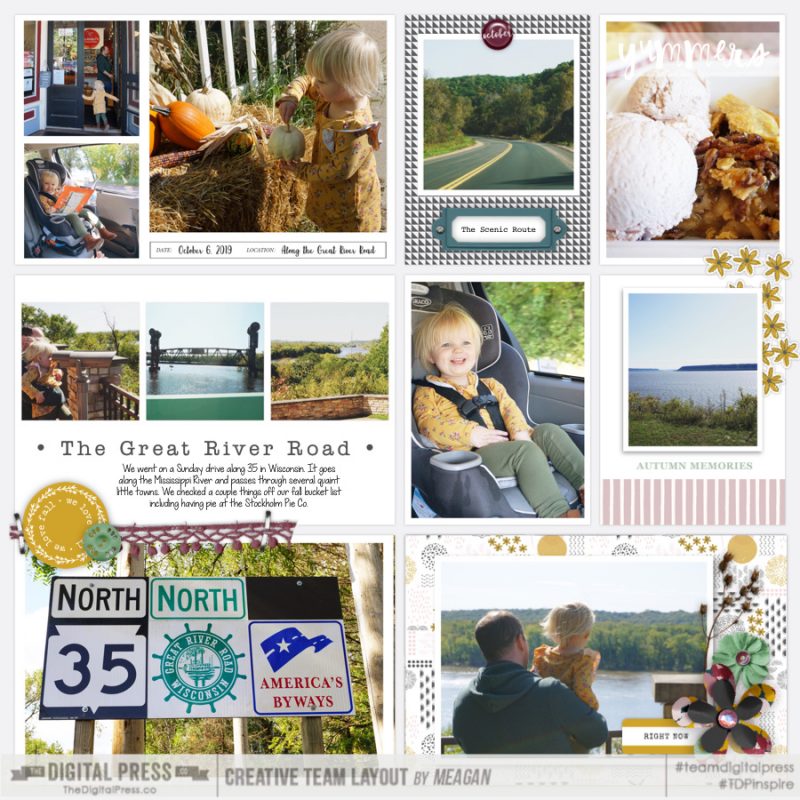
We all love those big-photo layouts, right, such as my example page just below this paragraph? You know… the pages which have that one spectacular picture that deserves all the accolades of being front-and-center on a page. But what happens when you want to create a collage, of sorts, and blend photos together? It might seem like a challenging task, but it’s not. Let me share with you a few quick and easy tips on combining photos to create a background for your scrapbooking layout.

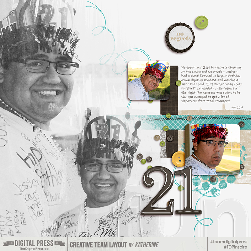
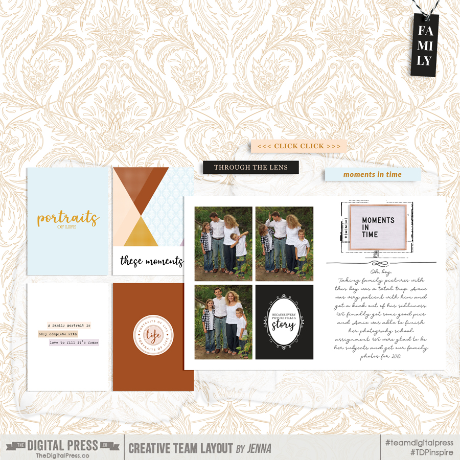
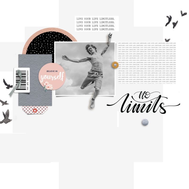
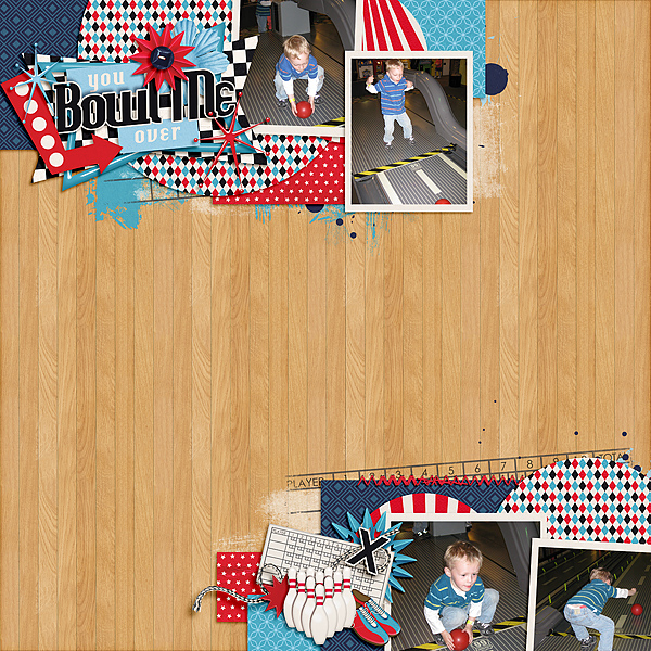
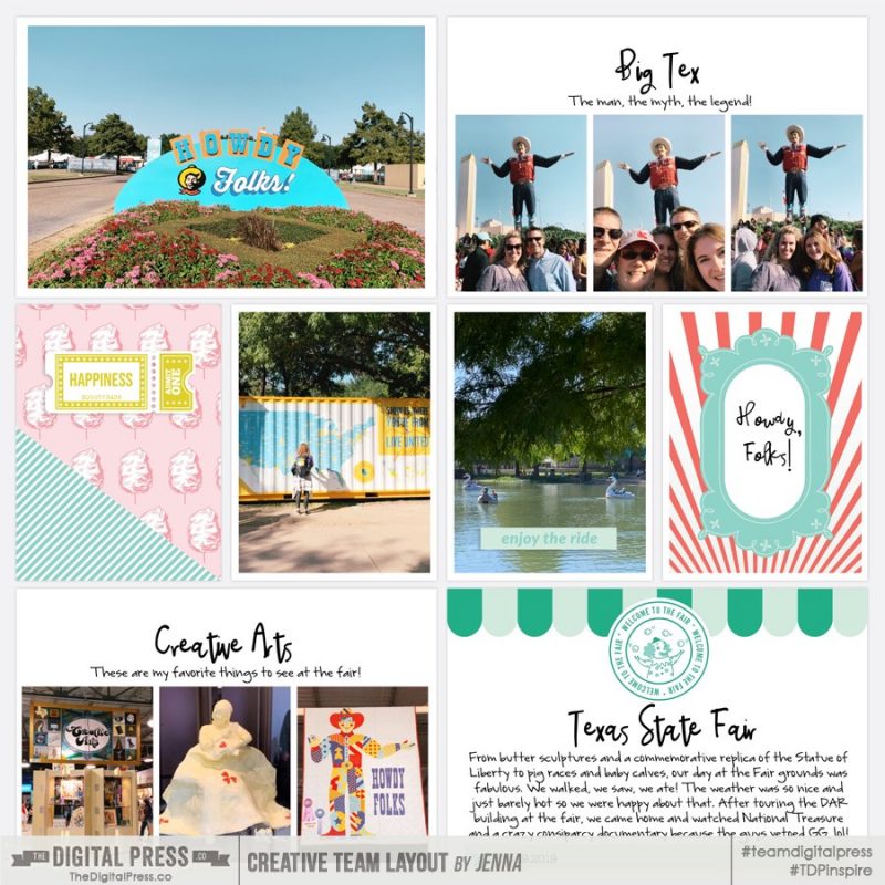
When I posted this layout (above) in the gallery, I received some love with a request for instructions on how I created the look of the overlapped black and white photos. Well, here we are! What I’m going to share are my own tips on how I achieved this look. As many of us know, there is often “more than one way to skin a cat” and the world of digital scrapbooking offers a multitude of ways to achieve a specific look or outcome. I’ll be using Photoshop CC for this tutorial, but the same or similar results can be achieved in Photoshop Elements, or any other program that allows for layers and masks.

Tip 1: Start with a neutral foundation

I typically start my pages with a white or off-white color. This allows for a more seamless blending of the photos (although I will note here that sometimes I don’t want the images to just fade away and the harsher edges are good to see). If you use a kraft paper or a darker color, you may need to play with Blending Modes a bit to get the right effect. But that’s the fun of digital, playing around to find what works for you! Personally, I would steer away from patterned paper unless it is neutral tone on tone and almost not visible.

In my layout I used a simple layer filled of a light grey, knowing ahead of time that I was going to convert my photos to black and white.

Tip 2: Select photos that work with each other

Easier said than done, right? How do you determine if the photos “work” or not? Grab two or three images and place them on your layout. Lower the fill percentage on the top photo(s) to make it slightly transparent. This will allow you to position the pictures into an arrangement that will work. Look for areas where the images naturally seem to fit together.

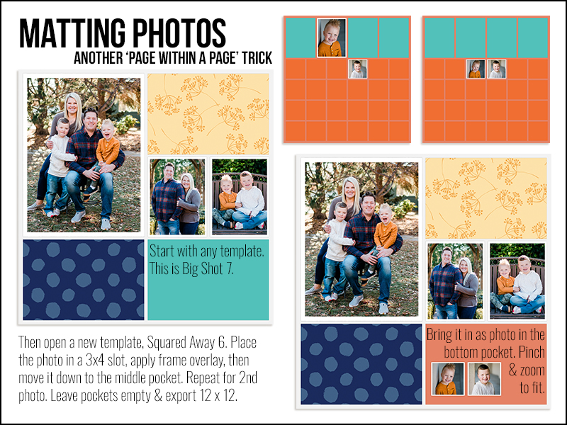
Here’s an example of how the photos I chose for my layout, when reversed, do NOT work (vs. the placement I ended up with for the final scrapbook page). The crown in the smaller photo is too close and overlapping with the face on the larger one … nope.

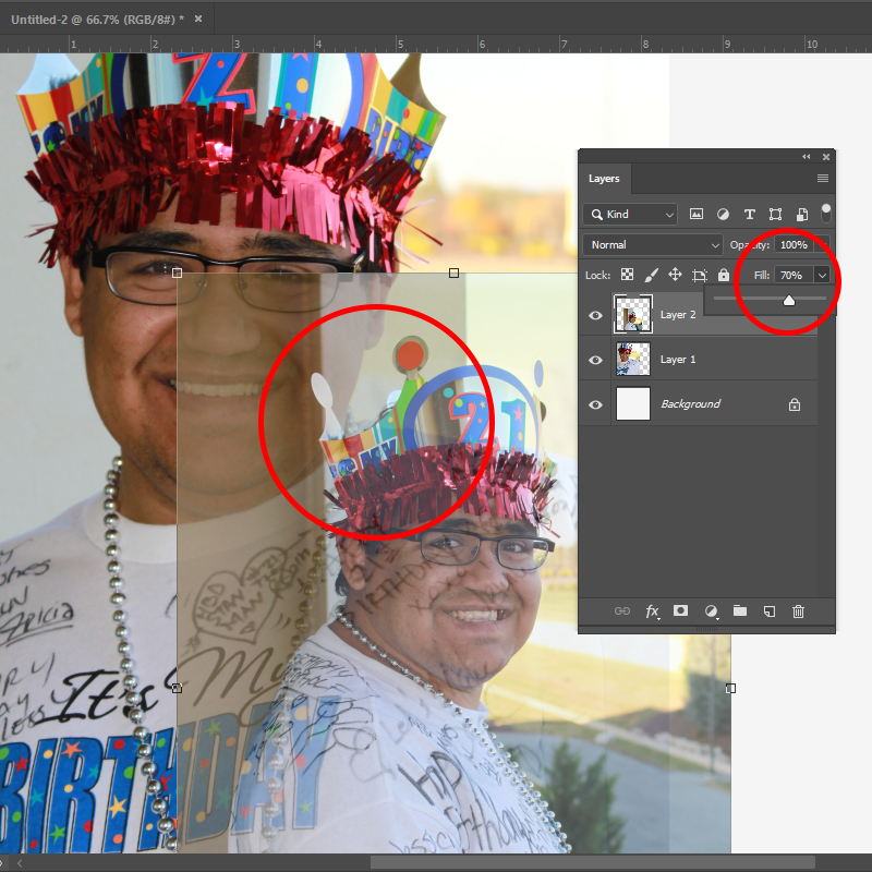
What you are looking for are natural lines where things like shoulders, heads, faces blend together. It’s a bit like putting a puzzle together.

Tip 3: Make it easy for yourself and use masks or overlays

With the foundation laid of where you’d like the photos, it’s a quick step to throw some masks or overlays under them (there are plenty of options in the shop). I’m usually looking more for a general shape of what I’m looking for, i.e., circular, rectangular, etc. and will seek that out. Some masks have ‘hard’ edges to them, but many have the softer, faded edges, which are perfect when you’re layering photos in the way we’d like to in this example.

Start by adding the masks over the photos.

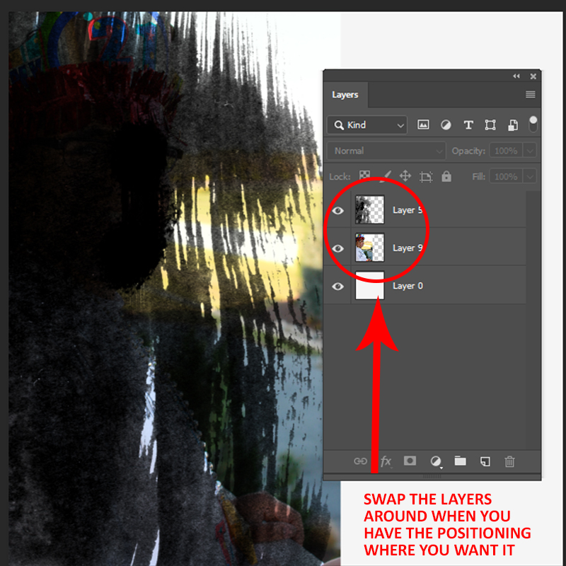
You may be reading this and thinking I’ve done things backwards. Surely you would do the masks or overlay first and then add the photos? Yes, you could. However, for my workflow with this kind of layout, I like to initially put the mask over the photo so I can see what will show through when I reverse the layers and clip the picture to the mask.

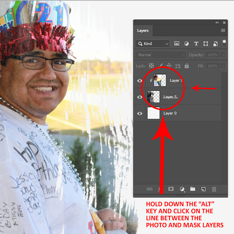
Sometimes through use of this process of line, I find a mask that just isn’t right or needs some resizing. In this example, the mask for the larger photo will reveal almost all of my son’s face, with other sections of the photo just showing through in bits and pieces — exactly what I was looking for!

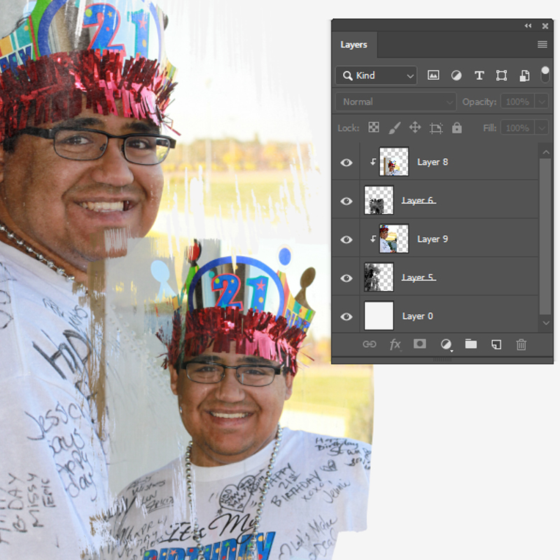
Repeat for all photos.

Tip 4: Don’t be afraid to “mask the mask” 

Sounds a bit strange, doesn’t it … “mask the mask”. We’d all love it if a scrapbook page came together 100% perfect 100% of the time. Yeah. No. Doesn’t really happen that way. Even in selecting what seems to be the ideal masks or overlays for layering your background photos, there might still be a need to adjust a few edges.

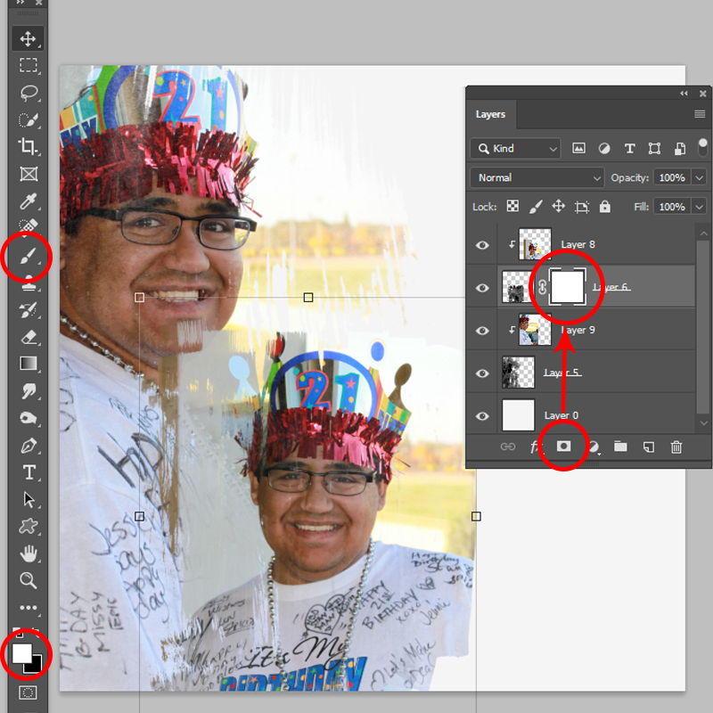
You’ll see here that the upper left and lower right corners of my smaller photo still need a bit of refinement.

Making sure you have the mask layer selected, click on the “add layer mask” icon in the Layers Palette. A white square will be added to the layer – this is the one you want to work on. Select a brush from your palette (soft round, artsy – whatever you like), and using black or white, “paint” the areas of the mask you’d like to adjust. Remember, when using masks, a black brush will conceal or hide things, while white will reveal (great if you accidentally hide too much).

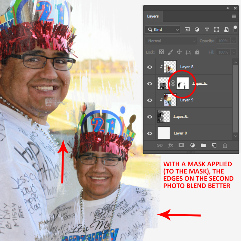
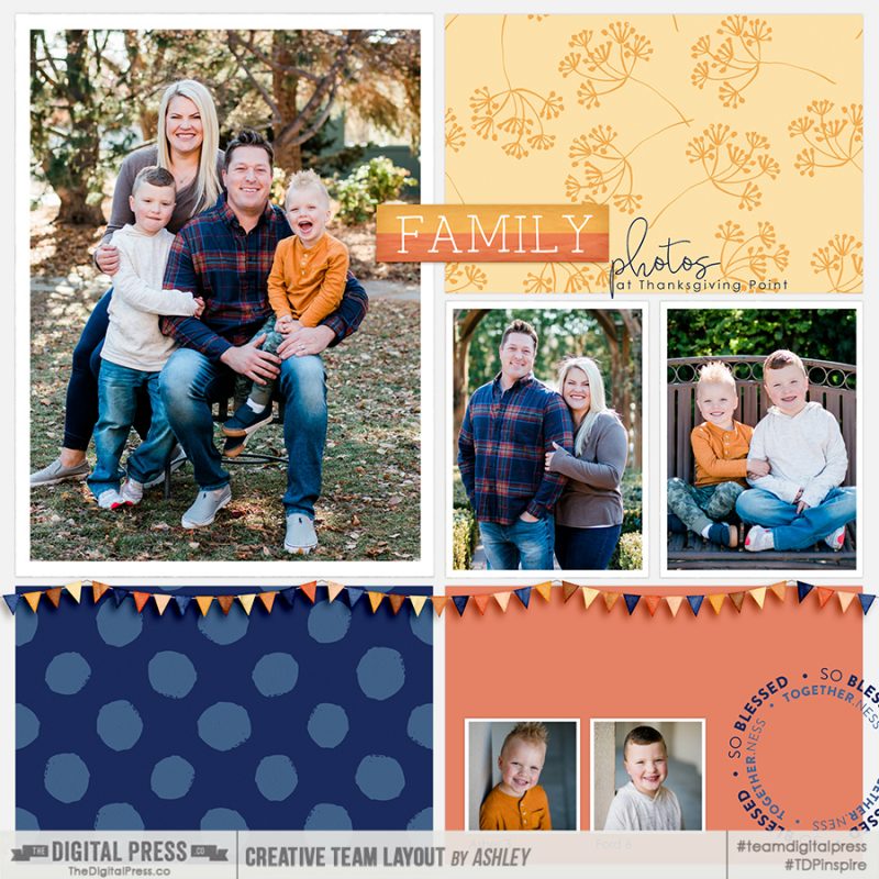
As you can see here, just a few small changes helps soften the edges and assist with blending the two photos. With my background now complete, I can layer in other photos or, as I did in my layout, add a template to the page.

While this might seem like a complicated process, it’s really only a few steps and then some artistic playing around to get the look you’d like – and with so many paint-like masks available at The Digital Press, why not give this technique a try?


About the Author  Kat Hansen is a creative team member here at The Digital Press. A HR Manager in the real estate industry by day, she loves the opportunity to spend a few hours each evening being creative. Vacation memories feature pretty heavily in Kat’s scrapbooking pages, as well as her health and fitness journey. Kat has quite the sense of humor (she “blames” her father for this), which she incorporates into her journaling and memory-keeping.

Hybrid How-To | Custom Holiday Place Cards

Hello, and welcome to another edition of our Hybrid How-To series here on The Digital Press blog! Today, I am excited to show you how I made some quick, simple personalized place cards for my Thanksgiving day table!

We don’t have a huge crowd for Thanksgiving, but everyone likes to feel welcome and know where they’re sitting… so these place cards are both pretty and functional. And of course, you can use your digital kits for any type of celebration, but with Thanksgiving right around the corner I thought I would get these ready to go in hopes it will motivate me that this is happening in just a few weeks!

My first step was to select a digital kit to work with; I chose this beautiful kit from Rachel Etrog Designs called Grateful Heart

I was drawn to the colors of this kit, as I knew they would work with my tablecloth and dishes. I also loved that sweet winter wreath, and the tags, and the flowers… and so on.

Once I had selected a kit to work with, it was time to decide upon on a basic design for my place cards. Using the wreath element along with some digital paint and solid colored digital papers, I drew out a 4 x 6 white card in Photoshop Elements (PSE). Then I applied the wreath and the “thankful for” word art to each card. I used the blank spaces to print some of my favorite printed papers and elements.

You can see how my pages looked in PSE (below). I then printed them as an 8.5″ x 11″ sheet on my Canon Pixar printer using matte presentation paper.

I also decided to add a simple blessing to the back side using more of the pattern papers. To do so, I just made a rectangle template inside the 4 x 6 card and added the solid paper… and then I typed in my words in PSE. I made a stroke around the inside rectangle, using one of the colors in the paper….I then cut and punched out all my cards and elements. I used different sizes of circle and banner punches with solid papers, patterned papers, and some vellum…


I basically played with the elements, putting the different shapes and sizes together until I got something I liked…

In using these layered embellishments, I was trying to give the cards some dimension… so I used a small tool and my fingers to “ruffle” the edges of one of the layers of paper in the flower, as shown here…

After securing everything on the front side with glue, tape and pop dots, I put the front and backs together. I secured them with a piece of scotch tape on the wrong side, and some pretty gold striped washi on the right side. Then I rounded the corners on the front of the card and attached a bow made out of string…

Then I cut out a few stars from my left over paper and found some sequins and glued them on the front for more interest and added dimension…

Here’s a look at the finished project on my table…

And that’s it! Super cute, and fun to make!

I hope I’ve inspired you to use your own digital products to make some holiday place cards! If you give this project a try, we would love to see pictures of your completed projects in the Hybrid Gallery at The Digital Press!

Happy crafting, everyone!


About the Author  KerriAnne is a homebody who resides in the desert southwest. She started scrapbooking when her kids were little, and hasn’t stopped despite the teenagers rolling their eyes and sticking out their tongues! When not scrapping or being a chauffeur, she can be found consuming large amounts of iced coffee.

Tutorial Tuesday | Digital Letter Boards

Hello, and welcome to another edition of our Tutorial Tuesday series here on The Digital Press blog! This week, I’m here to help you learn how to make a digital letter board image to use on your scrapbooking pages, thanks to our friends at Letterfolk.

Have you jumped on this trend and picked one of these up yet? The modernized-and-yet-vintage letter board of today is wildly popular and not likely going away any time soon. They are everywhere… and truth be told, they’re a lot of fun around our home. I have the Poet 10×10 size and enjoy adding quotes to it — both funny and sentimental. All the while, my kids watch to see what joke they can rearrange the letters into. It’s a fun way to decorate my home!

Now, with the help of this handy online tool at the Letterfolk web site, we can create digital letterboards to use on our scrapbook pages, as well (without the “help” from saucy teenagers).

It’s so easy! Let’s begin…

First, you will navigate your web browser to the Letterfolk website. Once there, scroll to the bottom of the page and click on the ‘virtual letter board‘ link…


Next, it’s as simple as entering a few lines of text and clicking through the options to customize your board.

You can customize everything from letter size, to justification, to line spacing, to board colors, to board sizes. Be sure to look through all the possible combinations; it’s endless!


After you’ve fully customized your board, click on the ‘Save Image’ button at the bottom of the screen and navigate to the folder you wish to save to.


Once you have your image saved, you can add it to your projects. The PNG images save at 1600×1600 or 1600×1280 (i.e. about 2-3″ on a 12″x12″ page)… and so they will look great on digital pages!

Here’s how I used these virtual letter boards on a couple of my pages…


If you’re not sure how to make one of these work for your pages, here are a few ideas…

  • Take a picture of your kid and use their funny quote on your letter board
  • Use a seasonal poem or quote along with some outdoor pictures
  • Don’t forget the first day of school and birthdays; add those special dates to the virtual letter board
  • Use song lyrics, bible verses, or a quote from your favorite author
  • Use it as a countdown image for an upcoming vacation, holiday, or special event
  • You can also search through Pinterest to find a lot of other great ideas, as well!

We hope you’ll give this fun process a try! We can’t wait to see what you come up with, and how you use your own digital letter boards on your own creations with TDP products to post in the gallery at TDP. Hop on “board” and we’ll see you there!


About the Author  Jenna is a traditional-scrapbooker-turned-hybrid-scrapbooker-turned-digital-scrapbooker-turned-app-scrapper. She’s made her way through each form of scrapbooking and loves them all, but for now her motto is KISS — “Keep it Simple, Sister!”  She mainly scraps on her iPad using a handful of apps, but the digital world often pulls her back in because there’s nothing like a good drop shadow. She prefers pocket-style scrapbooking, but isn’t one to shy away from an awesome template and a kit full of goodies.

Friday Favorites | November 1, 2019

Happy Friday, and welcome to another edition of our Friday Favorites series on The Digital Press blog! I love browsing through the gallery and seeing the amazing talent of our community members.  So much inspiration to be found!  I am very excited to share with you another showcase of the many amazing pages that can be found in our gallery!  We have a wonderful community of scrappers here at The Digital Press, and it’s always fun to see what they are creating with the amazing products found in The Digital Press shop.

Below you will find just a handful of the many fantastic pages I’ve seen in TDP’s gallery this past week (each image is linked up to the original post in the TDP gallery, which means you can click on the layout artist’s name or the image and check them out yourself, leave some love, etc.).

First up is this amazing page by DivaMom96. I absolutely love all the white space, and that adorable photo centered on the page with only minimal elements and papers used to highlight that sweet little smile. The paint splatters and brushes in the background add just enough pop, and the stamp and title (in the perfect font) just above the photo are spot on.  This page definitely demonstrates that less is more!

Next… here’s a great page by weaselwatchr. The paper strips in the lower half of this page add so much depth to this super fun page. I love the colors, and the clustering is incredible.  And that journal card is a purr-fect fit with that photo. Although kitty doesn’t look too thrilled, this page just makes me smile!

Additionally, here’s a fantastic layout by sylvia. I am in complete awe of her extractions. The way that young man just pops out of that photo is incredible. The elements that she places so carefully — along with the the birds stamped in the background — make this page stunning.

Next, I found this awesome page by Heidi Nicole. I love all the fun rectangle shapes on the page with little treasures tucked in to each one.  Her choice of papers fits perfectly, and that stitching is just my favorite.

And finally, I came across this beautiful fall page from AliceM. Fall is my favorite season, and this layout is all kinds of fall. The photos are gorgeous and are such a great choice for this particular digital kit. The shadow work is incredible, and the quote and the overall composition are both absolutely perfect. I love everything about this wonderful page!

These layouts are only a sampling of the many, many amazing pages to be found in The Digital Press gallery. I hope that you will take some time to take a look for yourself, and/or upload some of your own crafty creations!

Don’t forget each week our amazing designers add lots of new products to the shop, so don’t forget to take a look and see what you need to finish your pages so you can upload them to the gallery. Maybe one of your pages will be featured in an upcoming edition of Friday Favorites, too!


About the author  Tia is a member of the creative team here at The Digital Press. A mom to a 14-year-old son, her favorite thing to do is serve those in her community who need help, and volunteer at a small alternative private school for children with special needs. When she’s not volunteering or working on school projects, Tia loves to spend time with her friends and family!