Hello, and welcome to a new edition of our Tutorial Tuesday series here at The Digital Press Blog!
I am Corrin, and I am a font hoarder! I know that I am not alone in this, and so I hope that today’s tutorial will help all of us find some fun new ways to use all of those fabulous fonts.
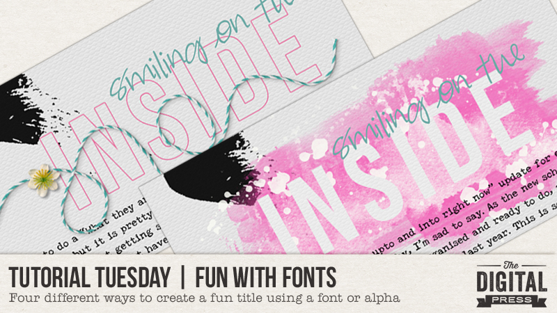
I have recently been trying to put titles on my pages more often, and so I have been looking for ways to make my titles stand out — even while I am using the fonts and alphas that I love and use all the time. For the examples I will show you today, I will use the same page, but will change the treatment of the font that I have used for the title.
Here are the different ways I have tried using the same font today…
- Stack it
- Add a Stroke
- Clip a paper to it
- Erase from a brush background
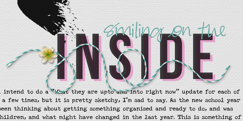
Stack It
First, I rasterized the font (Layer–Rasterize–Type), which is actually the first step for all of these techniques I’ll be showing you today. Then, I duplicated the layer and moved one of the layers across and up or down just a little. You can play around with how far apart to have the two titles, and how similar to have the colors, as well. I chose to use a deep black title, to echo the deep black image on my page, and then contrasted that with a lighter pink for the layer behind it…
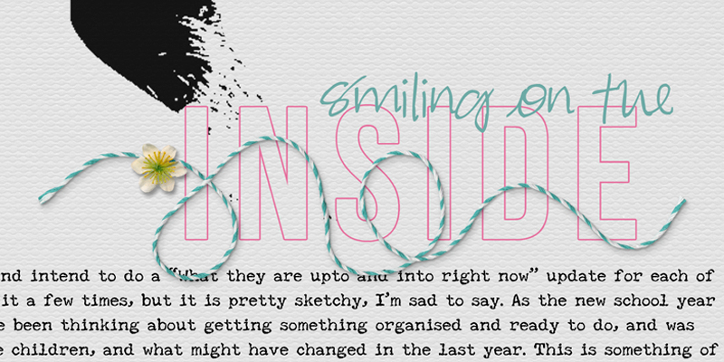
Add a Stroke
Again, I began by rasterizing the font… and then I added a stroke to it. You can choose to add the stroke to the outside of your text, the inside, or a bit of both (the center); it is really just about personal preference, so just try them all out and see which one you like best. Adding a stroke gives the font a really nice crisp and clean edge, and helps it stand out from the background paper. You can easily change the color of the stroke, so I chose to use a pink stroke around my white text. I think that leaving the layer with no shadow makes the title look like it has been printed right onto the page…
Clip a Paper to It
Once the font is rasterized, you can clip a paper to it — a technique that can add color or texture for a fun look. Adding a small shadow to a plain paper/font can make it look like the title is a stylish vinyl sticker or die-cut paper pieces… while a deeper shadow can create the impression of chunkier letters (maybe foam, thicker cardstock, or even woodchip). You can clip a plain paper or a patterned paper — both work really well with a small shadow if you want to create the impression that you cut the letters (very neatly!) out of paper to create your title…
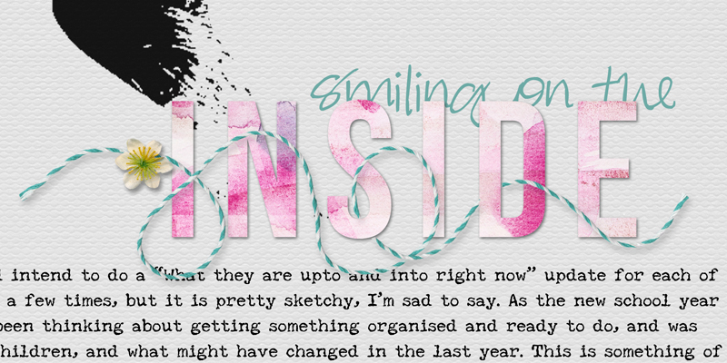
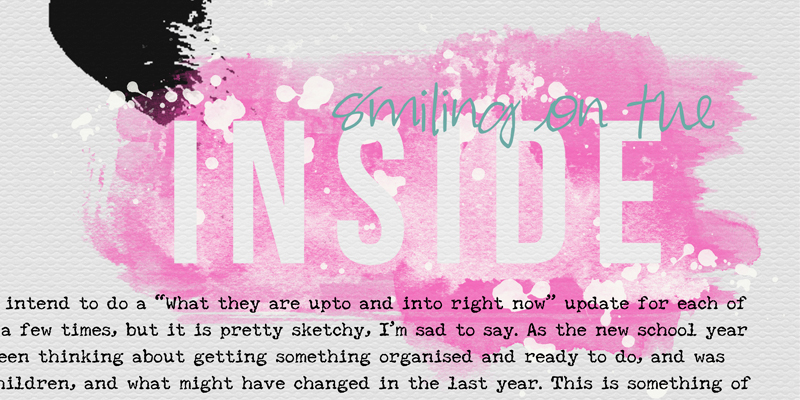
Erase the Title From a Brush
Lots of kits have a painty brush included — or you can also find separate sets of brushes in the store, as well — and these can make a great background on which to put your title. In this example, I layered some brushes in different shades of pink and white, and then I laid my white title layer over the top. This made it look as though my title was erased from the pink paint/brush – as though, in real life, I’d used a stencil and painted around it. I think this is quite a nice artsy look…
You can combine some of these ideas together, as well… perhaps clipping a pretty paper to the rasterized font, and then add a thicker stroke to make your title look like a fun sticker. Or, use a plain title with a thin stroke, and stack a layer below it for a clean, graphic style title… it is really up to you! Endless possibilities.
In the end, I chose to clip a white paper to my title font, and stack it over an aqua font, with a pink painty mask too! Here is a look at the final page I created…
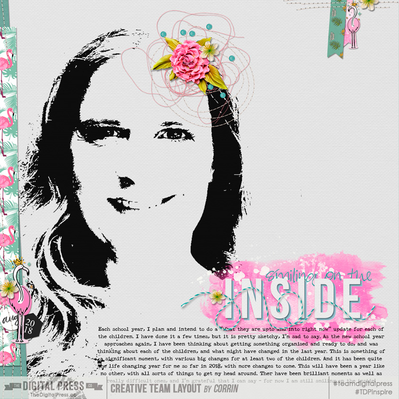
[I used Flamingo Love by Rachel Etrog Designs, Sakura Stitches by ninigoesdigi, and Words & Bits – Two by Dunia Designs]
I hope this gives you some ideas of ways to play and have fun with your fonts, and these ideas would work with many alphas too. I hope you will have a go and see what techniques and combinations appeal to you, and maybe even link me up to your own creations (or leave some of your own font/title suggestions?) with a comment here on the blog. 🙂
 About the Author Corrin is a member of the creative team here at The Digital Press. She is a fan of the Big Bang Theory and a lover of cozy pajamas or flip flops when the sun finally shines! She lives in the breezy South of England with her husband and 4 crazy kids, who regularly discover & plunder her secret chocolate stashes, and hopes that maybe this will be the year she reaches the bottom of the laundry pile!