Hi, all! Heidi here with a simple little trick that will help make your shadows a little more realistic.
I don’t know about you, but I am a sucker for premade shadow styles. Push a button and done. So today we are going to be using Sabrina’s new Shadow Styles. One thing I have discovered though, is that sometimes, the COLOR of the shadow just isn’t right. And if the shadow looks bad, where is your focus? On what is “wrong” with the layout instead of your focus being on your subject.
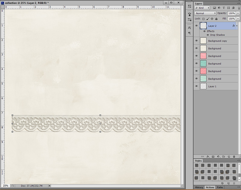
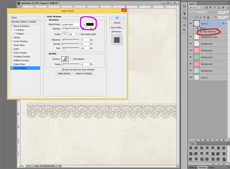
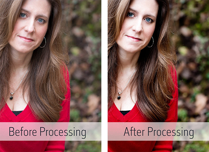
So in the screen shot below, the shadow on the lace is from Sabrina’s Shadow Style. It is the perfect size, but the color is way to dark for the paper I am using.
To change this takes less than 30 seconds … ready? Double click on the Drop Shadow effect (circled in red on the screen shot). It will pull up your layer style box.
Once you have the layer box open, make sure “drop shadow” is highlighted like mine is in blue. Next, you will click on the color box circled in purple below. That will open up the box to be able to change the color of your shadow.
Photoshop should now look similar to this:
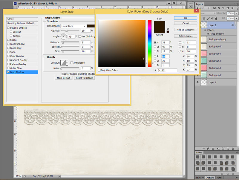
Notice the small white circle in the color box (bottom right)? That is the color of your shadow. It is way to dark for the paper I am using, so my next step is to move my cursor over my paper that I have my lace on and click on the paper. Notice how the white circle moved to the top right and the actual color changed from an orangish color to a little more yellow as well?
That means I now have a more accurate shade to create a shadow from. Also, notice how my shadow pretty much disappeared? It is now the same color as the paper, so it is hard to see an actual shadow.
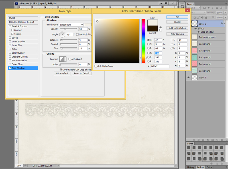
What I want to do is move my cursor back up to my shadow color box and pick a new shadow color. When I have a hard time finding a realistic color for my shadows, I stay with a grey color. Look at shadows around you right now … grey is probably what you will see. Sometimes, I can stay within the brown color for my shadow, but just pick a lighter brown. Play around with it. Click on lighter greys, darker greys, which color works for the paper you are using?
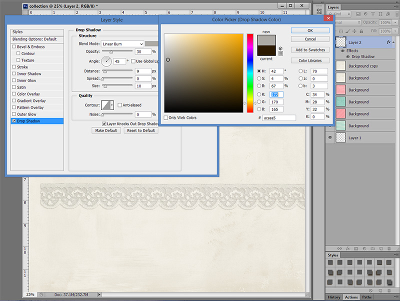
Here is the color I finally picked:
Much softer and a little more realistic right? Don’t believe me? Look at my first screen shot again. That shadow is way to dark. 😉
I usually use this method with pink paper. Brown shadows overall work great! Which is why Sabrina chose the color she did. But every once in awhile, you get that one perfect paper and horrible looking shadows. Now you know how to fix it fast and put the focus where it should be!!
Heidi has been scrapping for 17 years. Her passions include dark chocolate, photography of her family and reading Christian fiction. When not doing one of these activites, she can be found working at an elementary school library or enjoying being a SAHM.
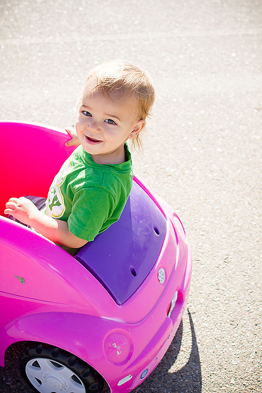
Part of telling our story is including the details that make up our everyday. Sure I love to scrap all the fun, BIG moments- our vacations, birthdays and holidays. But some of our most cherished moments happen in the mundane of our everyday.
Here are 3 easy tips to help you Capture the Everyday:
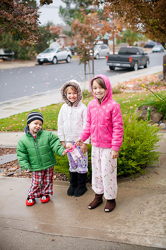
1. Keep your camera out and ready.
I keep my DSLR (Canon Mark ii) on all the time with a Memory Card in it. It sits on our kitchen counter ready to be grabbed at any moment. I admit I grab my iPad or iPhone 70% of the time to catch our everyday moments, but I do try to use my DSLR as well. I think mobile photos make great everyday pocket pages. The photos aren’t generally the best quality and would look best sized smaller.
I have a smaller camera (Canon 7d) “my diaper bag camera” that I take with me to the park or on vacation. If I had to lug my big DSLR, I most likely wouldn’t take as many photos. I can also fall back on my phone too.
2. Make the Effort.
It takes effort to document your daily life. The thought of documenting every.detail.of.our.day seems daunting. It overwhelms me to the point that I don’t want to do it. I actually want to do the opposite! lol
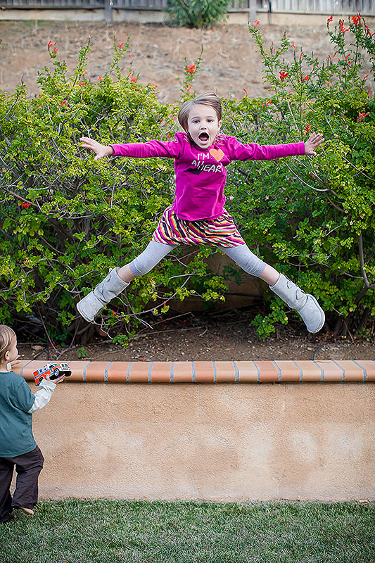
I let myself off the hook and capture a moment here and there. I focus on things my Kids like to do all the time- play Barbies, Legos, ride bikes, etc. I snap a few pictures and then join in with them and have fun.
3. Let your Kids in on the Fun!
My Kids are so used to seeing a camera out and they are getting interested in taking photos too! And what a great way to get in some of the photos too! Hand over your camera and let the Kiddos in on the fun too! I love downloading the photos after they have had my camera and seeing what they captured.
About the Author: Krista Lund is a mom of 3, married to her High School Sweetheart living in SF Bay Area. Some of her favorite things are brownies, chips n dip, taking pictures and documenting her family’s story.
Hello everyone – Judie here with my first blog post and related challenge at The Digital Press! I’m going to be talking about the “oh so dreaded” selfie (well, for some of us, anyway). But it really doesn’t have to be that way – I promise! We all know the importance of documenting ourselves along with our family and friends, but too many of us skip over it because it’s a pain to take selfies, or we don’t want to give up the camera to someone else, or we simply hate taking photos of ourselves. If you’re not one of those lucky people who are naturally photogenic and love snapping selfies, then this post is for you. Even if you are a selfie aficionado, you might just pick up a couple of cool tips along the way. 🙂
I was definitely one of those people (the one who always ran away from the camera unless I was behind it taking the photos), until I decided to make a project of it last year, and now I have a hard drive full of selfies and a gallery full of layouts that document me. So, how did I do it? I was simple really, instead of focusing on taking pictures of myself, I focused on the process of learning about portrait photography. That way, the focus was on growing my photography skills, as opposed to just taking photos of myself. This approach really helped me to get interested in the process of documenting myself and, after a while, I found that I really enjoyed it (both the photos and the scrapping).
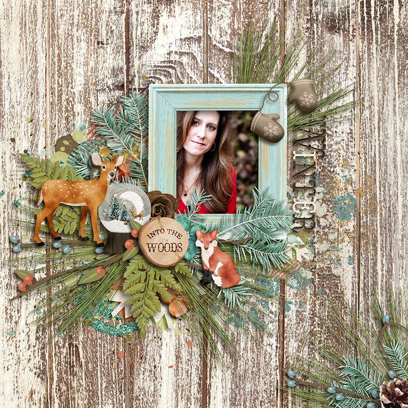
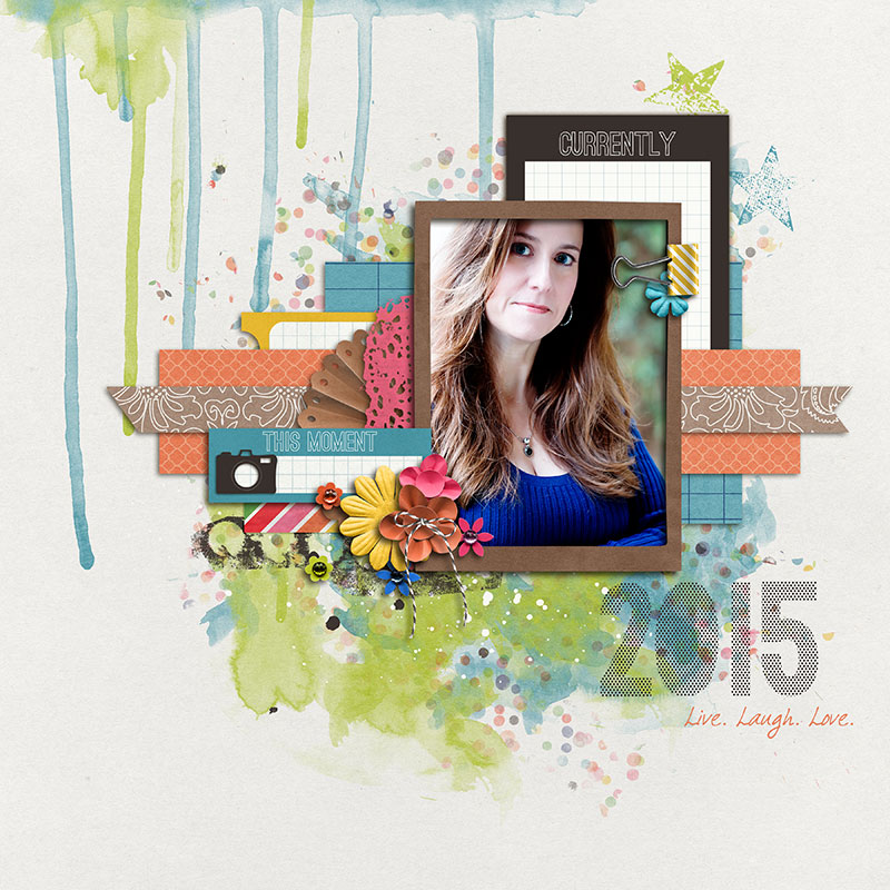
This is one of my favorite selfies (taken in December 2014):
Created with Woodland Winter by Studio Flergs
Step One: Taking the Photos
I thought I’d start by sharing my process with you, and then suggesting some other ways to put the photo focus on you. As I mentioned earlier, I encouraged myself to take selfies by approaching the project as a photographic learning experience. There are many online tutorials and tons of books and resources on taking selfies or head shots. If you Google “self-portrait” you’ll find many free articles and videos, but here are some of my favorites:
These are just a few of my favorites, but there are many more resources out there. I’d love it if you’d share your favorites in the comments to this article. 🙂
I used my DSLR (Canon 70D), 100mm lens, tripod and remote shutter release for my selfie project – but you don’t need all of this equipment. I would highly recommend some type of tripod, though. It will give you much greater freedom in terms of your environment and posing if you aren’t limited to the reach of your arm. A camera with a repositionable viewing screen and remote is also optimal because you can see exactly what the photo will look like before you take it. This set up gave me the opportunity to test different poses and determine which ones worked the best (without taking 100+ photos). Of course, you don’t have to focus on the technical photography details. If you’re more comfortable taking arm’s length selfies with your cell phone – go for it! The most important thing is that you get in front of the camera.
Here are some tips from my year-long selfie taking experience:
Try to take photos in natural light whenever possible (you’ll like the results a lot better).
Don’t take photos in bright sunlight, though. If it’s a sunny day, take photos in a shaded spot or at sunrise/sunset.
Try to vary your environment and poses so that you don’t have a group of photos that all look the same at the end of the year.
Don’t be afraid to include props in your photos (such as a Starbucks cup, football, favorite book, cell phone, etc.).
Remember that a selfie doesn’t have to be limited to just you! Feel free to include others in your photo to document your relationships.
If you don’t like yourself in photos, wear sunglasses. Everyone looks cool in sunglasses – seriously.
Get creative and really let your personality shine through in your photos!
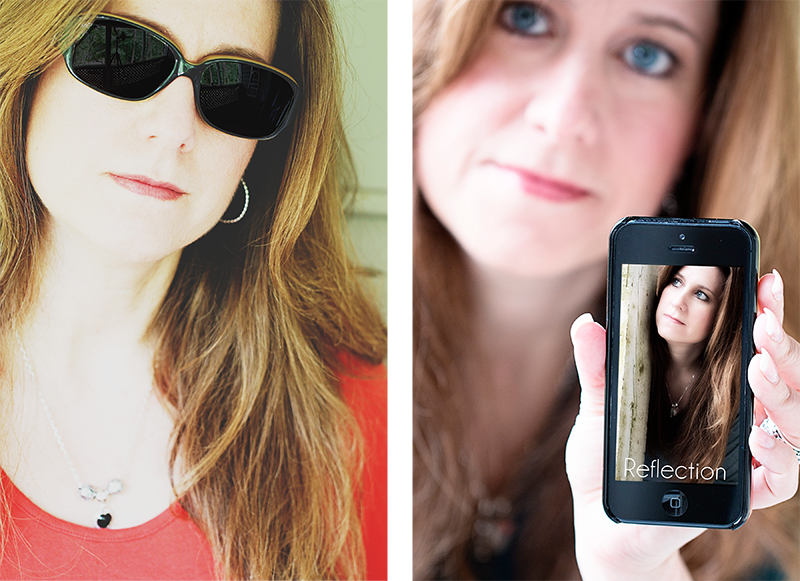
Here are a couple of examples of creative selfies. One that I used several filters on (see what I mean about sunglasses?) and one with my iPhone that I used as a “frame” for another photo:
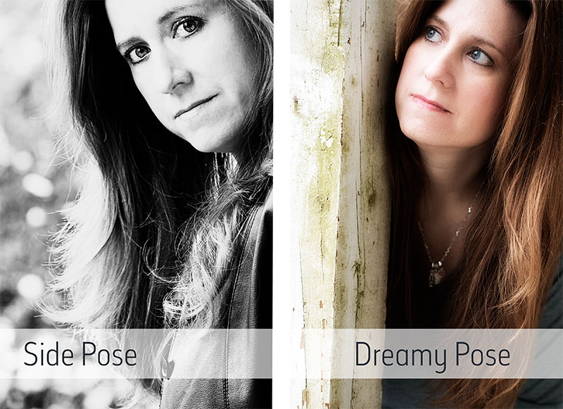
And here are a couple examples of non-traditional (straight on) poses:
Step 2: Getting the Photos Out of Your Camera
The next step is getting those photos out of the camera and ready to go in your scrapbooks (digital or hybrid). If you are using your cell phone, you may be able to process the photos right on the phone itself, or you can download and process them in your favorite software (Lightroom, Photoshop, etc.). I shoot in RAW and use a combination of Lightroom, Photoshop and RadLab for my photos. I start by doing basic adjustments in Lightroom (white balance, exposure, sharpening). Then I tweak the photo in Photoshop (eye pop, skin softening, etc.). Then I export to RadLab and add my favorite adjustments there. Don’t go overboard with the process though. The whole point of this exercise is to have photos that document you. The last thing you want are photos that look over-processed or nothing at all like you. My post-processing goals are limited to making basic adjustments and adding a pop of color (or converting to black & white). The entire procedure only takes me a few minutes for each photo. Even this basic post-processing can make a big difference, though. Here is an example of a photo straight out of the camera, and after post-processing:
There are hundreds of resources for photo retouching techniques, but one of my favorites for Photoshop is Professional Portrait Retouching by Scott Kelby. If you Google “photo retouching” and your software program you’ll find many free tutorials and YouTube videos on the subject. You can spend as little, or as much time on the post-processing as you like, just make sure the the final result is still true to YOU.
After a selfie shoot, I generally download all the photos onto my computer and pick out my favorites. Then, I delete (yes, I said delete) all the other ones. One disadvantage to shooting in RAW format is that the files are pretty large, so I don’t want a bunch of photos that I’ll never use taking up space on my hard drive (or external hard drive). While we’re on the subject of EHDs, let me take a second to remind you to back up your photos. I don’t delete them from my camera until I have them saved in at least two (often three) different places. Generally, I have a copy on my desktop hard drive, a copy on an external hard drive, and a copy in the cloud. If I do the back up as I download from my camera, I never have to worry about losing anything. After downloading the photos, I put the selfies in their own organizational folder in Lightroom. That way, I have them all in one place and don’t have to go through folders by date to find the one I want. Sometimes, I do the post-processing before I know what digital page I’m going to use the photo on, but most of the time I process them as a scrap. As I mentioned before, my post-processing only takes a couple of minutes, so it’s not a big deal to wait until I know whether I want to use a color or b/w version of the photo.
Step 3: Getting Creative & Documenting YOU
The whole point of this exercise is to document YOU and your life, right? So it doesn’t do any good to take photos and leave them on your computer. As digital scrappers, we document with photos and (sometimes) journaling. So let’s talk about the best part of the process – getting creative with your selfies! I talked about some ways of getting creative when taking the photos, but as you know, creativity knows no bounds with digital art. Here are some of my favorite ways to incorporate selfies into a digital page:
Include the post-processed photo on a traditional digital page.
Blend a photo into the background of an art journaling page.
Apply an artistic filter to the photo and use it on a page.
Include the photo in a pocket scrapping page.
Make a review page, including selfies from throughout the month, quarter or year.
Make a photo shoot page, including selfies from a particular photo shoot.
Use a photo with you wearing sunglasses and replace the lenses with reflective photos or patterned paper – BE CREATIVE!
Again, the most important part is to get the photos off of the computer and into a page documenting you. If you are uncomfortable scrapping photos of yourself, try doing something creative with the photo such as applying a sketch filter and blending it into the background of the page. Ready for some selfie inspiration? Here are some examples of some of the the styles I mentioned above:
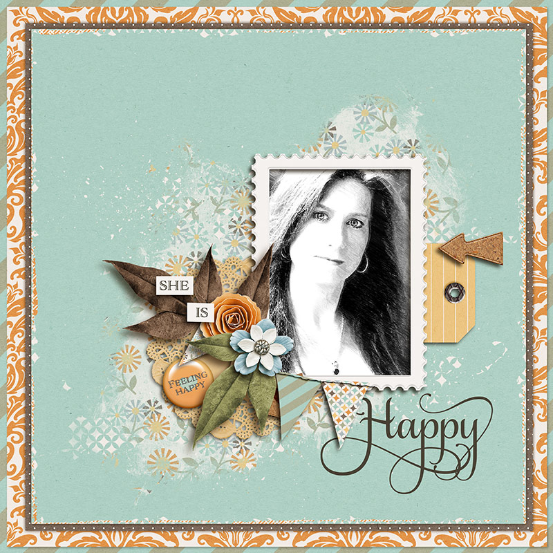
First up is a traditional page with a post-processed photo:
Created with Krafty Basics by Mari Koegelenberg Creations
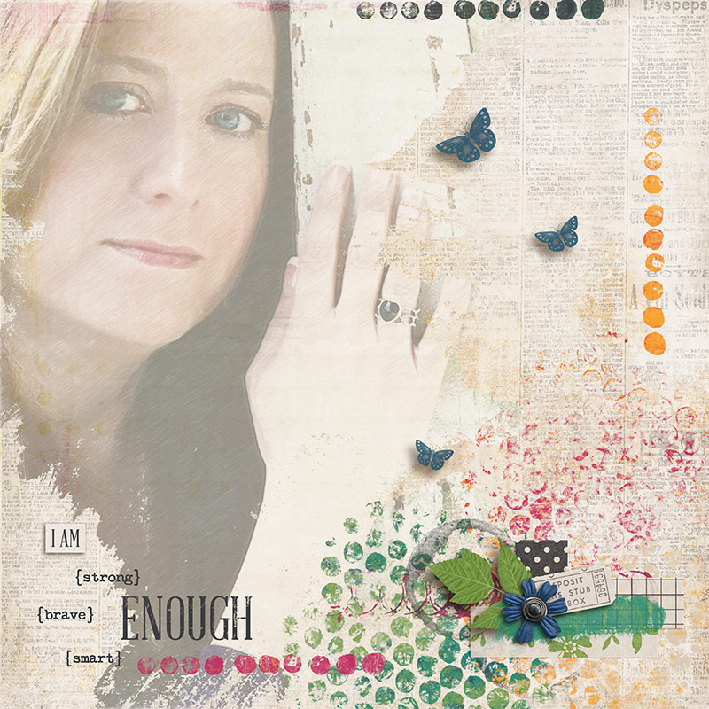
Here is an example of an art journaling type of page with a sketched version of the photo blended into the background:
Created with It’s Complicated by Sugarplum Paperie
Finally, here is an example of using a photo with a sketch filter applied:
About the Author: Judie is a member of The Digital Press creative team. She spends most of her time engaged in creative endeavors of all sorts. Traveling, Starbucks, football and Harry Potter are just a few of her favorite things.
How far have you been come with your New Year’s resolutions? If you made it to today, you pretty much left the danger zone. The first 21 days of the new year will show if we will make it or break it. I set a resolution, that I will try something new in my creative realm at least once a week. If this wasn’t your resolution, don’t worry. I hope after you read this tutorial you WANT to try something new.
You wouldn’t believe how detailed I can become when it comes to finishing my page. I can spend up to a quarter of my scrapping time with finishing details AFTER I completed my page embellishing. I often tweak my shadows until there is nothing but custom shadows left on my page items. I can show you how I do this in my next tutorial. Today I will narrate a bit about my other obsession: Overlays on the whole page. They come in various colors and benefits. I will show you how I use color and gradient overlays, blended textures and photo actions for my page finish. This usually doesn’t take me that long. It can be pretty fast once you know how to do it.
Color Overlays
Color overlays can create a special mood on your page like vintage, fresh, clear, girly, dreamy… whatever you think fits. It can also help in gaining color consistency, especially when you draw elements from different kits with different tones or shades.
In short how you do it: Go to the top of your layers panel, 1. click on the adjustment layer icon and on 2. Solid Color. The color picker dialog opens and you 3. chose a hue and your 4. tone or shade (more to that later). Then 5. set your blending mode to overlay or soft light, opacity 8-15%. You can always play with blend modes or opacity, hue, saturation and brightness to your liking. 6. You can always change your color by double clicking on the layer color.
Follow the steps for applying a color overlay
Depending on the color you chose, you will get different effects. For a vintage effect, use an orange hue. Sometimes a deep purple will work like that as well. For freshness, use the hue spectrum from green to blue. If you want it hazy, use the screen or lighten blend mode. Of course you can always take the effect away from parts of the page when you mask it out. 7. Use a soft brush on the layer mask 8. with 20-30% opacity and turn the foreground color to black before you 9. partially hide the layer by brushing into the layermask. With all overlays I usually go very subtle. Someone looking at the layout will most likely not notice the overlay although the mood that is created is noticeable.
Gradient Overlays
The effects of gradient overlays are pretty similar to the color overlays. You can create a little more movement on your page when you use them like a color overlay. I usually apply them to make the page seem more like a real paper page. What you do here is to make the parts of your page that are close to the virtual light brighter and the other parts darker.
1. Create a new layer on top and 2. choose white as your foreground color. 3. Click on the gradient tool in your toolbox. It’s housed with the paint bucket tool. 4. Choose the first gradient in the list and use the 5. linear gradient with 6. Dither and Transparency checked. Before you drag the gradient out, be sure to know where the shadow on your page falls. This is the side where the page has to get darker. 7. Drag your gradient line from the virtual light source of the page to the side where the shadow falls. 8. Set the blend mode to Soft Light and opacity to about 30%. You can always change the gradient later by using the gradient tool again. Play around with the gradient and the blend mode settings.
Follow the steps for applying a gradient overlay
Here you see the difference it makes. I used two color overlays, both masked off for a gradient effect without using the gradient tool. Plus the black and white gradient overlay. The page feel is sunnier and has a little more dynamic with the lighter/darker effect of the gradient.
Left without overlays, right color and gradient overlays.
Textures
If you really want to play around and try something a little weird, use textures. You can get free textures everywhere on the internet. Of course you can also buy them. Just google „photo textures“. Your digital scrap stash might be handy as a texture provider as well. Pretty patterns or worn paper textures may work. Or you create some textures by yourself. Use your camera and try it out!
I will show you how I used two photos I shot myself on the following layout.
Layout without added texture
One with roses, one with something I shot when I got bored at a party. I just photographed the windows of the house across at night. For blending a texture in, the photo doesn’t have to be perfect in any way. You can get creative here!
The textures I will use for the example.
I layered the bokeh shot on the layout with blend mode Color Dodge at 40% opacity. The difference is very subtle. It’s just a little added dreaminess. It’s most visible on the large blue flower.
Layout with added bokeh texture
The roses were a little trickier. I used blend mode Hard Light at 12% Opacity plus an adjustment layer Hue/Saturation, colorize checked with an orange hue and lot of lightness. You don’t have to remember these settings! Play around with the settings on your page until you get something you like. Use what comes to your mind to get the look you want.
You can mask out the texture partly. Pick a color of the overlay (at Normal blend mode 100% Opacity), that will blend like a neutral to your overlay photo (you have to try before) and paint it in to the parts where you want no texture. If your brush won’t paint on your picture, you have to rasterize it first (right mouseclick on the picture layer → rasterize layer). You see how my layer icon of the roses look when I painted a blend-neutral color in. On my page you can see how the roses blend in on the edges of the cluster but leave the cluster itself like it was before because of the green I painted in. Textures can be used widely and wildly, especially on art journaling pages.
Layout with bokeh and roses texture
Photo Actions
Photo actions are also available on the internet. You can buy them but there are lots of free samples out there as well. With an action you can get special effects and bring in a mood with one click. This is like a color overlay, only much more elaborate and with more features available. The action does it all for you. I bought several action sets that I really love and use them frequently in my photography. With some of the actions you can also enhance your finished layout. Usually it’s better to save and flatten your image to a jpg first. There’s a whole science to getting your actions installed, just google „install actions on *insert software version* *insert system*“ (for me it’s ps cs6 windows) and you will get the help you need. Be sure to check whether the action is suitable for your software and system.
Every action set works differently, only the start is usually the same. 1. Go to your actions palette (also via Window → Actions) and 2. click on the action you want and the 3. play button. Let the action be played. Sometimes prompts come up. Just follow them. You will see a new group or several layers in your layers panel when it’s finished. 4. You can now play with the layers until you get the result you like.
Follow the steps to start an action
I tend to use any vintage, matte or hazy action. Sometimes even sunbursts are available. I use them, too. To not overwhelm the page, I take the action layers back a lot. I want it subtle. You may have noticed that I locked the layers of my overlays in this screenshot. I often do that when I want to change something on the layout after I applied my overlays. This way I can access the layers beneath with auto select.
Here I share with you one last example of before and after. First one without an action, the right one with an action that has some features in it like enhancing saturation and contrast and adding a vignette with a brown hue.
Layout before and after using an action
I hope your brain is burning by now and it’s not only because it was a lot to cover here, but you feel inclined to try any of these suggestions. You would make me and other readers so happy when you show us your layouts with overlays. What comes easy for you, what makes you crazy, I take it all 😀 Link us up to your layouts! If any questions occur, feel free to ask in the comments section, too.
Other than that, have a great day!
About the Author: Alina enjoys sitting in front of her large computer screens too much. Apart from that she loves walking her dog and watching sunsets while being amazed of life in general. She is married to her best friend. Tries to manage the needs of her two cats and her dog and badly fails when they all want their cuddle time at once. Everything else is scrapping, taking photos and currently crafting. Having said that, she needs a bigger craft room.
If you are anything like me, you probably spend forever picking out just the right patterned papers and moving elements around until they are in the perfect spot. I can spend several hours staring at a layout until everything looks just right. Once every element, photo and paper has been positioned, I start to think about my journaling and how I am going to work my text box into my layout. I’m so often guilty of just drawing a simple text box, typing in my journaling and calling it done. But not today! I want to focus on a few ways to jazz up your journaling blocks.
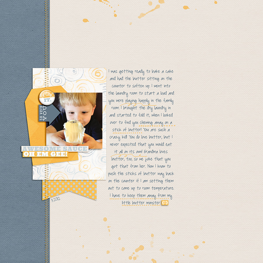
One idea for making your journaling stand out is to use brushes to highlight key words or phrases in your journaling. In my layout below, I used brushes to make certain parts of my writing stand out. It draws your eye to those more important words and gives a little pizzazz to that area of my layout. Brushes are great for this because you can pick the colors from the kit you are working with and can make them any size to suit your journaling.
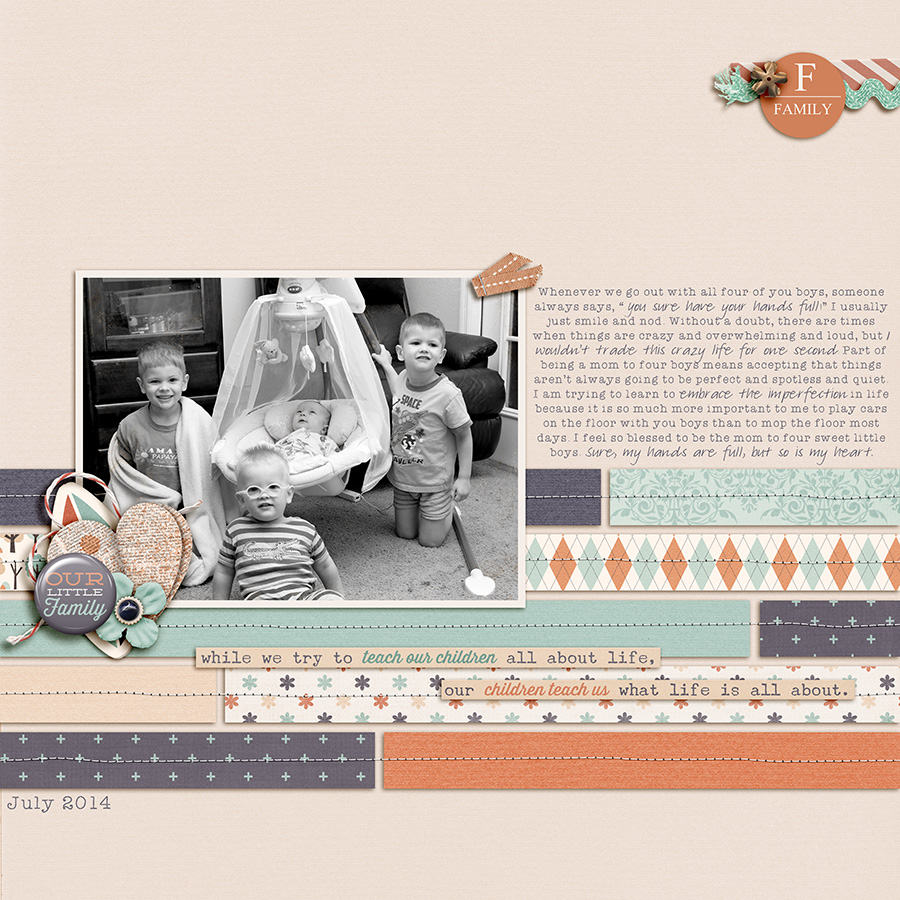
Another idea for bringing interest to your writing is to change up the font, color, or size of some of your text. In this next layout, I used a different font to give attention to more important parts of my journaling.
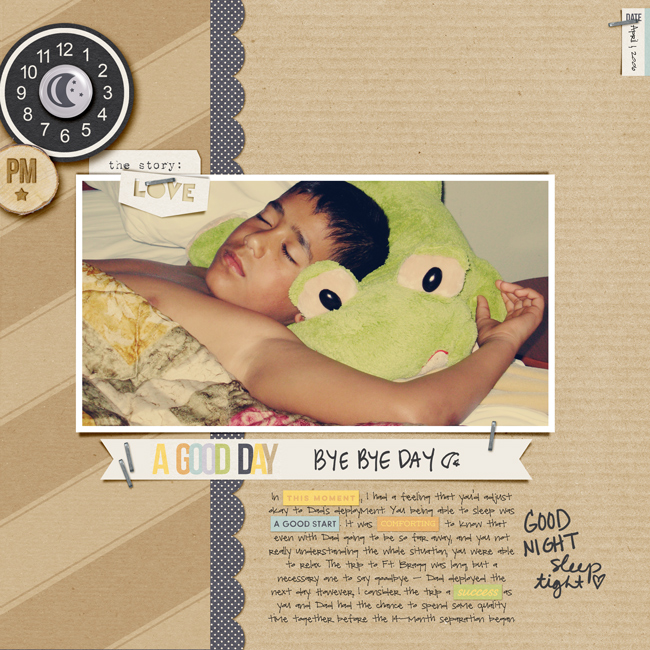
Word strips are another fun way to really make your journaling sing. I love this layout by Kat and how she used the word art from the kit to tell her story. I think it is so clever that she was able to work all of those word strips into her own journaling.
If you don’t want to work the existing word art from the kit into you journaling or if there aren’t any that fit with your story, you can make your own. You can use a product like Dawn by Design’s Line by Line Templates to create your own word strips to add emphasis to your story. You could simply use one strip, like in the layout below, or you could do all of your journaling on word strips. I love how the strips break up the text so that it isn’t in one big block.
So, now it’s your turn to give it a shot. I would love to see what you can do to jazz up your journaling. I’m hosting a challenge over on the forums at The Digital Press and I hope you will come play along! Check it out at The Drawing Board: Challenges.
About the Author: Katie is a member of the Creative Team here at The Digital Press. She lives in Central Florida with her husband and their four sweet but crazy boys. When she’s not dodging Nerf bullets or trying to dig out from under the never ending pile of laundry, she enjoys photography, cooking, going to Disney World with her family, and, of course, digital scrapbooking.
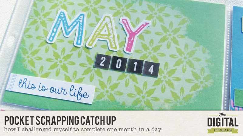
When it comes to pocket scrapbooking. I’m an embellisher. I can spend more time looking for that perfect addition to my page than I spend on any other part of the pocket scrapbooking process. It’s probably partially due to this reason that I’m not anywhere close to caught up. I began pocket scrapping in 2012. I am now the proud owner of partially unfinished 2012, 2013 and 2014 albums. And that’s ok. I don’t mind being “behind” because I’m still working toward documenting those memories and to me that’s the important part.
But then something happens and I ask myself…can I do an entire months worth of pocket scrapping in 24 hours? And so I gave it a go. I should go on to explain this was a normal everyday day. My husband went to work, I homeschooled (DD is a teenager so I realize that makes it easier), did some household chores (maybe a little less than normal), and prepared meals. I took phone calls, checked emails, and got lost on facebook more than once.
But I also focused on completing this project.
May 2014 has been looming large. For some reason I’ve been scared to tackle it. It was a busy month, with lots of stuff going on but I didn’t have good notes. I decided that this was the month to take on. So finally I loaded up facebook, looked at my status reports from that month and cut and paste the ones that I want to document into a text file. I then quickly went through my photos for the month, jotting down notes on which ones I would use and just trying to get an idea of the types of product I would need.
Then I decided on the product. I went with a selection of items from the January Special Edition releases. The bright colors were perfect for this spring month and I knew there would be more than enough coordinating products to complete an entire month’s pages. I also decided that I wouldn’t embellish my pages with anything other than what I could print from the Special Edition products and a simple office date stamp. My next decision was that I was going to use just the Project Life Design A page protectors. I love variety and typically use different configurations, but this is my favorite and I knew it would take the guess work out of figuring out what journal cards to use where. Since I normally I create one page at a
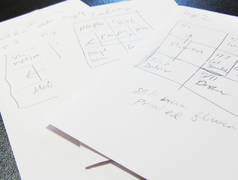
time looking at an entire month (6 pages in this case) was a bit daunting so I decided to work on it in batches.
At 11:00 am or so my (imaginary) timer begins. My first step was to go through my notes and photos and plan out where I wanted each story and picture to be. This gave me an idea of what I was working with topic wise before I started printing out my journal cards and embellishments. I used 4×6 index cards and crudely sketched out a diagram for each page. I loved using index cards for this purpose because I could use the blank space below my sketch for notes as I worked on each page.
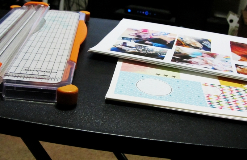
Now that I had an idea of what photos would go in which size spots I began editing and printing my photos. There were a lot of photos and I had to break this step up into a couple of sessions. This break was a perfect time to have lunch, get some laundry going and start my daughter on her afternoon assignments.
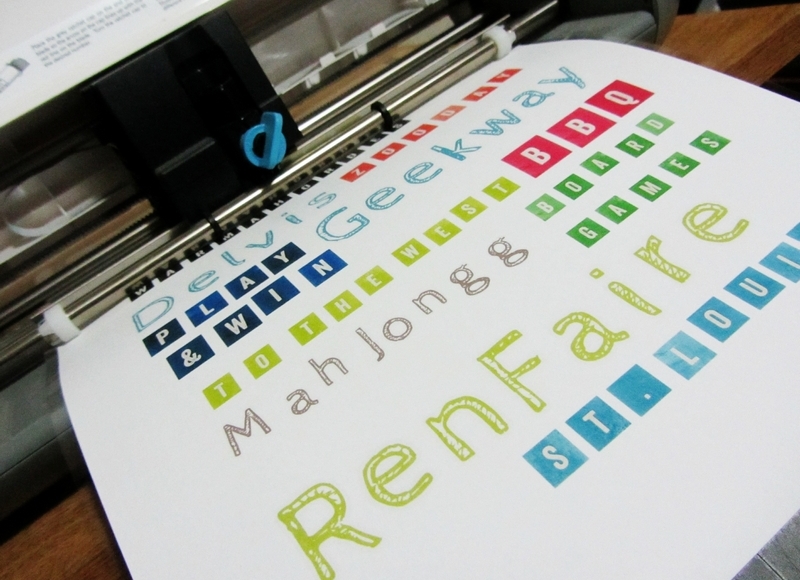
Next I began printing the cards for my pockets. I had a pretty good idea of how many I would need for each size so I kept tally marks as I went, to keep from printing more than I needed. Then I used my Silhouette to print and cut embellishments that I thought I might use. I printed off two pages worth of embellishments knowing that I probably wouldn’t use all of them but also knowing that I could set the unused pieces aside for another page down the line.
By this point my husband was home from work and wanted me to watch some TV with him. Instead of forgoing spending this time with him I set up the TV tray in the living room and set about cutting out all of my photos and journal cards. I typically like doing something while watching TV anyway so this worked out great. It took me about three epsisodes of the sitcom we were watching to get everything cut out and then it was time to prepare dinner.
After dinner I sorted through all of the photos and journal cards and placed the ones I thought I wanted to use together with each page’s index card. I continued working on this project while we watched a few more episodes and I was able to get the photos and embellishments adhered to the journal cards before my husband and daughter went to bed.
I typically stay up for a few hours after they go to bed so this was the perfect time for me to tackle the journaling. I was surprised that it only took me an little over an hour to get most of the journaling knocked out. For my last step of the evening I went through all of the cards I’d put together and made a list of any titles I wanted to print and cut out of the alphabets I’d chosen to use. I grabbed up the stack of cards so that I could make sure I’d get the sizing right and print and cut the titles. At this point I was done and decided to call it a night.
Come morning, the only things I had left to do was adhere my titles, journal on a few of the cards that I was waiting on the titles for and print a photo that somehow I’d missed when I did my initial editing session. I was feeling good. Surely I could get this done by 11 am. Of course, life happens. I’d promised my daughter the day before that I’d make her something for breakfast that was not cereal, homeschool math was a little harder this morning, and I spent 20 minutes searching for my 2 way glue pen that I’d misplaced. Still I was able to get through this and slide my last card into the last pocket at about 12:30. Could I do it in 24 hours? No, but I could do it in 25.5 hours and to me that was just as good.
Here is a look at the pages that I created.
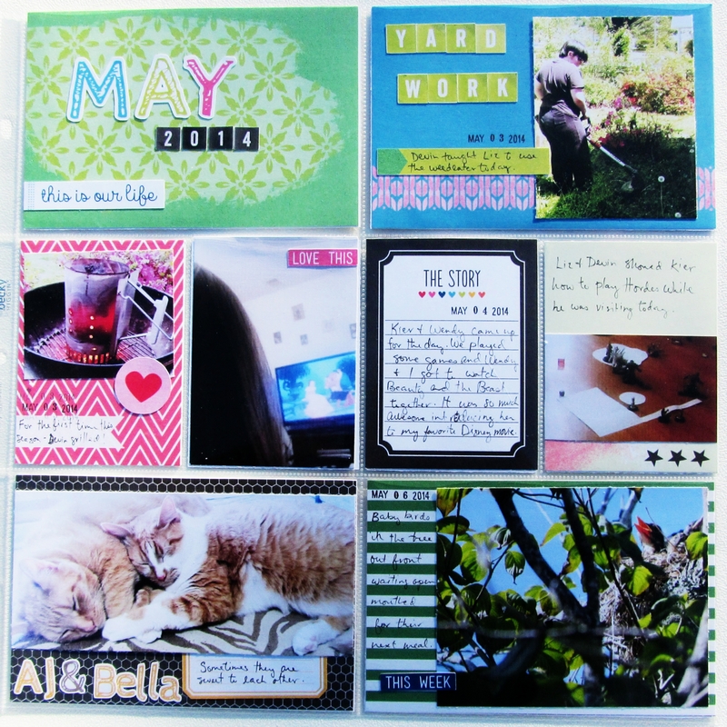
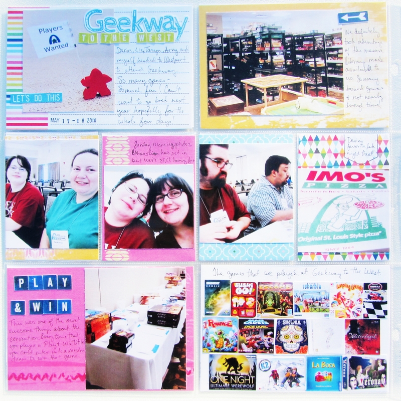
Page 1
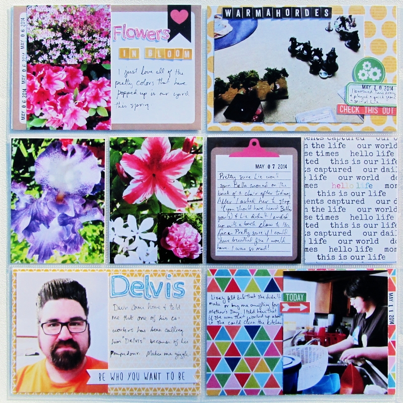
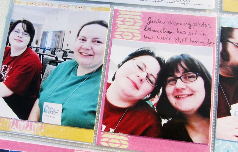
Page 2
Using collages is a quick and easy way to get more photos into a small space.
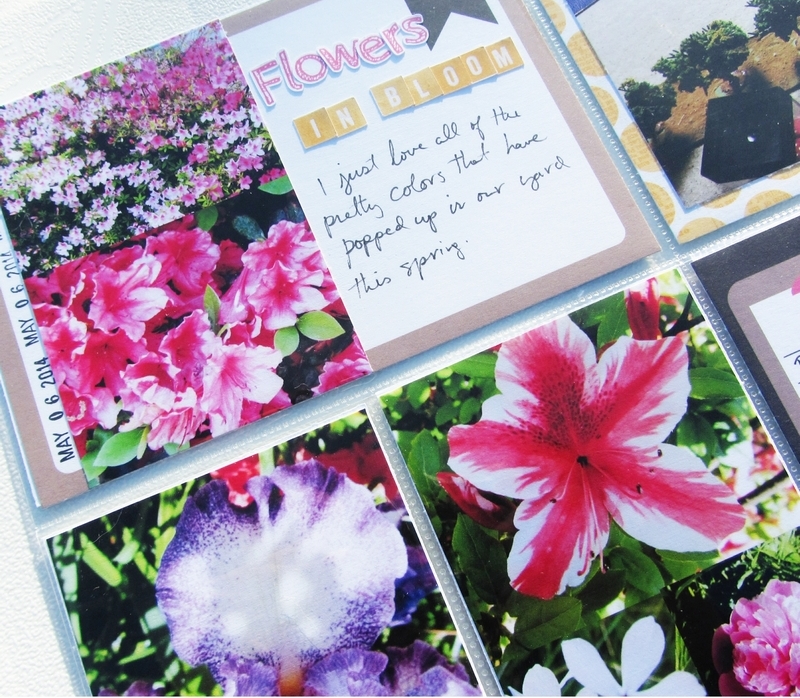
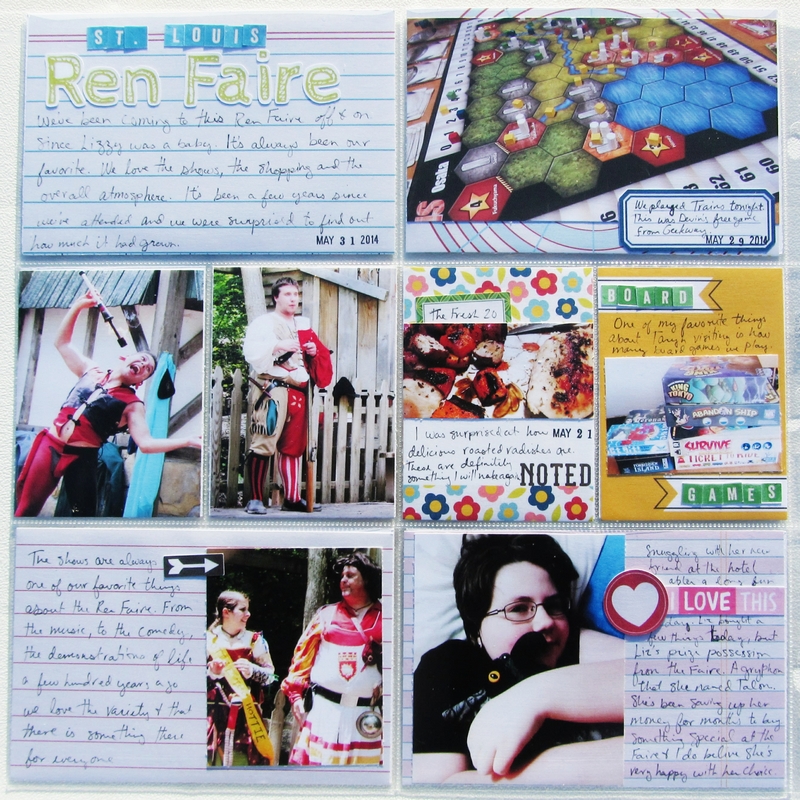
Page 3
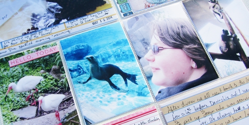
I decided not to add much embellishment wise to the 3″x4″ photos on this page. I’d already talked about going to the zoo on this page and so I let the photos speak for themsleves.
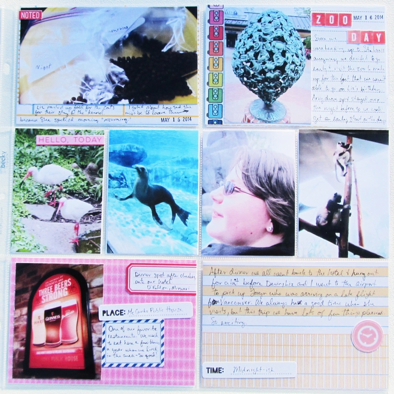
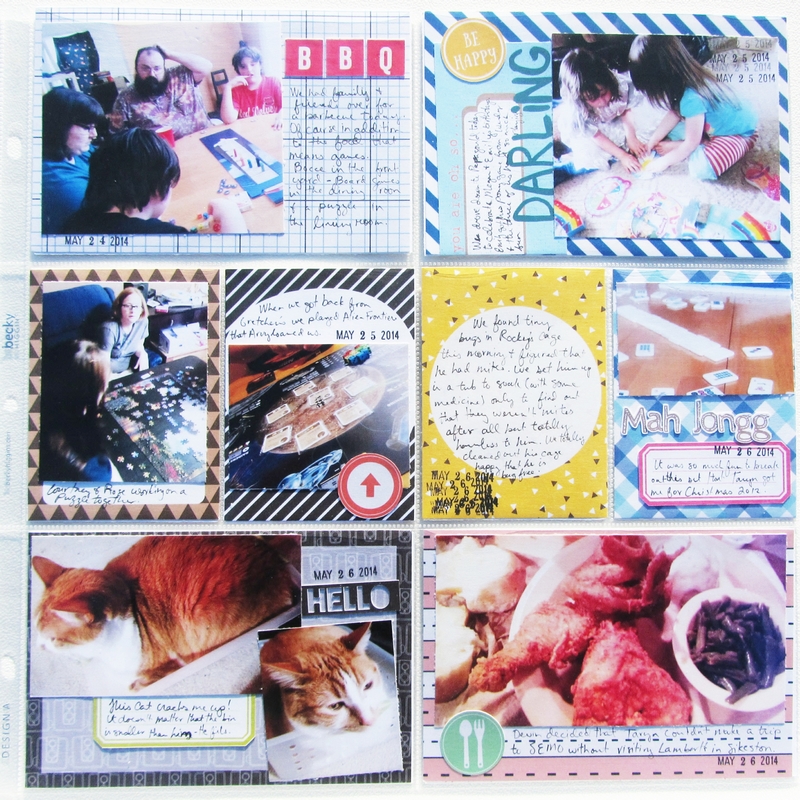
Page 4
I created cards from some of the solid papers by placing paint and stamps on them. These are perfect for matting these photos that aren’t quite 3″x4″.
Page 5
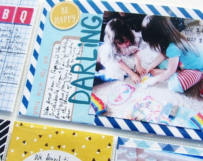
I love using patterned papers for backgrounds as well. I desperately wanted to use the You are so Darling journal card with this photo, but I couldn’t make the photo size work with the card the way it originally was. Rather than taking the time to reprint the photo at a smaller size, I cut up the journal card, placed it on patterned paper and used it as a journal spot.
Page 6
One of my favorite things to use as journal cards is notebook paper. I used Danielle Engebretson’s Graph and Crafts papers for all four 4″x6″ pockets on this final page.
While I don’t think I’ll embrace this as a new way to tackle my pocket scrapping backlog, it was nice finding that I could accomplish all this in a little over a day’s time. I know for my next project I’ll be back to digging through my paper clips and wood veneer looking for that perfect piece to embellish my page, but for me this was an awesome challenge, and in the end I love the pages that I created.
Sarah is a member of the Hybrid Creative Team at The Digital Press. She is a homeschool mom currently living in rural Missouri. Her passions are tabletop gaming and, of course, hybrid scrapbooking.
 Heidi has been scrapping for 17 years. Her passions include dark chocolate, photography of her family and reading Christian fiction. When not doing one of these activites, she can be found working at an elementary school library or enjoying being a SAHM.
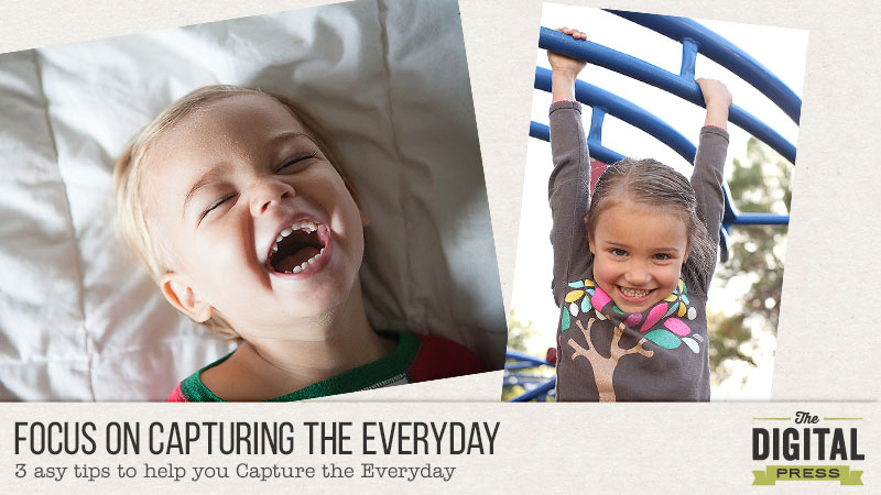


 About the Author: Krista Lund is a mom of 3, married to her High School Sweetheart living in SF Bay Area. Some of her favorite things are brownies, chips n dip, taking pictures and documenting her family’s story.
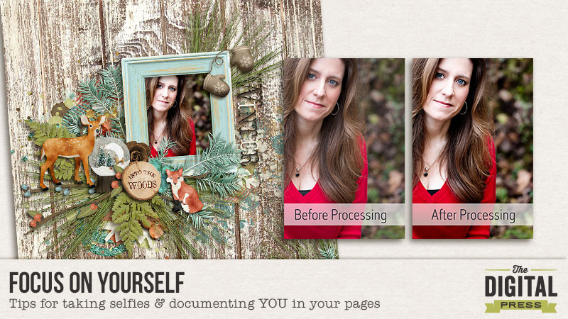
 About the Author: Judie is a member of The Digital Press creative team. She spends most of her time engaged in creative endeavors of all sorts. Traveling, Starbucks, football and Harry Potter are just a few of her favorite things.


 About the Author: Alina enjoys sitting in front of her large computer screens too much. Apart from that she loves walking her dog and watching sunsets while being amazed of life in general. She is married to her best friend. Tries to manage the needs of her two cats and her dog and badly fails when they all want their cuddle time at once. Everything else is scrapping, taking photos and currently crafting. Having said that, she needs a bigger craft room.